Welcome to EPHE 487/591: Biomedical Statistics!
Here you will find everything you need to successfully complete the course.
Here you will find everything you need to successfully complete the course.
Lesson 1. Introduction
Topic 1.1 What to measure?
Field (pages 1-12)
Key terms to know:
Hypothesis
Independent Variable
Dependent Variable
Predictor Variable
Outcome Variable
Level of Measurement
Categorical Variable
Binary Variable
Nominal Variable
Ordinal Variable
Continuous Variable
Interval Variable
Ratio Variable
Discrete Variable
Measurement Error
Validity
Reliability
Criterion Validity
Content Validity
Test-Retest Reliability
Topic 1.2 How to measure it.
Field (pages 13 -17)
Key terms to know:
Correlational Research
Experimental Research
Ecological Validity
Confounding Variables
Between Subject Designs / Independent Group Designs
Within Subject Designs / Repeated Measures Designs
Unsystematic Variation
Systematic Variation
Randomization
Counterbalancing
Assignment 1
1. Install R and R Studio HERE
2. Install JASP HERE
Note on Macs I believe you need to install xQuartz to get JASP to work.
Lesson 2. Analyzing Data
I personally think it is a lot easier to use R Studio to work with R. R Studio is a shell that visualizes a lot of things that are typically hidden in such as variables. It also provides a menu driven selection of tools that R users typically have to execute using R code. This tutorial assumes you have R Studio installed.
Once R Studio is installed I would recommend creating a directory for your working R files. Do this now.
Open R Studio (note, R automatically loads once R studio is opened). Take some times and explore the menu items and the workspace.
IMPORTANT! 90% of more of the mistakes I see students make are typographical - R is an exact programming language! You must have your syntax perfect or there will be an error!
Using Session --> Set Working Directory --> Choose Directory set the directory to your R directory. Note, you will see the command for changing the working directory in your command window after using the Session drop down menu. To do this from the command prompt you would use setwd("~/R") where whatever is in quotes is your path to your R directory.
Installing Packages
One of the reasons R is so powerful is that users can write their own "packages" which add tools to R. You can download these packages for free.
To install a package, go to Tools - Install Packages.
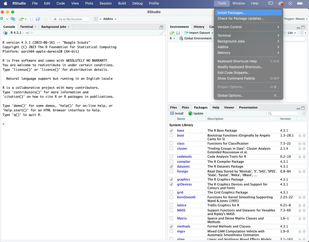
You need to know the name of the package you want, type in plyr and click on Install. Make sure Install Dependencies is checked.
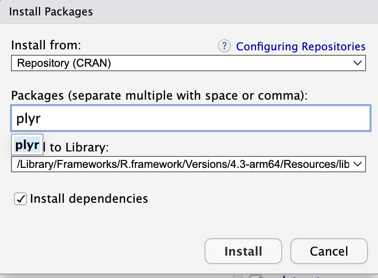
If you click on the Packages tab as seen above, you can check to see that plyr is installed. You can see the tab on the first image above.
At the command prompt type library("plyr"). This tells R Studio to load the plyr library for use. You will need to do this each time you use a library, although you can set R to load libraries automatically. There are reasons for not doing this - we will get to that later.
Okay, the next thing we will do today is load some data into R.
There are a variety of ways to do this of course, but I will focus on the read.table command. We will work with the file data.txt. Download it now. I would encourage you to open this file in a text editor or EXCEL to take a look at it.
Make sure you put the data.txt file in your Working Directory.
Now, at the command prompt, ">" type the following command: myData = read.table("data.txt").
You should now see your data in R Studio as a variable called myData. You can either use the command View(myData) or click on the Environment tab and look under Data. Then click on myData to see your data.
We have loaded the data into a structure called a table (hence the command read.table). In R tables are used to hold statistical data. Note that the columns have labels V1, V2, and V3. These are the default column labels in R. To see the first column for instance you would type myData$V3 at the command prompt (note the $ - this tells R that you want the column V3 in the table myData). Do this now. You should see the numbers in the third column with numbers in [ ] brackets which provide the index of the first number in the row. For example, the second number in the third column would be identified as myData$V3[2].
In research terms, we typically set up our data in the form of a table that has columns for independent variables (things we manipulate) and dependent variables (things we measure).
You should see in myData that has a column(s) for the independent variable, here coded as a 1 or 2 and column(s) with data, were negative numbers in column 2 ranging from approximately -2 to -12 and positive numbers ranging from 200 to 500 in column 3. Here, the independent numbers of 1 and 2 represent two groups and the other numbers are just data (an EEG score in column 2 and reaction time in column 3).
Sometimes it is easier to rename the columns so they are meaningful to you. Use the following command to do this:
names(myData) = c("group","eeg","rt")
Note, the c command essentially tells R that the following stuff in brackets is a list of items. I think the names command does not need to be explained.
The renaming here is to specify in words a column label for the independent variable (group) and the two dependent variables (eeg, rt).
One of the reasons the table structure is so powerful is that you can use logical indexing. For example, to get all of the rt values for participants with a group code of 2 you just need to simply type myData$rt[myData$group==2].
The last thing we will do is define our independent variable group as a factor. This is important for doing statistical analysis as it tells R that group is an independent variable (i.e., a factor) and not data. To do this simply use:
myData$group = factor(myData$group). myData will look the same but R will know now that myData$group is an independent variable and not a dependent variable.
To see how to use factors, we can run a t-test for now - although we will explain t-tests in detail later. To run the t-test use t.test(myData$rt ~ myData$group). With this command you are literally telling R to conduct a t-test examining if there are differences in myData$rt as a function of myData$group. More on this later.
JASP
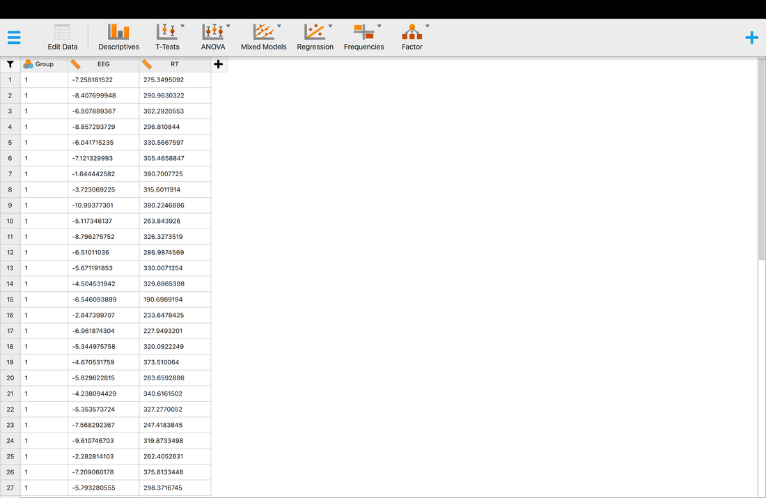
Now, we will load data into JASP which is considerably easier. One thing to note, in JASP the first row must have Column (variable) names as opposed to just the data. Download this file HERE and compare it to data.txt.
To load the data, first open JASP.
In the top left, click on the three lines and then OPEN --> Computer --> and navigate till you fine dataJASP.txt and select it. You should see the data in the main window like below. This is all we are going to do in JASP for now.
At the command prompt type library("plyr"). This tells R Studio to load the plyr library for use. You will need to do this each time you use a library, although you can set R to load libraries automatically. There are reasons for not doing this - we will get to that later.
Okay, the next thing we will do today is load some data into R.
There are a variety of ways to do this of course, but I will focus on the read.table command. We will work with the file data.txt. Download it now. I would encourage you to open this file in a text editor or EXCEL to take a look at it.
Make sure you put the data.txt file in your Working Directory.
Now, at the command prompt, ">" type the following command: myData = read.table("data.txt").
You should now see your data in R Studio as a variable called myData. You can either use the command View(myData) or click on the Environment tab and look under Data. Then click on myData to see your data.
We have loaded the data into a structure called a table (hence the command read.table). In R tables are used to hold statistical data. Note that the columns have labels V1, V2, and V3. These are the default column labels in R. To see the first column for instance you would type myData$V3 at the command prompt (note the $ - this tells R that you want the column V3 in the table myData). Do this now. You should see the numbers in the third column with numbers in [ ] brackets which provide the index of the first number in the row. For example, the second number in the third column would be identified as myData$V3[2].
In research terms, we typically set up our data in the form of a table that has columns for independent variables (things we manipulate) and dependent variables (things we measure).
You should see in myData that has a column(s) for the independent variable, here coded as a 1 or 2 and column(s) with data, were negative numbers in column 2 ranging from approximately -2 to -12 and positive numbers ranging from 200 to 500 in column 3. Here, the independent numbers of 1 and 2 represent two groups and the other numbers are just data (an EEG score in column 2 and reaction time in column 3).
Sometimes it is easier to rename the columns so they are meaningful to you. Use the following command to do this:
names(myData) = c("group","eeg","rt")
Note, the c command essentially tells R that the following stuff in brackets is a list of items. I think the names command does not need to be explained.
The renaming here is to specify in words a column label for the independent variable (group) and the two dependent variables (eeg, rt).
One of the reasons the table structure is so powerful is that you can use logical indexing. For example, to get all of the rt values for participants with a group code of 2 you just need to simply type myData$rt[myData$group==2].
The last thing we will do is define our independent variable group as a factor. This is important for doing statistical analysis as it tells R that group is an independent variable (i.e., a factor) and not data. To do this simply use:
myData$group = factor(myData$group). myData will look the same but R will know now that myData$group is an independent variable and not a dependent variable.
To see how to use factors, we can run a t-test for now - although we will explain t-tests in detail later. To run the t-test use t.test(myData$rt ~ myData$group). With this command you are literally telling R to conduct a t-test examining if there are differences in myData$rt as a function of myData$group. More on this later.
JASP
Now, we will load data into JASP which is considerably easier. One thing to note, in JASP the first row must have Column (variable) names as opposed to just the data. Download this file HERE and compare it to data.txt.
To load the data, first open JASP.
In the top left, click on the three lines and then OPEN --> Computer --> and navigate till you fine dataJASP.txt and select it. You should see the data in the main window like below. This is all we are going to do in JASP for now.
SPSS
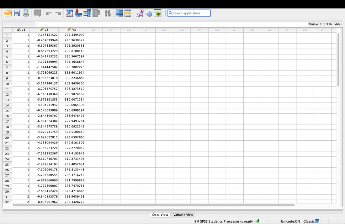
Opening data is also easy in SPSS. Open SPSS then select:
New Dataset by double clicking on it.
On the next screen:
File --> Import Data --> Text Data
And select data.txt
An import wizard will pop up. Hit Continue on all subsequent screen until you can hit Done. In brief, these screens allow you to customize the import to match the data you have. Your data is fine just the way it is.
When done, you will see the data in three columns labelled V1, V2, and V3. Note, you could have changed the column names on the import OR you can do it here by selecting Variable View at the bottom. Change the names of the three columns to Group, EEG, and RT.
That is it for SPSS for now.
Assignment 2
1. Review everything you did above and make sure you understand it.
2. In R Studio, ensure you can load the data HERE ('data2.txt') into a variable called moreData and rename the columns as subject, group, and testscore. Make subject and group factors.
3. Question. How do you think column one would be different if this was a within / repeated measures design? (it is currently formatted as a between / independent design).
EXTRA
If you want to push ahead, see if you can run t-tests between the three groups in R Studio. Note - there are three groups. So, you cannot use the ttest command exactly the way we did above, you need to select subsets of the data as we did however.
Lesson 3. Measures of Central Tendency
Reading: Field, Chapters 1 to 3
If you are not familiar with the concepts of the mean, median, and mode watch THIS. Or use Google. These are concepts you should already know...
Let's start by loading the file we used in the last class, data.txt, into a variable called myData and labelling the three columns as group, eeg, and rt .
One of the most important descriptive statistics is the MEAN, or AVERAGE. The MEAN is just a number that represents the average or arithmetic MEAN of the data. But think about what a MEAN really is – it is a representation of the data. If a baseball player has a mean batting percentage of 0.321 it means they contact the ball on average 32.1% of the time. That numbers describes what they can do, on average. If there was no variability, then that number is their ability in a true sense. If the player starts hitting more consistently, the mean goes up. Why? Because you have added a series of scores that push the mean up because they are greater than the previous mean – thus the average score goes up. The reverse is also true if the player starts missing. Never lose sight of the fact that the mean reflects a series of scores and that changes in those scores over time change the mean. We typically call the mean a POINT ESTIMATE of the data.
In R, to calculate the mean simply use: mean(myData$rt). Note, this is the mean of the whole data set independent of group.
Before we move on, it is important that you understand what a mean really is. Of course, it is an average, but what does that mean? (no pun intended!)
Look at the following plot of myData$rt. (Note, you can do this yourself by using plot(myData$rt).
I have also used abline(a = mean(myData$rt), b = 0, col = "red") to add a red line representing the mean. If you look at the command it specifies a y intercept a which is equal to the mean, a slope b = 0 and makes the line colour red.
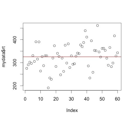
Now, what is the mean? Yes, it is an average of your the numbers in myData$rt. BUT, it is also a model for your data. What do we mean by model? The mean value (325.661) represents the data - it is the model of this data. Think of it this way - if you were going to predict the next number in the series of numbers myData$rt, what number would you pick? The best guess would be the mean as it is the average number. So, the mean is a model of the data. You can read more about this notion HERE and HERE.
Okay, now load in a new data file, data3.txt which is HERE, into a data table called income. This file contains 10000 data points, each of which represents the income of a person in a Central American country in US dollars.
Here is a histogram of income. You can generate this yourself easily by using the command hist, e.g., hist(income$V1). Note, I have not bothered to rename the column so it has the default label V1 for variable one.
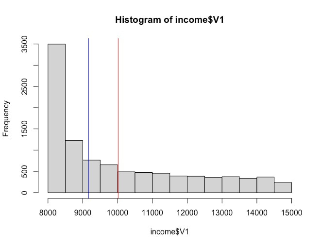
Note the shape of the data. We will data about distributions of data later, but this is what is called a skewed distribution.
Determine the mean and median of the income$V1 using mean(income$V1) and median(income$V1).
You should find that the mean is 10017 and the median is 9165. Note, to add the vertical lines I used the command abline(v = mean(income$V1), col = c("red")). and abline(v = median(income$V1), col = c("blue")).
First, you should review a full definition of a median, but it is essentially the score at the 50th percentile, or the middle of a distribution of numbers. A good definition of the median is HERE.
In terms of the data set income$V1, which is a better model for the data, the mean or the median? Think of it this way, if you moved to the country that this data is from, would you expect your income to be closer to $10017 or $9165? The correct answer in this case is $9165 given the distribution of the data. This is important to realize. A lot of time in statistics we become obsessed with using the mean as a model of our data. However, sometimes the median is a better model for your data - especially in cases like this where it is heavily skewed. Note, for normal data the mean and median should be very similar. Compare the mean and median for myData$rt. You should see that they are very close, differing by 2 points, 325.661 versus 327.7983.
I am not going to say much about the mode. Although the mode is frequently mentioned in statistics textbooks, I can honestly say in my 20+ years as a researcher I have never computed a mode other than when I teach statistics.
Logical Indexing
One of the reasons R is so powerful for statistics is that is supports logical indexing. What I mean by that, is that in our data set myData$rt, I have included codes (myData$group) to highlight that the reaction time data is from two groups of participants. So, if you type in mean(myData$rt) you get the mean across both groups of participants. However, if you wanted to simply get the mean of the myData$rt for participants in group one you would type mean(myData$rt[myData$group==1]). R will interpret this to give you the mean for myData$rt only for cases where the variable myData$group is 1.
JASP
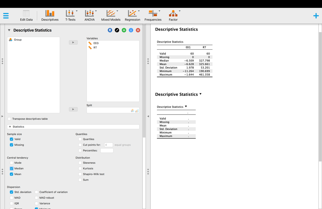
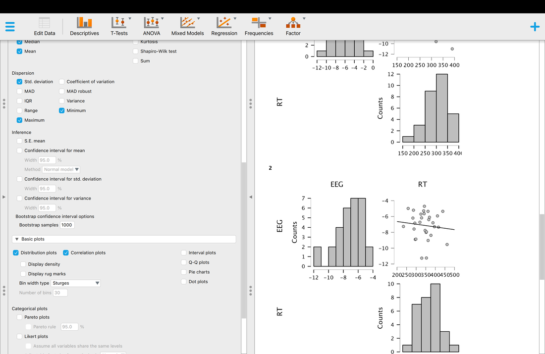
Computing descriptive statistics is quite easy. First, load your data into JASP. Make sure you use THIS data as it contains the column headers you need for JASP.
On the JASP home screen, click descriptives. You will have to select which variables you would like descriptives for. Select EEG and RT. You should see a screen that looks like the screen below. Note, the median is missing and is not computed by default. Simply click the arrow and expand the Statistics tab and select median as another statistic to compute.
Determine the mean and median of the income$V1 using mean(income$V1) and median(income$V1).
You should find that the mean is 10017 and the median is 9165. Note, to add the vertical lines I used the command abline(v = mean(income$V1), col = c("red")). and abline(v = median(income$V1), col = c("blue")).
First, you should review a full definition of a median, but it is essentially the score at the 50th percentile, or the middle of a distribution of numbers. A good definition of the median is HERE.
In terms of the data set income$V1, which is a better model for the data, the mean or the median? Think of it this way, if you moved to the country that this data is from, would you expect your income to be closer to $10017 or $9165? The correct answer in this case is $9165 given the distribution of the data. This is important to realize. A lot of time in statistics we become obsessed with using the mean as a model of our data. However, sometimes the median is a better model for your data - especially in cases like this where it is heavily skewed. Note, for normal data the mean and median should be very similar. Compare the mean and median for myData$rt. You should see that they are very close, differing by 2 points, 325.661 versus 327.7983.
I am not going to say much about the mode. Although the mode is frequently mentioned in statistics textbooks, I can honestly say in my 20+ years as a researcher I have never computed a mode other than when I teach statistics.
Logical Indexing
One of the reasons R is so powerful for statistics is that is supports logical indexing. What I mean by that, is that in our data set myData$rt, I have included codes (myData$group) to highlight that the reaction time data is from two groups of participants. So, if you type in mean(myData$rt) you get the mean across both groups of participants. However, if you wanted to simply get the mean of the myData$rt for participants in group one you would type mean(myData$rt[myData$group==1]). R will interpret this to give you the mean for myData$rt only for cases where the variable myData$group is 1.
JASP
Computing descriptive statistics is quite easy. First, load your data into JASP. Make sure you use THIS data as it contains the column headers you need for JASP.
On the JASP home screen, click descriptives. You will have to select which variables you would like descriptives for. Select EEG and RT. You should see a screen that looks like the screen below. Note, the median is missing and is not computed by default. Simply click the arrow and expand the Statistics tab and select median as another statistic to compute.
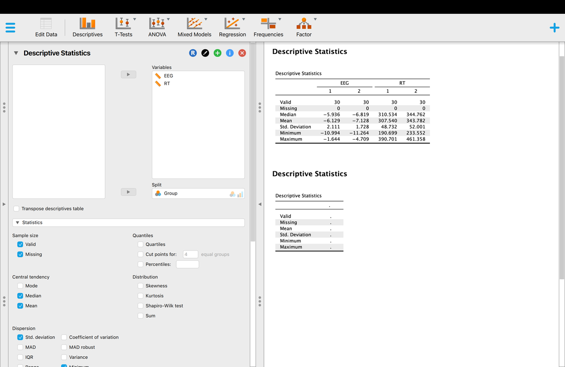
Okay, so you have your descriptive statistics for all of the data. What if you wanted them by group? Simply Enter Group as a variable into the Split box and you will have your descriptive statistics by Group.
SPSS
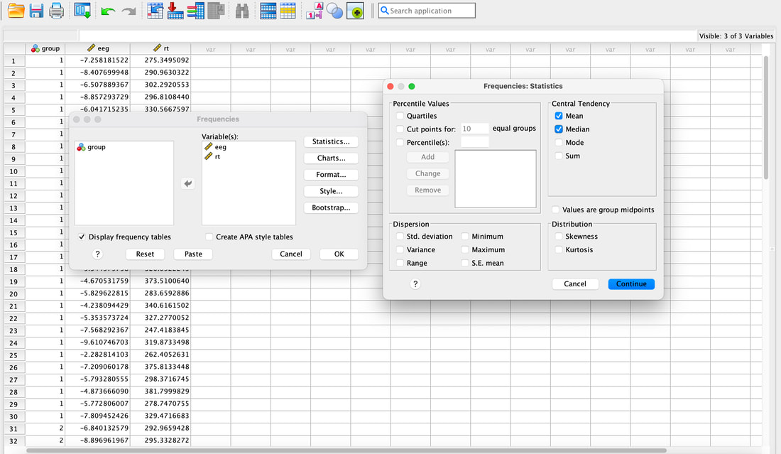
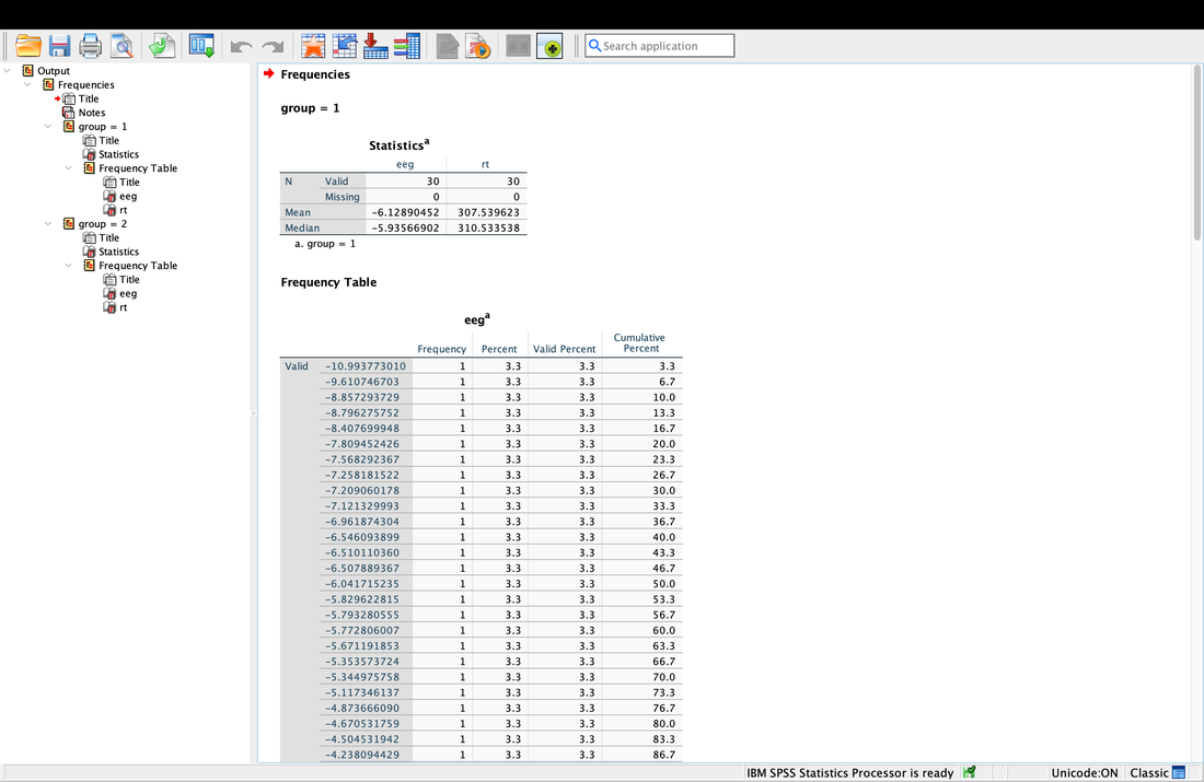
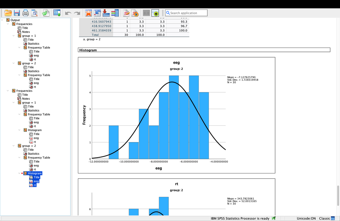
Computing descriptive statistics is easy in SPSS as well. Load data.txt into SPSS. If you click on Analyze --> Descriptive Statistics --> Frequencies. Enter eeg and rt (or V2 and V3 - I renamed the columns) as variables. Now, you can click on Statistics and select the Mean and the Median. Hit Continue then Okay and you will see the Mean and the Median.
Computing descriptive statistics is easy in SPSS as well. Load data.txt into SPSS. If you click on Analyze --> Descriptive Statistics --> Frequencies. Enter eeg and rt (or V2 and V3 - I renamed the columns) as variables. Now, you can click on Statistics and select the Mean and the Median. Hit Continue then Okay and you will see the Mean and the Median.
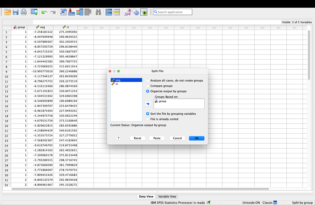
Getting descriptive statistics for groups separately in SPSS is somewhat annoying. Go to the Data tab then select Split File. This will allow you to then organize your output by Group as seen in the screenshot below. Then, repeat the steps above and you will see that you get separate descriptive statistics for each group.
Assignment 3
Your assignment for the week - compute the mean and median for groups 1 and 2 separately for both variables, myData$rt and myData$eeg. Use the plot command and the abline function to plot the mean and median for both variables (on the whole data set) as per the first plot on this page. Plot the mean in red and the median in blue. Email me your values and your plots.
Lesson 4. Variance
Reading: Field, Chapters 1 to 3
Today we are going to talk about VARIANCE. If you truly understand what variance is then you will be just fine with anything you do in statistics.
At some point before, during, or after class you should watch the following videos. First, watch THIS video. Then this ONE. And then this ONE. And finally this ONE.
Now, R is easier to use when you just have to run scripts. A script is a bit of code that does several things sequentially.
Download the script HERE and put it in your R directory.
Open R Studio, set the working directory, and then File --> Open File and select whatisvariance.r, the script you just downloaded. Your screen should look something like this.
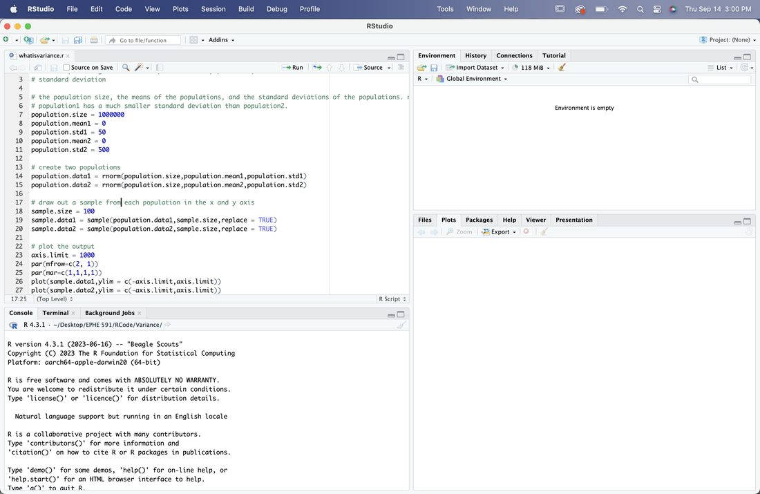
The green writing after the # is a comment. These typically reflect information about the script. Now, most of this is commands you are not familiar with, which is fine. Read over the script and the comments. Then, click on the source button to run it. This will generate two plots. The plots reflect two samples drawn from two different populations with the same size and mean, but with a different standard deviation (variance). Change the standard deviations for each of the samples and run it again. What does this all mean?
Once you have done that, there are a series of R scripts below to run. Play with them and figure out what I am trying to teach you with them.
Sample Size and its Impact of Sample Means
Sample Size and its Impact on the Variance of Sample Means
Note for the next two scripts the x-axis is samples.
Sample Size and Variance
Another One on Sample Size and Variance
Now, some stuff to work through.
Load the file sampleData.txt into a table called "data" using read.table.
Check that the mean of column V1 is 298.16 and that the mean of column V2 is 350.79. Note that unless you rename the columns the default names are data$V1 and data$V2.
Take a look at the data using the View command. You will note that each of the numbers in the column is not 298.16 or 350.79, indeed, these numbers VARY quite a bit around the mean. Let's examine that variance by plotting data$V1 and data$V2. Try the following code:
par(mfrow=c(1,2)) this tells R you want to arrange two plots side by side, 1 row, 2 columns
plot(data$V1,ylim = c(250,400)) this will plot data$V1 on the left panel with y-axis limits of 250 and 400
plot(data$V2,ylim = c(250,400)) this will plot data$V2 on the right panel with y-axis limits of 250 and 400
Notice that the numbers are distributed about the mean values, in other words, there is VARIABILITY of these values around the mean.
Try the following command: data$V3 = data$V1 - mean(data$V1). This creates a new column data$V3 where each entry is just the corresponding value in data$V1 with the mean subtracted. What is the sum of this column? Hint: sum(data$V3). This will give you a really small number - in reality the sum should be zero but because of rounding error this never happens. Try plotting data$V3. You should see that is looks a lot like a plot of data$V1, however, the mean is now zero. This is of course, because you have subtracted the mean. The variability (data$V3) is simply the variability in scores about the mean. Recall that in the previous lesson we described the mean as a model. The mean is a model of the data, the best estimate of what the next score will be or of the data as a whole. However, you can also think of the data this way: data = model + variability, or data = mean + variability. Typically, in statistics, we use the word error instead of variability. The error is the difference of individual scores from the model.
As opposed to keeping all of the "error" scores, we may wish to describe how much variability there is around the mean. Create a new column, data$V4 using the following code: data$V4 = data$V3*data$V3. This column has a special name in statistics, it shows the squared errors from the mean. Importantly, this column does not sum to zero, it sums to a number (this is because there are no negative numbers once it is squared). The name for this term for a given set of data is the Sum of Squared Errors or SSE. If you divide this number by n-1 (the number of data points minus 1, so 99 for this data), you have a quantity called VARIANCE - the variance is a number that describes the variability in the data. For example, if everyone had the same score as the mean, the variance would be zero because the sum of squared errors would be zero. Compute the variance now: sum(data$V4)/99. We did not actually have to do all this work, usually we would take the short cut: var(data$V3). Note, the actual number we get for the variance only has meaning if you understand the data. For example, if I tell you a mean for a data set is 60 and the variance is 20 that does not mean a lot to you. However, if I told you that the mean of 60 was an age representing age of death and 20 was the variance, that is quite scary! Imagine what the distribution of age of death would look like! The mean of the variance also has relative meaning - you could compare the variance between two groups and that may be of interest to you.
Compute the variance for data$V2. I would recommend using the long approach we used above (by doing the math and creating new columns) and also by using the command var.
Standard Deviation
Sometimes researchers use a different quantity to represent the variability in a data set - the standard deviation. Mathematically, the standard deviation is just the square root of the variance: sqrt(var(data$V1)). There is also a simple command for it: sd(data$V1). This would be a really good time to find a textbook and read (a lot more) about variance and standard deviation.
Point versus Interval Estimates
If you recall, we discussed the mean and median as point estimates of the data. The standard deviation and variance are interval estimates of the data because they span a range of values. Ensure you understand this idea.
Sometimes statisticians like to create data to test ideas. In R this is very easy, for instance:
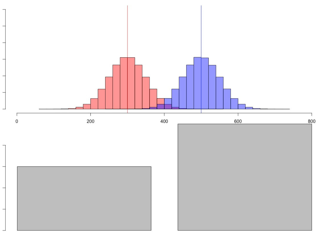
newData = rnorm(1000,300,25) creates a new data set called newData which has 1000 scores, a mean of 300, and a standard deviation of 25. We will need this later. But yes, I have just showed you how to create fake data.
Another way to examine variance is to use a histogram. Try the following command: hist(newData). Use a textbook and again read about histograms. Essentially, they show a breakdown of your data into bins (usually 10, but it can be any number), with a count of the number of data points that fall into the range of a given bin. If you try the following two commands: output = hist(newData) and then simply output, you should see a lot of information about what a histogram is comprised of. Make sure you know this information. NOTE. Your histogram is normally distributed, what some would call a "bell curve" or Gaussian. There are reasons for this and we will talk a lot more about normality later.
JASP and SPSS
To compute the standard deviation and variance in JASP or SPSS you would just compute descriptives as you did in Lesson 3 and select that you want to compute those two measures.
Similarly, to generate histograms in JASP you just select Basic Plots on the Descriptive tab and in SPSS you select Charts after you go Analyze --> Descriptive Statistics --> Frequencies.
Once you have done that, there are a series of R scripts below to run. Play with them and figure out what I am trying to teach you with them.
Sample Size and its Impact of Sample Means
Sample Size and its Impact on the Variance of Sample Means
Note for the next two scripts the x-axis is samples.
Sample Size and Variance
Another One on Sample Size and Variance
Now, some stuff to work through.
Load the file sampleData.txt into a table called "data" using read.table.
Check that the mean of column V1 is 298.16 and that the mean of column V2 is 350.79. Note that unless you rename the columns the default names are data$V1 and data$V2.
Take a look at the data using the View command. You will note that each of the numbers in the column is not 298.16 or 350.79, indeed, these numbers VARY quite a bit around the mean. Let's examine that variance by plotting data$V1 and data$V2. Try the following code:
par(mfrow=c(1,2)) this tells R you want to arrange two plots side by side, 1 row, 2 columns
plot(data$V1,ylim = c(250,400)) this will plot data$V1 on the left panel with y-axis limits of 250 and 400
plot(data$V2,ylim = c(250,400)) this will plot data$V2 on the right panel with y-axis limits of 250 and 400
Notice that the numbers are distributed about the mean values, in other words, there is VARIABILITY of these values around the mean.
Try the following command: data$V3 = data$V1 - mean(data$V1). This creates a new column data$V3 where each entry is just the corresponding value in data$V1 with the mean subtracted. What is the sum of this column? Hint: sum(data$V3). This will give you a really small number - in reality the sum should be zero but because of rounding error this never happens. Try plotting data$V3. You should see that is looks a lot like a plot of data$V1, however, the mean is now zero. This is of course, because you have subtracted the mean. The variability (data$V3) is simply the variability in scores about the mean. Recall that in the previous lesson we described the mean as a model. The mean is a model of the data, the best estimate of what the next score will be or of the data as a whole. However, you can also think of the data this way: data = model + variability, or data = mean + variability. Typically, in statistics, we use the word error instead of variability. The error is the difference of individual scores from the model.
As opposed to keeping all of the "error" scores, we may wish to describe how much variability there is around the mean. Create a new column, data$V4 using the following code: data$V4 = data$V3*data$V3. This column has a special name in statistics, it shows the squared errors from the mean. Importantly, this column does not sum to zero, it sums to a number (this is because there are no negative numbers once it is squared). The name for this term for a given set of data is the Sum of Squared Errors or SSE. If you divide this number by n-1 (the number of data points minus 1, so 99 for this data), you have a quantity called VARIANCE - the variance is a number that describes the variability in the data. For example, if everyone had the same score as the mean, the variance would be zero because the sum of squared errors would be zero. Compute the variance now: sum(data$V4)/99. We did not actually have to do all this work, usually we would take the short cut: var(data$V3). Note, the actual number we get for the variance only has meaning if you understand the data. For example, if I tell you a mean for a data set is 60 and the variance is 20 that does not mean a lot to you. However, if I told you that the mean of 60 was an age representing age of death and 20 was the variance, that is quite scary! Imagine what the distribution of age of death would look like! The mean of the variance also has relative meaning - you could compare the variance between two groups and that may be of interest to you.
Compute the variance for data$V2. I would recommend using the long approach we used above (by doing the math and creating new columns) and also by using the command var.
Standard Deviation
Sometimes researchers use a different quantity to represent the variability in a data set - the standard deviation. Mathematically, the standard deviation is just the square root of the variance: sqrt(var(data$V1)). There is also a simple command for it: sd(data$V1). This would be a really good time to find a textbook and read (a lot more) about variance and standard deviation.
Point versus Interval Estimates
If you recall, we discussed the mean and median as point estimates of the data. The standard deviation and variance are interval estimates of the data because they span a range of values. Ensure you understand this idea.
Sometimes statisticians like to create data to test ideas. In R this is very easy, for instance:
newData = rnorm(1000,300,25) creates a new data set called newData which has 1000 scores, a mean of 300, and a standard deviation of 25. We will need this later. But yes, I have just showed you how to create fake data.
Another way to examine variance is to use a histogram. Try the following command: hist(newData). Use a textbook and again read about histograms. Essentially, they show a breakdown of your data into bins (usually 10, but it can be any number), with a count of the number of data points that fall into the range of a given bin. If you try the following two commands: output = hist(newData) and then simply output, you should see a lot of information about what a histogram is comprised of. Make sure you know this information. NOTE. Your histogram is normally distributed, what some would call a "bell curve" or Gaussian. There are reasons for this and we will talk a lot more about normality later.
JASP and SPSS
To compute the standard deviation and variance in JASP or SPSS you would just compute descriptives as you did in Lesson 3 and select that you want to compute those two measures.
Similarly, to generate histograms in JASP you just select Basic Plots on the Descriptive tab and in SPSS you select Charts after you go Analyze --> Descriptive Statistics --> Frequencies.
Assignment 4
1. Question. Why is the sum of a column of numbers with the mean subtracted equal to zero?
2. Create three data sets, all of size 1000 and a mean of 500, but one with a standard deviation of 10, one with a standard deviation of 50, and the last with a standard deviation of 100.
3. Use the commands in this assignment to create a plot (which you will submit) that has 1 row, 3 columns and has a plots of the three data sets, Can you visually see the difference in the variance? HINT: Set your y limits to 0 and 1000 for both plots for this to work.
4. Question. Describe the increase in variability you see in words. Use a computation of the variance for each data set to justify your description.
5. For the data you created in Question 2, create a new variable called squaredErrors. This variable should have 6 columns, the first three containing your three columns of data, the next three each containing the squared errors (thus a 1000 row by 3 column matrix) for one of the columns. Compute the sum of squared errors for each of your columns and report these numbers. Also report the variance.
HINT. Creating a table from scratch in R is not as simple as you think. Here is one way to do this:
data1 = rnorm(1000,500,10)
data2 = rnorm(1000,500,50)
myTable = as.data.frame(matrix(data1))
# you have to create a table using as.data.frame and you have to specify the data is a matrix - trust me on this one.
myTable$V2 = data2
# then you just add your others variables as columns
6. Repeat Question 3, but using histograms (hist) instead of plots. For your comparison to be valid both the x and y axis limits have to be the same for all your plots! Use hist(myData$V1,xlim = c(1, 1000), ylim = c(1,300)) as a guide to help you with this. You do not need to redo the variance computations.
Submit your answers to me via email before next class.
Challenge: Do all of this in an R Script. You can answer written questions as comments and have code to do all the math and plots.
EXAM QUESTIONS
What are the mean, median, and mode?
What is mean by "The mean is a statistical model"? What are statistical models?
What is variance? What is standard deviation?
What is the difference between a point and an interval estimate?
For Next Class
Download a trial copy of GraphPad Prism HERE
Lesson 5. Visualizing Data
Reading: Field, Chapter 4
RULE # 1: DO NOT MAKE BORING PLOTS WITH LITTLE INFORMATION ON THEM, PUT AS MUCH INFORMATION (DATA) AS YOU CAN ON YOUR PLOTS
RULE # 2: NEVER PLOT WITH EXCEL
RULE # 3: NEVER FORGET RULES #1 AND #2
Consider the plot below, made with the R code HERE. The top plot conveys a lot of information. The bottom one, well, never do that...
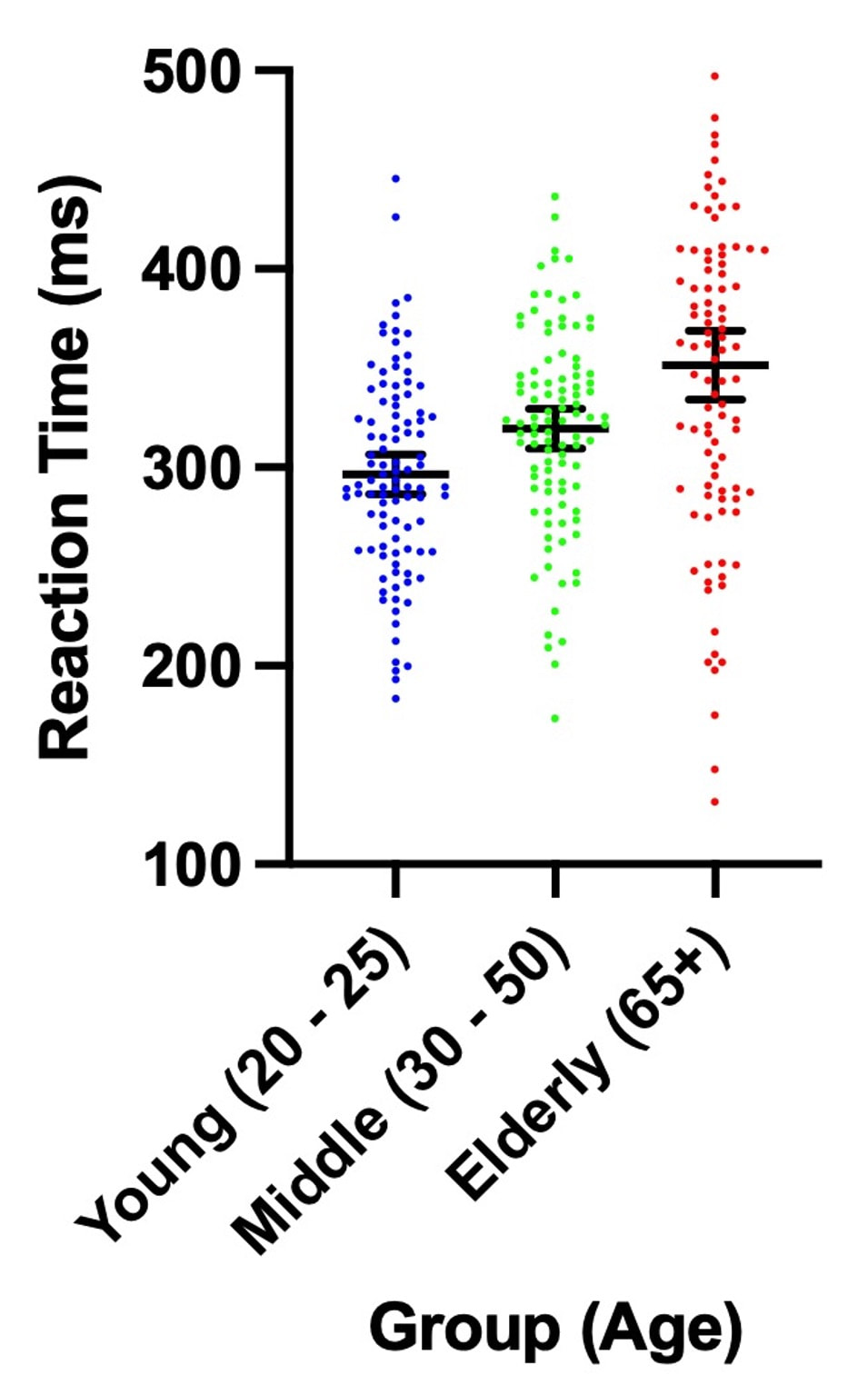
In terms of providing the viewer lots of information, the plots below contain the same point estimates, but the one on the right has so much more information!
|
|
Try reading this paper by Rougier et al. 2014 for some ideas!
The Grammar of Graphics is a MUST READ!
Need help with colour, check out THIS website!
And for some inspiration, look HERE!
Finally, in R you want to learn to use ggplot2 as soon as possible!
A Note on Error Bars
Plotting Basics
Load the data file HERE into a table called "data".
Next, name the three columns "subject", "condition", and "rt". You will note there are three groups of 50 participants in this data set.
Let's generate a basic scatter plot: plot(data$rt)
You will note this command generates a scatter plot of the values in data$rt with subject as the x axis value and rt as the y axis value.
If you wanted to represent this data as a bar plot you would simply use: barplot(data$rt)
For now, let's return to a basic scatter plot: plot(data$rt)
If you wanted to visualize the group differences, you could use a plot like this: plot(data$rt~data$condition)
This essentially tells R that you want a scatter plot of data$rt but instead of data$subject on the x axis you would like to use data$condition. Try plot(data$rt~data$subject) as a proof of concept. The default in R for the plot command is to assume the x axis reflects each data point if nothing else is specified. Note, this will not work for bar plots - you need to generate the means in advance. See below.
You can add other information to your plot. For example, if you want to label the plot axes in R you would do the following:
plot(data$rt~data$condition, main="Condition Effect", xlab="Condition", ylab="Reaction Time (ms)", ylim=c(0, 500))
Go HERE for a lot more information information about what you can add to plots.
We can make our graph even more sophisticated. Let's highlight the means for each group.
means = aggregate(rt~condition,data,mean)
This command gets the mean values for each condition in the table "data" and assigns them to the variable means. Type "means" to check.
Now try: points(means$condition,means$rt,pch=16,col='red')
You should see a red circle reflecting the mean in the middle of each scatter plot for condition.
A different way to visualize this data would be to plot each group separately using a line to reflect the mean as per a previous assignment. You would do this as follows:
par(mfrow=c(1,3))
plot(data$rt[data$condition==1])
abline(a = means$rt[1], b = 0, col = "red")
plot(data$rt[data$condition==2])
abline(a = means$rt[2], b = 0, col = "red")
plot(data$rt[data$condition==3])
abline(a = means$rt[3], b = 0, col = "red")
You will note the yaxis is different for each plot. You could fix this with ylim which we learned earlier.
More details on plotting in R can be found HERE and HERE.
GRAPHPAD PRISM
Showing you how to do all of this in GraphPad Prism is beyond the scope of this tutorial. However, if you open this Prism FILE then you will see how easy it is.
Assignment Question
1. Using a data set of your choice generate a plot similar to the one immediately above. Ensure you title the plot, label the axes, and make sure the x and y limits are the same on all of your sub plots.
Bar Graphs
Now you will learn how to plot bar graphs in R. Load the data HERE into a table named data. Name the columns subject, group, and rt.
If you simply type in barplot(data$rt) you will get a bar plot of data$rt with a column representing each data point. There is a lot you can do with a bar plot in R, so lets work through some of the basics.
Let's say you wanted to colour the bars in green, you would first need the colour name in R. You can find a guide HERE.
Try this. barplot(data$rt, col = 'forestgreen')
Alternatively, use barplot(data$rt, col = 'forestgreen', border = NA) if you do not want borders on the bars.
If you wanted to color subsets of the bars, you would have to specify colors for each bar. You could do something like this:
cols = data$subject
cols[1:50] = c("red")
cols[51:100] = c("blue")
cols[101:150] = c("green")
barplot(data$rt, col = cols)
Some other useful features:
To label the x axis:
barplot(data$rt,xlab = 'Subject')
To label the y axis:
barplot(data$rt,ylab = 'Reaction Time (ms)')
To add a title:
barplot(data$rt,main = 'Insert Title Here')
To add a title and a subtitle:
barplot(data$rt,main = 'Insert Title Here', sub = 'My Subtitle')
To set x limits to the x axis:
barplot(data$rt, xlim = c(1, 50))
And to set y limits to the y axis:
barplot(data$rt, ylim = c(150, 550))
A full list of the parameters for barplot can be found HERE.
Plotting Means With Error Bars
A common thing you may want to do with this data is to generate a bar plot of the means of the three groups with an error bar for each column.
I could have a whole class on error bars, but it would not be that exciting. We will come back to error bars again and again, but the short version is from a statistics perspective the BEST error bar is a 95% confidence interval - a lot more on this later in the course. Other popular error bars are the standard deviation and the standard error of the mean.
This is a bit complicated but I want to plant the seed. Error bars should reflect the variance that is important to the comparison. For BETWEEN designs the standard deviation is appropriate for each group, because the variance within the group is what impacts the test. For a WITHIN design, variance of the conditions does not matter. But, the standard deviation of the difference scores does. Why do you think this is?
Now, let's make some error bars. For now, I am just going to show you how to compute a 95% CI. We will use these more later in the course and talk about what they mean. For now, if you are curious watch THIS and THIS.
Note, I have renamed the column names using:
names(myData) = c("subject","condition","rt")
Step One. Get the mean for each group:
means = aggregate(rt~condition,data,mean)
N.B., for simplicities sake, I am going to remove the means from the mini data frame they have been put in:
means = means$rt
Step Two. Get the standard deviation for each group.
sds = aggregate(rt~condition,data,sd)
sds = sds$rt(same removal of the data frame here)
Step Three. Compute the CI size for each group.
cis = abs(qt(0.05,49) * sds / sqrt(50))
Note, if you want to know what these commands do use ?abs, ?qt, and ?sqrt.
Step Four. Plot the bar plot of the means.
bp = barplot(means, ylim = c(200,400))
Note, we are assigning the barplot a name, bp, so we can use it below.
Step Five. Add the error bars.
arrows(bp,means-cis, bp, means+cis, angle=90, code=3, length=0.5)
This is actually a quick R cheat using the arrows command, but it works! Essentially, you are specifying arrows draw between the point (bp,means-cis) and point (bp,means+cis) with the arrows heads at an angle of 90 degrees, on each end of the line (code = 3) and with a length of 0.5. If you want to get serious about plotting, use a plotting program or see some of the more advanced lessons!
GRAPHPAD PRISM
Showing you how to do all of this in GraphPad Prism is beyond the scope of this tutorial. However, if you open this Prism FILE then you will see how easy it is.
Assignment Question
2. Using a data set of your choice generate a boxplot similar to the one immediately above. Ensure you title the plot, label the axes, and make sure the x and y limits are appropriate.
Boxplots
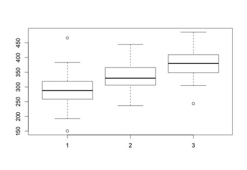
There are other plots in R that can be very useful - a classic one for examining data is a box plot.
In this lesson you will learn how to plot bar graphs in R. Load the data HERE into a table named data. Name the columns subject, group, and rt.
Generating a boxplot if very easy. Simply use:
boxplot(data$rt~data$group)
Now, what is important with a box plot is what information is shown. The line in the middle of each "box" is the median score for the group. The bottom of the box represents the first quartile (or 25th percentile) score. The top of the box represents the third quartile (or 75th percentile) score. The bottom and the top of the "error bars" represent the minimum and maximum scores respectively. Note, these are not the mathematical minimum and maximum but the boxplot minimum and maximum. To understand these scores, we must define the interquartile range (IQR). This is the range from the 25th percentile score to the 75th percentile score - the height of the box itself. The minimum is Q1 (the 25th percentile score) - 1.5 x IQR. The maximum is Q3 (the 75th percentile score) + 1.5 * IQR.
What of the circles? The circles represent outlying scores - these are scores that the function generating the box plot decides are too extreme to actually be in the group. Let's verify this quickly with the first group:
group1 = data$rt[data$group == 1]
median(group1)
min(group1)
max(group1)
You will note the values returned for min and max are the circles shown on the boxplot as these are the true mathematical minimum and maximum scores.
If you want to see what the numbers the box plot is computing - try this:
stuff = boxplot(data$rt~data$group)
stuff
What you should see here is that the box plot is returning all of the information in the plot and more - even the confidence intervals for the groups.
For a list of all the properties of a boxplots, use
?boxplot
Note, all of the classic plot properties such as titles, axis labels, and axis limits can be set.
GRAPHPAD PRISM
Showing you how to do all of this in GraphPad Prism is beyond the scope of this tutorial. However, if you open this Prism FILE then you will see how easy it is.
Assignment Question
3. Using a data set of your choice generate a boxplot similar to the one immediately above. Ensure you title the plot, label the axes, and make sure the x and y limits are appropriate.
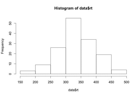
Histograms
Again, we will work with the same data as before. Load the data HERE into a table named data. Name the columns subject, group, and rt.
Generating a histogram is very easy in R. Try the following:
hist(data$rt)
What you will see is a simply histogram like this.
Histograms provide an excellent representation of your data. For example, you could use something like the bar plot we generated a few exercises ago or you could show something like this:
hist(data$rt[data$group==1],col=rgb(1,0,0,0.5),ylim = c(0,25))
hist(data$rt[data$group==3],col=rgb(0,0,1,0.5),ylim = c(0,25),add=T)
Now this plot only overlays groups 1 and 3 but you get the idea - there is a lot more information here than a simple bar plot.
You can also pull information out of a histogram. Try:
stuff = hist(data$rt)
stuff
As with the boxplot command, you will see that the histogram generates a lot of statistical information.
For a list of all the properties of a histogram, use
?hist
Note, all of the classic plot properties such as titles, axis labels, and axis limits can be set.
GRAPHPAD PRISM
Showing you how to do all of this in GraphPad Prism is beyond the scope of this tutorial. However, if you open this Prism FILE then you will see how easy it is.
Assignment Question
4. Using a data set of your choice generate a histogram where you overlay three data sets. To make your life easier... make sure they do not overlap too much!
OPTIONAL: ggplot: Bar Graphs
In this section, we are going to learn to plot a bar graph using a package called ggplot2. This package is very popular for R users and that is because it allows you to customize anything on your graph. Start off by installing the package ggplot2 as you have been shown in a past section.
Now, ggplot requires a long format of data rather than a wide format. A wide format is where columns are different conditions and rows are each participant. A long format will instead compile it so that the first column names the conditions, and the second column names the score. This means that if you have 20 people and 3 conditions, the first 20 rows will be the scores for condition 1, the second 20 rows will be condition 2 and so forth. This seems simple right now, but when you have multiple predictors, things begin to get complicated. Let’s say you have two time points, and three conditions per time point. That means that for each participant you need Time1*Condition1, Time2*Condition1, Time1*Condition2, Time2*Condition2, Time1*Condition3, and Time2*Condition3. Luckily, you do not have to arrange your data in this way. Instead, we will use a package called reshape2 which will compile your wide format data into long format data. Install the reshape2 package now.
Unlike past sections, I will not here walk you through each part of the code. The reason for this is that this code is much more elaborate than what you’ve used before. Instead, I have decided to give you working code which has extensive commenting. I suggest you read the comments thoroughly, but also play around with it. The best way to learn what every line of code does is by playing with it. See what happens if you delete a line, or if you change a value. If you don’t do these things, you will not truly understand what everything does.
HERE is the data you will need for this tutorial.
HERE is the code you will need for this tutorial.
Now, load the script into R and the tutorial will continue there.
OPTIONAL: ggplot: Grouped Bar Graphs
This tutorial requires the ggplot2 and the reshape2 packages. Importantly, the last tutorial, ‘Bar Plot with GGPlot’ walks you through what wide and long format data is, so make sure that you have read this information to better understand what we are doing here.
Grouped bar plots are a way to visualize factorial data. What we are going to do in this tutorial is present data with 2 factors. One factor is feedback with two levels (win, loss) and the other factor is frequency with four levels (Delta, Theta, Alpha, Beta). What we are going to do is display the win and loss feedback next to each other for all levels of frequency. This way we can more easily compare this data.
Similar to the last tutorial, I will not here walk you through each part of the code. The reason for this is that this code is much more elaborate than what you’ve used before. Instead, I have decided to give you working code which has extensive commenting. I suggest you read the comments thoroughly, but also play around with it. The best way to learn what every line of code does is by playing with it. See what happens if you delete a line, or if you change a value. If you don’t do these things, you will not truly understand what everything does.
HERE is the data you will need for this tutorial.
HERE is the code you will need for this tutorial.
Now, load the script into R and the tutorial will continue there.
OPTIONAL: ggplot: Line Graphs
This tutorial requires the ggplot2 and the reshape2 packages. Importantly, a past tutorial, ‘Bar Plot with GGPlot’ walks you through what wide and long format data is, so make sure that you have read this information to better understand what we are doing here.
Line plots are appealing ways to present continuous data. This can include one or more levels (lines). Here, we will be presenting two lines of data. This tutorial will show you how to make line plots, however, it is formatted for ERP data. Within the script, there are comments that point out where some of the code may be removed if you are not presenting ERP data.
Similar to the last tutorial, I will not here walk you through each part of the code. The reason for this is that this code is much more elaborate than what you’ve used before. Instead, I have decided to give you working code which has extensive commenting. I suggest you read the comments thoroughly, but also play around with it. The best way to learn what every line of code does is by playing with it. See what happens if you delete a line, or if you change a value. If you don’t do these things, you will not truly understand what everything does.
HERE is the data you will need for this tutorial.
HERE is the code you will need for this tutorial.
Now, load the script into R and the tutorial will continue there.
Exam Questions
1. Why is it appropriate to use a standard deviation for a group error bar in a BETWEEN design but not for a condition error bar in a WITHIN design?
2. What information is shown in a boxplot?
3. What information is shown in a histogram?
1. Why is it appropriate to use a standard deviation for a group error bar in a BETWEEN design but not for a condition error bar in a WITHIN design?
2. What information is shown in a boxplot?
3. What information is shown in a histogram?
Lesson 6. Outlier Analysis
Okay, sometimes we get values in our data that are outliers. This could be due to random chance, an error in testing, or someone that is just truly an outlier.
The plots below all reflect the same data set. No matter how you plot this data, there is one data point that just does not look right.
The plots below all reflect the same data set. No matter how you plot this data, there is one data point that just does not look right.
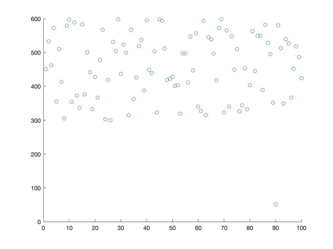
|
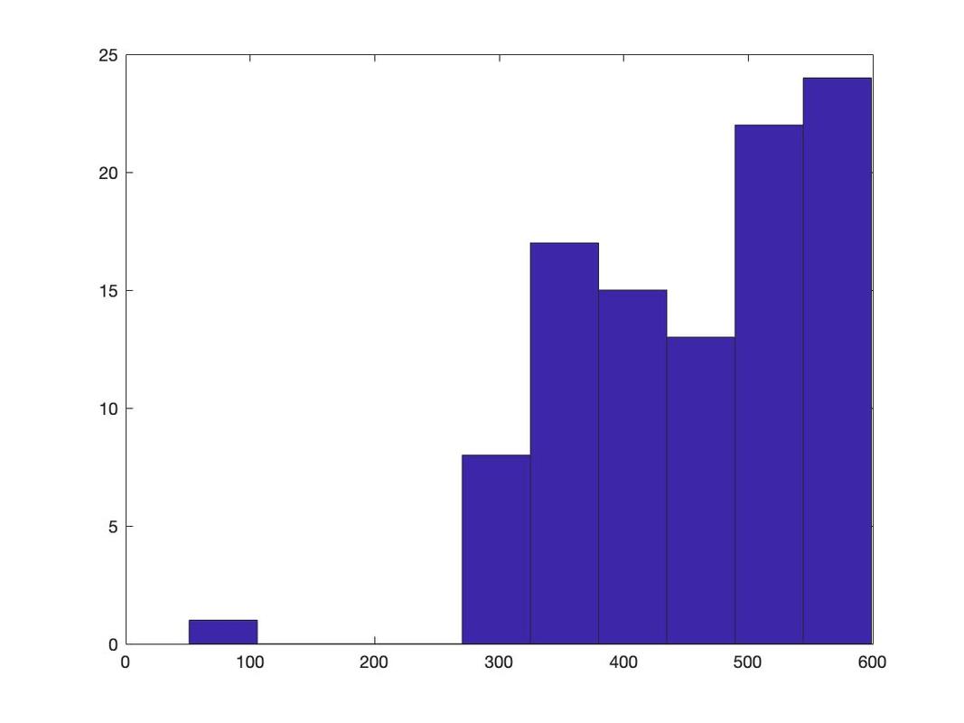
|
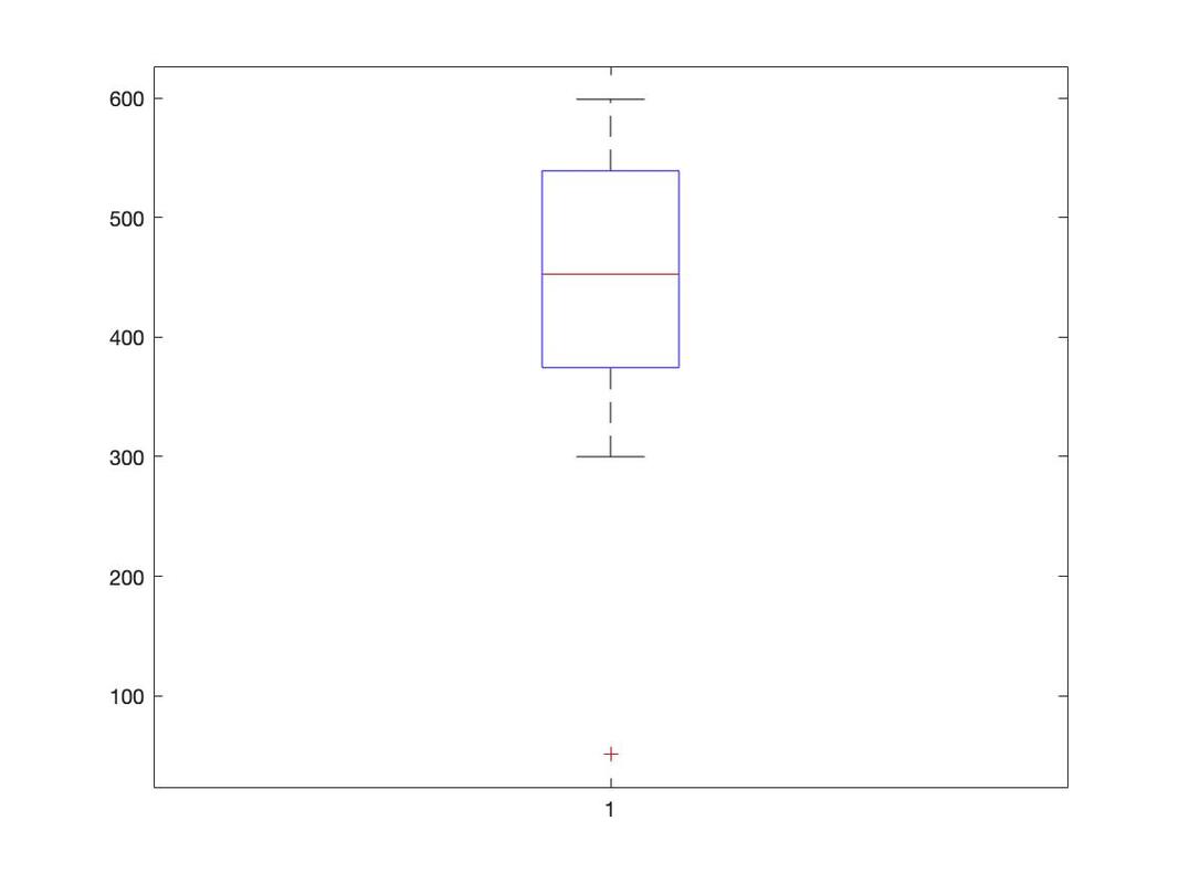
|
Outlier analysis is a complicated business so I am going to offer some rules to follow.
1. Some people believe that outlier analysis is not something you should do. The data is the data as it is. So, if you remove some data from a data set there are some people who will tell you not to do it. If this is your supervisor, you kind of have to listen. If it is a reviewer for a journal article, you probably have to listen.
2. You have to have a decent sample size (n >= 30). If you only have 12 participants you remove 1 or 2, some would call this p-hacking and it would be inappropriate.
3. If you have a very large sample size (n >= 1000) then I think it would be fair to keep all of the data in as it just reflects the tails of the population. The reality is if you have more than 1000 data points removing 1 or 2 will probably not change your statistics very much.
4. You have to be transparent. If you are going to remove some data, you must report it and the logic you used to identify the outliers (see below). Ideally, you would provide a plot of all the data pre and post outlier removal.
How to Identify Outliers
1. Use a box and whisker plot (far right image above). This is considered a very standard way to do it. Note, if you want to get the exact values it would require a bit of programming as in a perfect world you would use the maximum and minimums (3rd quarterile plus 1.5 x the interquartile range, 1st quartile minus 1.5 x the interquartile range) to "cut off values. Note that R will also give you these values.
2. Use the mean plus / minus two or three standard deviations. Any values outside this range are discarded or interpolated.
3. Use a histogram and remove the top and bottom 2.5% or 5% of the data.
4. Use a known standard. For example, it is generally accepted human reaction time cannot be less than 100 ms.
What Do I Do Once I Have Removed Data
1. Just work with the remaining data.
2. Use a regression model to interpolate the missing data (we will cover this when we cover regression).
3. Replace the missing data with the mean. Note this is generally not recommended as it biases the data and reduces variance.
4. Use an interpolation function like na.approx. HERE is an excellent example of how to do this.
Assignment
1. You should have three unique data files that were distributed to the whole class. Check the data for outliers. Pick a criteria above to identify the outlying data (if there is any).
2. Generate three plots - one with the outlying data, one without the outlying data, and one with the data interpolated.
3. Chose a technique (option 3 or 4) to interpolate the data.
4. When you email me your answer, include a BRIEF statement as to what you did to identify and interpolate the outlying data.
Lesson 7. Correlation
Reading: Field, Chapters 6 and 7 (note - do not worry about multiple regression yet)
Watch: Video on Correlation
Watch: Video on Regression
Load the data HERE into a table called data.
Let's plot the data using the following command: plot(data)
You should see something that looks like the plot below.
Watch: Video on Correlation
Watch: Video on Regression
Load the data HERE into a table called data.
Let's plot the data using the following command: plot(data)
You should see something that looks like the plot below.
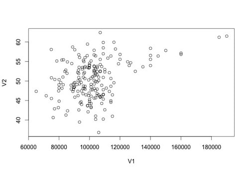
In statistics, sometimes we interested in the relationship between two variables. For example, is there a relationship between income and happiness? Is there a relationship between average hours of sleep per night and grade point average?
To test the extent of a relationship in statistics we use correlation. A Pearson correlation analysis return a number, "r", between -1 and 1 that represents the extent of a relationship. Positive numbers reflect a relationship wherein both the X and Y variables increase concomitantly. Negative numbers reflect a relationship wherein while one number variable increases the other decreases. A Pearson value of 0 suggests there is no relationship. However, the following relationship "strengths" are typically used:
0.1 to 0.3 = Weak correlation
0.3 to 0.5 = Medium correlation
0.5 to 1.0 = Strong correlation
The same ranges are true for negative correlations.
Returning a correlation value in r is very easy. Try: cor(data$V1,data$V2)
You will see that there is a medium strength correlation of 0.3585659 between these two variables.
In addition to interpreting correlations using the above ranges you can also use a formal statistical test against the null hypothesis. You do this by typing: cor.test(data$V1,data$V2)
You should see that the p value in this case is less than 0.001 indicating that the correlation of the sample differs from zero.
Assignment
1. The data HERE contains 6 columns of numbers. Test the correlation between column 1 and the other columns. Report both the relationships as defined above and also the p values for each correlation test.
EXAM QUESTIONS
1. What is bivariate correlation and when is it used?
2. What is covariance?
Lesson 8. The Logic of Null Hypothesis Testing
Lecture Notes
Background Materials
Text: Field, Chapter 2
Video: The Central Limit Theorem
Video: The Sampling Distribution of the Mean
Video: Hypothesis Testing
Video: Central Limit Theorem II
A MUST READ! Haller and Kraus 2002
BEFORE YOU BEGIN WORKING ON THE ASSIGNMENT (IT IS A BIG ONE), READ IT CAREFULLY SO YOU DO NOT HAVE TO STOP AND GO BACK AND REPEAT STEPS!
Assignment 8
1. Download the the R script HERE and put it in your Working Directory and then use this code to demonstrate that the mean of your sample means grows closer to the true mean and that the variance of sample means decreases with increasing sample size. Your assignment must do the following:
a. You must test the following sample size (5, 10, 50, 100, 1000, 10000).
b. Your test must be of 1000 samples of each sample size.
c. You must include all of the relevant plots (or your script must generate them).
Also answer each of the following two questions
d. Explain the relationship between sample size, the means of samples, and the the variance of samples.
e. Explain why this is important experimentally - why is having a bigger sample size better when doing quantitative research?
2. Make a variable called sample.data1 that has 1000 data points, a mean of 500, and a standard deviation of 100.
using sample.data = rnorm(1000,500,100).
a. Plot a histogram of sample.data: hist(sample.data)
b. This data has a "normal" or Gaussian distribution. Why is this? Think of sampling the height of people in Canada. If you pick people at random off the street, you will have the occasional short person and the occasional tall person, but on average, most people will have a height that is close to the average height in Canada. But again, why is this? As it turns out, in nature, most phenomena (but not all) have a distribution that is normal. Indeed, this is a fundamental principle of research statistics and is formally know as the Assumption of Normality (more on this in the next lesson).
c. So, the rnorm makes data that is normally distributed. You can use the runif command to make randomly distributed data: sample.data2 = runif(1000,1,1000). This command makes a sample of 1000 randomly distributed numbers between 1 and 1000. Look at the histogram of sample.data2 and compare it to the histogram of sample.data. You should see quite clearly that the distribution of scores is random and not normal.
d. But what about the sampling distribution of the mean? Let's create one. Try the following code (it is the sample as the code we used above):
sample.data = NA
sample.means = NA
for (counter in 1:1000)
{
sample.data = rnorm(20,300,25)
sample.means[counter] = mean(sample.data)
}
hist(sample.means)
So let's look at what this code does. It creates 1000 samples of size 20 with a mean of 300 and a standard deviation of 25. It then plots the histogram of the sample means. This is a sampling distribution of the mean! It is the distribution of the means of a number of samples. Theoretically, the sampling distribution of the mean shows EVERY VALUE THE MEAN CAN TAKE and THE PROBABILITY OF GETTING A GIVEN MEAN VALUE. If you think of the histogram you have just made, it kind of has both of these properties? What value is at the 50th percentile? One way to think of the sampling distribution of the mean is that it shows the range of values the mean can take (and the likelihood of getting a given value). Experimentally, this is important to know - when we collect a sample of data we hope that the mean of our sample is close to the population mean, but it is important to never forget it could actually be quite far from the true population mean!
e. Reuse the code above from Part 1 to show that the sampling distribution of the mean becomes more normal with increasing sample size - you will have to run it several times but try the following sample sizes (or modify the R script): 5, 10, 15, 20, 30, 50, 100, 1000, 5000, 10000. Make a plot that shows the histograms for each of your these sample sizes (or paste a bunch of plots into Word).
f. What happens to the shape of the histogram with increasing sample size?
g. Repeat Question 1 using randomly distributed data. What changes do you note in the histograms with increasing sample size.
h. From what you have observed here, rewrite the Central Limit Theorem (see videos and class notes) in your own words.
i. What is the Standard Error of the Mean for each of your sampling distributions? (HINT - you can get this from what you have done above, also see the class notes and the videos).
EXAM QUESTIONS
1. What is the difference between a population and a sample?
2. What is a normal distribution? What is skew? What is kurtosis?
3. What is the Central Limit Theorem and why is it important?
4. What is the sampling distribution of the mean?
5. Explain the logic of null hypothesis testing?
Lesson 9. Statistical Assumptions
Reading: Field, Chapter 5
All inferential statistical tests have assumptions. The assumptions are conditions that MUST be bet for the interpretation of a statistical test to be valid. To be clear, if you fair one of the assumptions, the test results (i.e., the p value) might not be correct.
Therefore, before you run a statistical test you MUST test that tests assumptions. We will deal with what you do for a given test when you fail an assumption as we work through the tests.
1. Assumption Number One. The Assumption of Normality
Most people think that the assumption of normality means that you data is normally distributed, but it does not. What it actually means is that the sampling distribution of the mean for your data is normally distributed. Now recall, what we discussed before - the population data is normally distributed, then the sampling distribution of the mean will be normally distributed. So, if you know this "truth" then you actually do not need to test this assumption at all. But... do we actually know this, probably not. But what if the population data is skewed? Well, we also learned that if your sample size is greater than 30 (50 would be better), then the sampling distribution of the mean for the population will be normal even though the population data is not normally distributed.
So, what in practice do you do.
1. Use a sufficient sample size (n > 30, ideally 50: NOTE PER GROUP, NOT TOTAL). This is why in a lot of papers you do not even see a footnote saying that this assumption was tested.
2. Plot a histogram of your data of your data. If the data looks normally distributed, then it most likely is. Assume the assumption is met. If it is not, and your sample size is less than 30... you can hope that point 1 is true.
Download the data files HERE and HERE.
Use the following R code:
data1<-read.table("normaldata.txt")
data2<-read.table("skewdata.txt")
par(mfrow=c(2, 2))
par(mar=c(1,1,1,1))
hist(data1$V1)
hist(data2$V1)
You clearly see from the plot that data1 is normally distributed and data2 is skewed quite badly. So, with data1 you would assume the assumption is met, with data2 - with a sample size of 30 - you would hope it is met. Your plot should look like the image below.
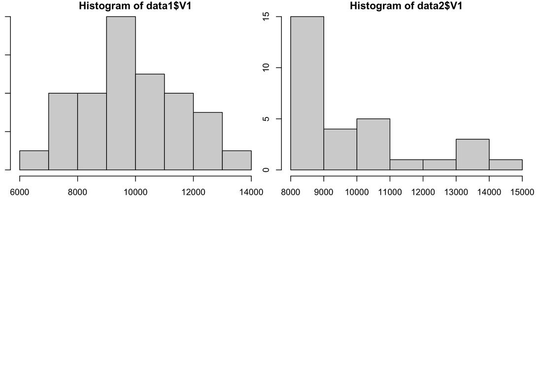
Another graphical test you can do to test normality is a Q-Q plot. Try the following with the data you have loaded.
install.packages("car")
library(car)
par(mfrow=c(2, 2))
par(mar=c(1,1,1,1))
qqPlot(data1$V1)
qqPlot(data2$V1)
Interpreting a Q-Q plot is pretty straightforward. Ideally, if your data is all in a straight line, it is normally distributed. If it has a weird shape and is curved, and especially if it falls outside the confidence window, then your data is not normally distributed. You should see clearly in the Q-Q plot that data1 is normal and that data2 is not.
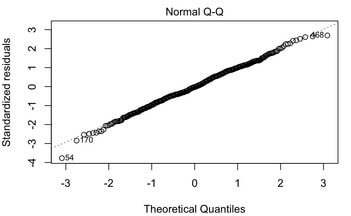
3. You can also statistically test your data for normality. One way to assess normality is to use a Shapiro Wilk test (see HERE). The Shapiro Wilk test assesses the normality of a data set and provides a p value - a test statistic that we will talk a lot more about later - that the states whether or not the data is normally distributed. If the p value of the test is less than 0.05 then the data is not normally distributed. If the p value of the test is greater than 0.05 then the data is normally distributed. Try a Shapiro Wilk test on your data by doing this: shapiro.test(data1$V1).
You should see the p-value is 0.9163 which means according to the Shapiro Wilk test data1 is normally distributed. Now try it for data2 shapiro.test(data2$V1). You should see that the p-value is significant (p-value = 8.788e-05) meaning that data is not normally distributed.
Another way to test normality is via a Kolmogorov-Smirnov test. The KS test compares your data against a distribution of your choice (e.g., normal). With this test, you must specify the mean and the standard deviation of the distribution so you need to use the values from your data to approximate those.
Try this with data1: ks.test(data1$V1,pnorm,mean(data1$V1),sd(data1$V1))
You should see that the test is not significant so again, data1 is normal according to the KS test. Note "pnorm" just means you are comparing to a normal distribution. The KS test can actually be used to test against any distribution, not just the normal one.
Now try it with data2: ks.test(data2$V1,pnorm,mean(data2$V1),sd(data2$V1))
You will see that this test is also not significant. But why? The KS test is better for large samples of data (n > 100) and it does not handle heavily skewed data very well. This is because the mean and the standard deviation you are using are biased by the skew.
But try this: ks.test(data2$V1,pnorm,median(data2$V1),sd(data2$V1))
You should see that the p value is now significant (p-value = 0.003172). The median is a better approximation of the centre of the distribution given the skew.
SOME FINAL NOTES. If you have multiple groups, do not forget you have to test the assumption for each group. Most statistical test are robust against violations of the assumption of normality. In other words, the tests will probably work if this test is failed.
For additional info on the assumption of normality:
WATCH THIS
READ THIS
2. Assumption Number Two. Homogeneity of Variance
The assumption of Homogeneity of Variance is simple, if you have two or more groups in your statistical test, the variances of the groups must be roughly the same.
For example, as a researcher you have want to compare the number of calories eaten on average per day between people from Victoria and people from Vancouver. The sample data is HERE.
Load the data in R in a new variable called caloriedata (caloriedata = read.table('caloriedata.txt')). Note that the data has three columns, the first coding the subject number, the second coding the group (1 = Victoria, 2 = Vancouver), and the third average caloric intake. Let's give the columns in the table names:
names(caloriedata) = c('subject','group','calories')
The column for group is a factor, or independent variable. In R, you need to define factors as factors. Let's do this:
caloriedata$group = factor(caloriedata$group)
Also look at the subject column. You will note that the subject numbers range from 1 to 100. No subject number occurs twice and the subject numbers in groups 1 and 2 are different thus making this clearly an independent design.
As you know a statistical test is not valid unless the assumptions are met. As you have two independent groups, the assumption of homogeneity of variance needs to be tested. The easiest way to do this is to examine the variance ratio using Hartley's rule of thumb.
vars = aggregate(caloriedata$calories,list(caloriedata$group),var)
vars
Essentially, you are looking to ensure that the variance of one group is no more than four times the variance of the other group (or vice versa). In this case, you can clearly see the assumption is met.
You can also test the assumption of homogeneity of variance graphically. But, the type of plot you need is complex and typically you have to plot all the subject data and confidence intervals as well. Finally, as plots can be misleading, there are better ways to test the assumption.
A more formal way to test the homogeneity of variance is to use Levene's Test.
install.packages("car")
library(car)
leveneTest(caloriedata$calories~caloriedata$group)
The test is not significant (p = 0.1363) thus the assumption of homogeneity of variance is met. Alternatively, you could use the Bartlett Test.
bartlett.test(caloriedata$calories~caloriedata$group)
Again, the test is not significant thus the assumption of homogeneity of variance is met. Although you have to install the car package to use the Levene Test, it is generally considered to be more reliable than the Barlett test, especially for smaller sample sizes.
For more information on this assumption, watch THIS.
3. Assumption Number Three. Interval Data
Quite simply, most statistical tests (we will discuss some where this is not true) expect interval, ratio, or continuous data. They would not work with nominal or ordinal variables. There is no test for this, you just need to know this one. Review what all these types of variables mean! More information HERE.
4. The Assumption of Independence
A fair number of statistical tests assume independent (but not all). Basically, all between designs assume independence - the data in group 1 has to be independent of the data in group 2. This is usually true as different people are in each group. In within designs, we expect the data for a given participant to be dependent, but we expect the data between participants to be independent. As with the previous assumption, there is no way to test this and you have to know whether this is true or not. Read Field (Chapter 1 and 5) for more information.
Assignment 9
1. Load the following DATA. It reflects the data for three groups of participants.
2. Test the assumption of normality graphically and by using a statistical test. Is the assumption met? Why?
3. Test the assumption of homogeneity of variance by the rule of thumb and a statistical test. Is the assumption met? Why?
4. Do you think the assumption of interval is met? Why?
5. Do you think the assumption of independence is met? Why?
Exam Questions
1. What is the assumption of normality?
2. What is the assumption of homogeneity of variance?
3. What is the assumption of interval data?
4. What is the assumption of independence?
Lesson X. Z-Scores
Lesson 10. T-Tests
Text: Field, Chapter 9
Video: Single Sample T-Tests
Video: Dependent Sample T-Tests
Video: Independent Sample T-Tests
TTests are inferential statistical tests that allow you to draw conclusions about data. There are three types of ttests and they are used in very specific situations.
A single sample ttest is used when one wants to compare a sample mean to a known population mean.
Note, the logic of null hypothesis testing is not covered in this assignment. At this point, you should know that a test statistic will be calculated which will result in a p value. In simple terms, for this test if p is less than 0.05 (the most conventional alpha level that is used) then you would believe that your sample mean is different from the known population mean. Conversely, if p is greater than 0.05 then you would conclude that the sample mean and the population mean do not differ. Direction of the effect, if significant, is determined by examining the actual values of the sample mean and the population mean, i.e., is the sample mean smaller or greater than the population mean.
For example, you believe that males in Victoria, B.C. eat less calories on average than the the national average. The national average is a known population mean - it is a value you can ascertain from prior research, i.e., Stats Canada. You do some research and find out from Stats Canada that the average active male aged 19-30 eats approximately 3000 calories per day - your known population mean. So, you go out and determine the average number of calories eaten by a group of 50 19-30 year old active males in Victoria. That data is HERE. You want to conduct a single sample ttest to estimate p for this comparison.
1. Load the data into a table called calorieData. Note, I am not going to bother to rename the one column of data, so the data is simply in calorie.data$V1
2. Running a single sample ttest is simple:
analysis = t.test(calorieData$V3, mu = 2900)
This command tells R to conduct a single sample ttest of calorie.data$V1 against a known population mean of 2900. By specifying mu, R will automatically know to treat this as a single sample ttest.
3. To see the results of the ttest, simply type:
print(analysis)
You should see that the results of this single sample ttest are significant using a conventional alpha of 0.05 as p = 0.007017, which is less that p = 0.05.
Make sure you understand what degrees of freedom are. For a single sample ttest the degrees of freedom are: df = n -1.
Single sample t-tests are used to compare a sample mean to a known population mean.
Paired (or dependent) sample t-tests are used when you want to compare two dependent, or related samples. For instance, if you measure fitness test scores for a single group of participants at two different points in time. Another dependent example would be having a single group of participants perform an experimental task in two different conditions. Another way to think of it would be that in paired, or dependent tests, all participants take part in all conditions - whether it is the same test separated by time or two conditions.
For example, as a researcher you have a new diet you want to put people on to see if it results in a loss in the amount of calories consumed on a daily basis. You measure the average daily calories consumed at the start and end of the diet. The data is HERE.
Load the data in R in a new variable called calorieData2. Note that the data has three columns, the first coding the subject number, the second coding the time point (1 = pretest, 2 = posttest), and the third the caloric intake measured at the time point. Let's give the columns in the table names:
names(calorieData2) = c('subject','time','calories')
The column for time is a factor, or independent variable. In R, you need to define factors as factors. Let's do this:
calorieData2$time = factor(calorieData2$time)
Note, this was not necessary in Lesson 5A as there was only one set of data for one group.
Also look at the subject column. You will note that the subject numbers 1 to 50 are repeated - that is a clear indicator this is a paired or dependent design.
Now, lets run a paired samples ttest to compare the average amount of calories consumed at the two time points.
analysis = t.test(calorieData2$calories ~ calorieData2$time, paired = TRUE)
Note the notation here, the code would translate to "Let's run a ttest where we examine caloriedata$calories as a function of calorieData2$time - by the way, its a paired/dependent samples ttest.
To see the results of the ttest, simple type:
print(analysis)
You should find that the result of the ttest is p = 0.02704.
Make sure you understand what degrees of freedom are. For a dependent samples ttest the degrees of freedom are: df = n -1.
Review. If you want to see the means of the data (or other descriptives) for the actual conditions - not the difference scores which are in the analysis results, you could do something like:
mean(calorieData2$calories[calorieData2$time == 1])
Independent sample t-tests are used when you want to compare two independent groups. For instance, if you want to compare fitness test scores between people from Victoria and people from Vancouver. In an independent test, if you are in one group you cannot by definition be in the other group. In the aforementioned example if you are from Victoria you cannot be from Vancouver and vice versa.
For example, as a researcher you have want to compare the number of calories eaten on average per day between people from Victoria and people from Vancouver. The sample data is HERE.
Load the data in R in a new variable called calorieData3. Note that the data has three columns, the first coding the subject number, the second coding the group (1 = Victoria, 2 = Vancouver), and the third average caloric intake. Let's give the columns in the table names:
names(calorieData3) = c('subject','group','calories')
The column for group is a factor, or independent variable. In R, you need to define factors as factors. Let's do this:
calorieData3$group = factor(calorieData3$group)
Also look at the subject column. You will note that the subject numbers range from 1 to 100. No subject number occurs twice and the subject numbers in groups 1 and 2 are different thus making this clearly an independent design.
Now, lets run an independent samples ttest to compare the average amount of calories consumed between the two groups.
analysis = t.test(calorieData3$calories ~ calorieData3$group)
Note that here there is nothing after the design - the default ttest in R is an independent ttest thus specifying mu (single sample) or stating Paired = True (dependent samples) is not necessary.
To see the results of the ttest, simple type:
print(analysis)
You should find that the result of the ttest is p = 0.08754.
Make sure you understand what degrees of freedom are. For an independent samples ttest the degrees of freedom are: df = n1 - 1 + n2 - 1.
The correct way to report a ttest is: "The results of our analysis revealed that there was no difference in calories consumed between people from Victoria and people from Vancouver, t(94.5) = 1.73, p > 0.05." In this sentence the 94.5 reflects the appropriate degrees of freedom, the 1.73 is the actual t statistic, and the p value is stated to be above 0.05. Note, some journals ask for exact p values so you would state p = 0.08754.
You will note the degrees of freedom here are not what you might thing. Modern statistical packages correct for violations of assumptions. In this case, the assumption of homogeneity of variance was not violated but homogeneity of variance was not exact. So, R made a minor correction for this and thus the degrees of freedom are not exact (theoretically df = n1 + n2 - 2 = 98).
BUSTED!
Did you test statistical assumptions?
For a single sample t-test the only assumption you are concerned about is normality. This is also true for a dependent sample t-test because while there are two time points/conditions - the actual test is on the difference scores. But, for the an independent sample t-test you have to test the assumption of homogeneity of variance! Now, as just note, the test will correct for violations by modifying the degrees of freedom but you still need to test for this.
DOING IT IN JASP
For a single sample t-test, load the data HERE which has JASP column headers into JASP using "Open". Select T-Tests --> One Sample. Note, you will have to specify the population mean. But to make your life easier you can simply check a box to test for normality.
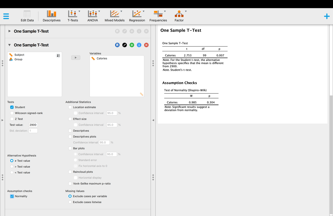
Okay, let's try the paired samples t-test with the JASP formatted data HERE. One of the things I personally hate about JASP (and SPSS) is that for dependent samples tests JASP expect WIDE format data. Time is not coded in a column like it was in R, but you need separate columns for each time point. Of course, you can test the assumption of normality and do a whole lot of other cool things.
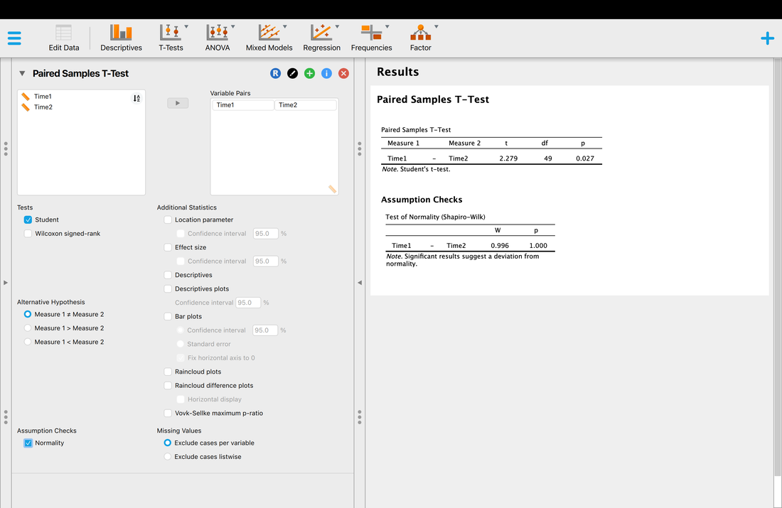
And, of course, we can do an independent samples t-test. Load the JASP formatted data HERE. Note, it is the same as the data for the R version, just with column headers. Note, it will do your assumption checks (normality by group) and test for the assumption of homogeneity of variance.
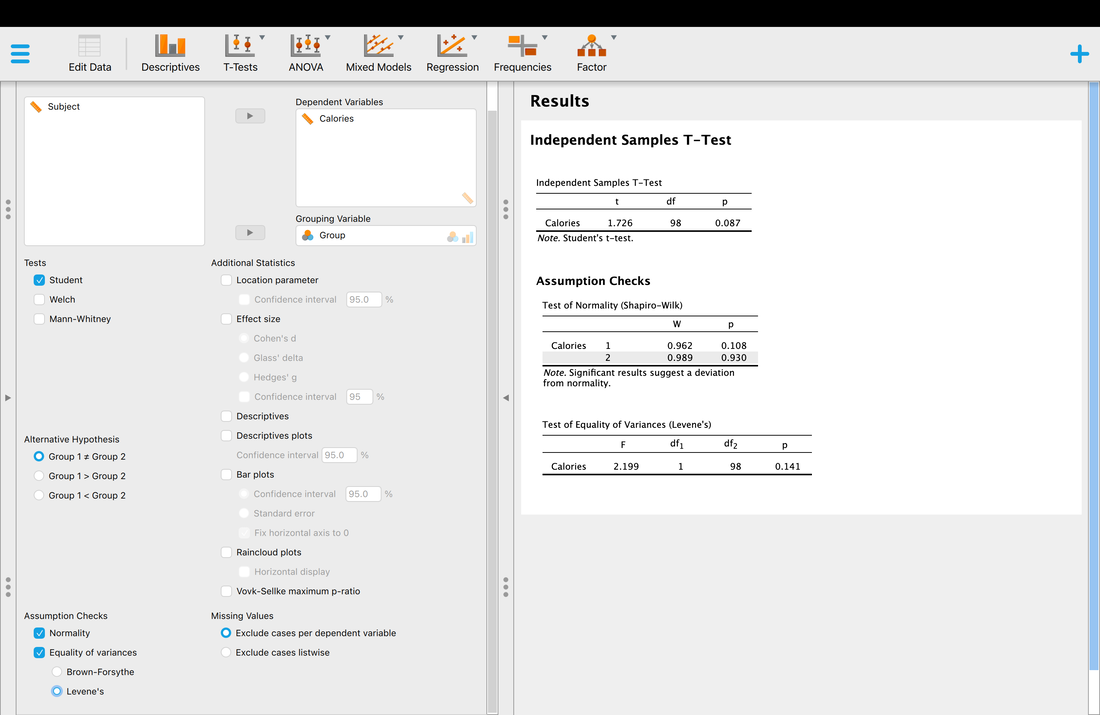
Assignment Questions
1. Conduct a single sample ttest on the data HERE. Does the sample data differ from a population mean of 2900 (report the t statistic and the p value)? What is the sample mean and standard deviation? What is the 95% confidence interval of the sample data? Generated a bar plot of the sample data with a 95% confidence interval as the error bar.
2. Conduct a paired samples ttest on the data HERE. Do the two time points differ (report the t statistic and the p value)? What are the means and standard deviations of the two time points AND the difference scores of the data points? What are the 95% confidence intervals of the two time points AND the difference scores? Generated a bar plot of the the two time points and the difference scores with the 95% confidence intervals as the error bars.
3. Conduct an independent samples ttest on the data HERE. Do the two groups differ (report the t statistic and the p value)? What are the means and standard deviations of the two groups? What are the 95% confidence intervals of the two groups? Generated a bar plot of the the two time points with the 95% confidence intervals as the error bars.
Challenge Question
4. For Question 3, create a plot of the difference of the two group means with the appropriate 95% confidence interval. You can find some information on how to do this HERE.
EXAM QUESTIONS
1. What is a z-score?
2. Explain how and when each of the three t-tests is used.
EXTRA: Why Sample Size Matters When Comparing Two Means.
Lesson 11. ANOVA
Text: Field, Chapter 10
Lecture Slides
Video: ANOVA Assumptions
Video: ANOVA
With t-tests you learned how to test to see whether or not two groups differed - an independent samples t-test. But what do you do if you have more than two groups?
The first case we will examine is when you have three or more independent groups and you want to see whether or not there are differences between them - the test that accomplishes this is an Analysis of Variance - a between subjects test to determine if there is a difference between three or more groups.
Analysis of Variance (ANOVA) is a complex business, at this point you need to find a textbook and read the chapter(s) on ANOVA. For a quick summary you can go HERE, but that is not really going to be enough.
Load this DATA into a new table called "data" in R Studio. You will note the first column indicates subject numbers from 1 to 150, the second column groups codes for 3 groups, and the third column actual data. Rename the columns "subject", "group", and "rt".
Lets define group as a factor. Remember how to do that?
data$group = factor(data$group)
Before we actually run an ANOVA we need to test the assumptions of this test. What are assumptions? In short, each statistical test can only be run if the data meet certain criteria. For ANOVA, there are four assumptions that you need to meet.
Now, we did this two classes ago so you can skip this if you want. But you might want to know this for the final exam.
Assumption One: Between Group Independence. The groups are independent. Essentially, your groups cannot be related - for instance - if you are interested in studying age this is easy - a "young" group is naturally independent of groups that are "middle aged" and "elderly". This may not be as true in all instances and you need to be sure. Note, there is no statistical test for this, you need to use logic and common sense. For example, the means and variances of a group may be identical but they can be truly independent. Consider this - you are interested in how many calories a day people eat. You create a group in Berlin, Germany and Auckland, New Zealand and find they eat the same number of calories per day as reflected by the means and the variances. These groups are most likely independent but they share common statistical properties.
Assumption Two: Within Group Sampling and Independence. The members of each groups are sampled randomly and are independent of each other. This relates to research methods and is beyond the scope of this tutorial, but typically we do the best we can here.
Assumption Three: Normality. The data for each group are drawn from a normally distributed population. Actually, this is not 100%. The actual assumption is that the sampling distribution of the mean of the population from which the data is drawn is normally distributed. There is a lot of theory here, but in short, this is actually almost always true and most people have a misperception of this assumption. Most people think that the assumption means that the data itself is normally distributed which is not true at all. The confusion stems from the fact that most textbooks state something like this "If the data is normally distributed then the assumption is met". That is a true statement, if your data is normally distributed then it is extremely likely that the sampling distribution of the mean of the population the data is from is normally distributed. However, if the data is not normally distributed then it is still quite possible that the sampling distribution of the mean of the population data is normally distributed. You should discuss this one with your statistics professor if you are still confused!
In spite of this, most people like to test whether the data is normally distributed or not. Here are three ways to do this:
a. Plot Histograms for each group and assess this through visual inspection. For the above data:
par(mfcol=c(1, 3))
hist(data$rt[data$group==1])
hist(data$rt[data$group==2])
hist(data$rt[data$group==3])
b. Examine the skew and kurtosis of the data for each group. You can read more about Skewness and Kurtosis HERE and HERE, but essentially Skewness assesses how much to the left or right the distribution is pulled (0 is perfectly normal) and kurtosis assesses how flat or peaked the distribution is (3 is perfectly normal).
To test the skewness and kurtosis for the first group you would use the following commands:
install.packages("moments")
library("moments")
skewness(data$rt[data$group==1])
kurtosis(data$rt[data$group==1])
skewness(data$rt[data$group==2])
kurtosis(data$rt[data$group==2])
skewness(data$rt[data$group==3])
kurtosis(data$rt[data$group==3])
c. Use QQ plots to assess normality. On a QQ plot the data is normal if it all falls on a line. Try the following code:
qqnorm(data$rt[data$group==1])
qqline(data$rt[data$group==1])
qqnorm(data$rt[data$group==2])
qqline(data$rt[data$group==2])
qqnorm(data$rt[data$group==3])
qqline(data$rt[data$group==3])
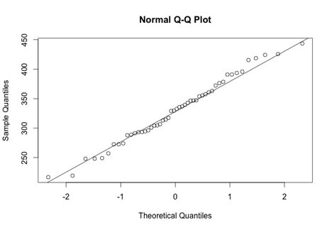
d. Use a formal statistical test that assesses normality like the Shapiro - Wilk Test.
shapiro.test(data$rt[data$group==1])
shapiro.test(data$rt[data$group==2])
shapiro.test(data$rt[data$group==3])
If the p value of this test is not significant, i.e., p > 0.05, then it suggests that the data is normally distributed.
Assumption Four: Homogeneity of Variance. ANOVA assumes that the variances of all groups are equivalent. There are three ways to test this.
a. Plot Histograms (ensure the number of bins and axes are the same) and visually ensure that the variances are roughly equivalent. See above.
b. Compute the variances for each group:
var(data$rt[data$group==1])
var(data$rt[data$group==2])
var(data$rt[data$group==3])
A general rule of thumb is that if the smallest variance is within 4 magnitudes of the largest variance then the assumption is met. In other words varmax < 4 x varmin.
c. Use a statistical test of the assumption. The Bartlett Test tests the assumption directly and returns a p value. If the p value is significant, p < 0.05, then the assumption is not met. Dealing with a violation of the assumption is beyond this assignment, but you do need to be aware if any of the assumptions are violated.
bartlett.test(data$rt~data$group)
Alternatively, you could use an alternative test such as Levene's Test.
leveneTest(data$rt~data$group)
Okay, those are the assumptions tested and covered. Let's do the ANOVA.
In earlier lessons you learned how to test to see whether or not two groups differed - an independent samples t-test. But what do you do if you have more than two groups?
The first case we will examine is when you have three or more independent groups and you want to see whether or not there are differences between them - the test that accomplishes this is an Analysis of Variance - a between subjects test to determine if there is a difference between three or more groups.
Analysis of Variance (ANOVA) is a complex business, at this point you need to find a textbook and read the chapter(s) on ANOVA. For a quick summary you can go HERE, but that is not really going to be enough.
Load this DATA into a new table called "data" in R Studio. You will note the first column indicates subject numbers from 1 to 150, the second column groups codes for 3 groups, and the third column actual data. Rename the columns "subject", "group", and "rt".
Lets define group as a factor. Remember how to do that?
data$group = factor(data$group)
Of course you can use graphics to get a feel for what is happening. Let's try a boxplot:
boxplot(data$rt~data$group)
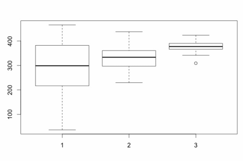
However, the point of an ANOVA is to statistically assess whether or not there are differences between the three groups. As it turns out, this is very easy to do:
analysis = aov(data$rt~data$group)
This command tells R to run an analysis of variance (aov) on data$rt with data$group as a factor. To see the actual results of the ANOVA, you need to type: summary(analysis). What you will see is the ANOVA summary table.
analysis = aov(data$rt~data$group)
This command tells R to run an analysis of variance (aov) on data$rt with data$group as a factor. To see the actual results of the ANOVA, you need to type: summary(analysis). What you will see is the ANOVA summary table.
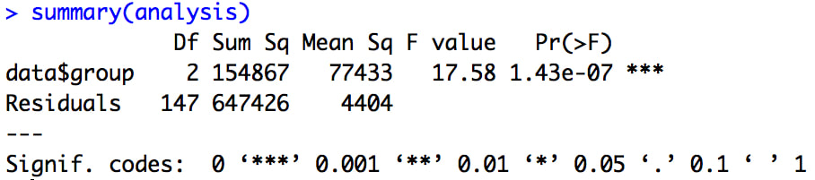
The summary table gives you a lot of key information. Perhaps the most important are the F statistic and the p-value - in this case the p value is below 0.05 so the ANOVA suggests that there are differences between the groups.
Note, typically you would report this ANOVA as follows. Our analysis revealed that there was a difference between groups, F(2,147) = 17.58, p < 0.001.
There is something important to note here - an ANOVA simply tells you whether or not there is a difference between groups, it does not tell you where the difference is. See below and Lesson 7C.
The box plot above suggested this, another way to show this would be to plot the means with error bars. To do this, we need to add the library "gplots". See Lesson 1A but you can do the following:
install.packages("gplots")
library("gplots")
If you recall, this will install the gplots library and then the library command will load it. Now, to plot the group means with 95% confidence intervals as the error bars you can simply use:
plotmeans(data$rt~data$group)
For more understanding...
The short version is that ANOVA is a special case of multiple regression - it is just a form of a linear model.
Try the following:
model1 = aov(data$rt~data$group)
summary(model1)
Look at the F statistic and p-value.
model2 = lm(data$rt~data$group)
summary(model2)
Look at the t statistics and p-value (recall F = t^2!!!). They are the same but the data is represented in a regression format because it was defined as a linear model and not a special case. To recover the ANOVA table.
anova(model2)
Okay, now that we did all that let's try it in JASP with the data formatted for JASP HERE.
One click of a button, right?
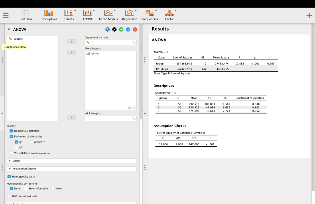
Assignment Question
The data HERE reflects data from 4 groups of people, with each group reflecting data from a different city. PROBLEM. You will need to format the data for JASP or use R. Run the ANOVA. What is the story here? What cities are the same and what cities differ? Ensure you report the results of your ANOVA and support your claims. Ensure that you make a statement and test all of the assumptions of ANOVA.
EXAM QUESTIONS
1. What is ANOVA?
2. What are the assumptions of ANOVA?
Lesson 12. Post Hoc Tests
Video: Posthoc Analysis
Video: Multiple Comparisons
Note, we are moving firmly into JASP now to make life easier. This is all doable in R, and I can provide code if needed / desired. See the bottom of the page.
So, in the last lesson we had a significant ANOVA. What does this really mean? All a significant ANOVA tells you is that there is a difference somewhere between the groups. It does not tell you where that difference is.
So, with the DATA (JASP) we used last class, is group 1 different from group 2, is group 2 different from group 3, is group 1 different from group 3? The ANOVA does not tell us this. It just says that the groups differ. But to interpret this, we need to figure out what groups differ.
Now, you could use plots. We could just visually look. Note, both these plots were made in JASP. Run the ANOVA like you did last lesson, but scroll down and tick Descriptives Plots - select Group as the horizontal axis, and select error bars. For the second plot, scroll down a bit further and select Raincloud plots.
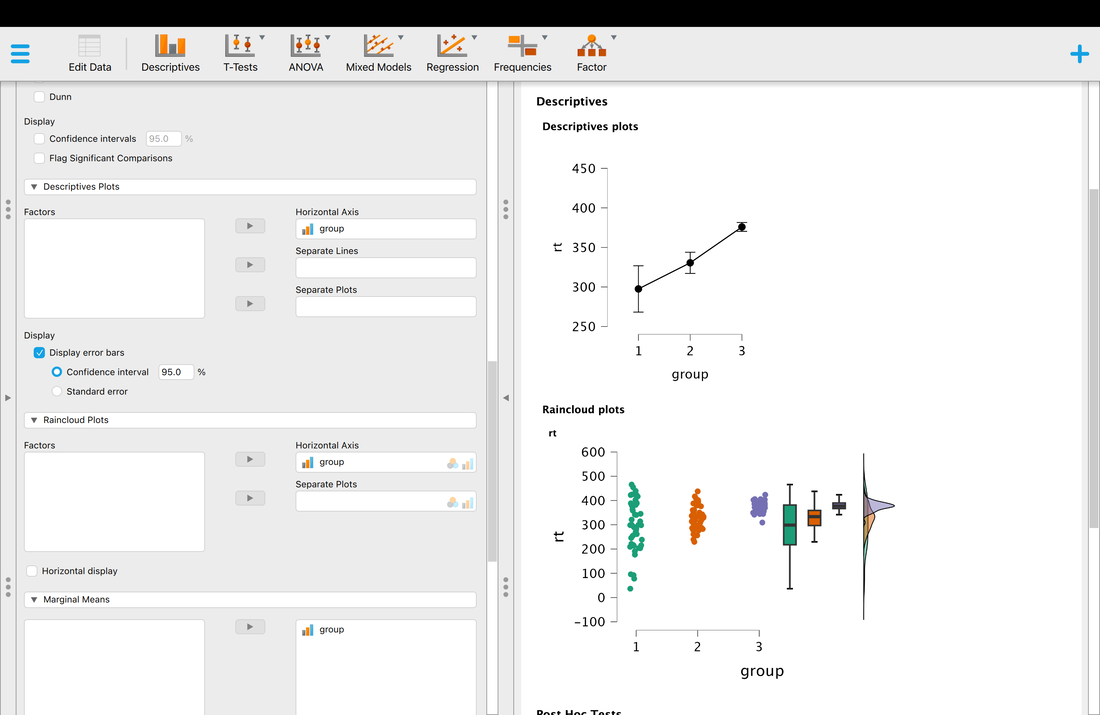
Now, we could attempt to use the plots to infer the differences. And with 95% confidence interval error bars, this is not a bad idea. But, we need to do better. So, we could look at descriptive statistics, and use the standard deviation, the standard error of the mean, or 95% confidence intervals to infer differences. But again, this does not really test if there is a difference. It just gives you a bit of insight.
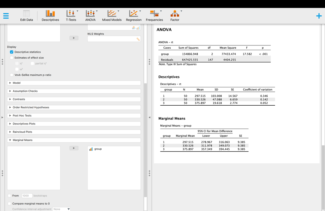
So what to do? You have two options. One is a "posthoc test", the other is a contrast. Today we will just consider posthoc tests.
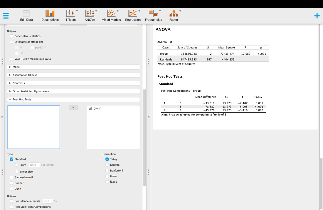
A posthoc test is an inferential statistical test that is designed to tell you where the differences in the ANOVA lie. If you look at the above output, it is telling you that groups 1 and 2 differ (p < 0.05), that groups 1 and 3 differ, p < 0.05, and that groups 2 and 3 differ, again p < 0.05.
So, now we know where the differences lie.
But why a "Tukey test" and why "Correction".
Okay, the Tukey Test is the most common, but the other tests Scheffe, Bonferroni, etc are just other posthoc tests. Some are more conservative than others - try them all and look at the p-values. Some are more liberal. The Tukey test is the most common but a supervisor or a journal reviewer may have a different opinion. The key is you pick one, you cite something that justifies it, but you never report the values from multiple tests.
But why a "Correction". In principle, you might ask why not just use independent sample t-tests to see where the differences are. The tests would work. Try it out. But note the p-values!
This goes back to Type One errors - we discussed this a few lectures back. Every time you do a statistical test - if alpha = 0.05 - there is a 5% chance of an incorrect result. You conclude there is a difference when there is not. So... posthoc tests "tweak" the p-value to make it more conservative to correct for the possibility of a Type One error. This VIDEO is a good review is you are unclear.
The point is, you do not want to do a ton of comparisons without a correct.
Now, in this case, with only three groups you could probably get away with using independent samples t-tests. This is actually called simple effects analysis. But, if you had a scenario with more groups, this is a bad idea. Hence posthoc analysis, Tukey tests, and corrections. I would note another one is the Bonferonni correction. Essentially, all Bonferonni does is divide you alpha (= 0.05) by the number of comparisons you make.
Doing this in R (Optional)
Load this DATA into a new table called "mydata" in R Studio. You will note the first column indicates subject numbers from 1 to 150, the second column groups codes for 3 groups, and the third column actual data. Rename the columns "subject", "group", and "rt".
Lets define group as a factor. Remember how to do that?
mydata$group = factor(mydata$group)
Of course you can use graphics to get a feel for what is happening. Let's try a boxplot:
boxplot(mydata$rt~mydata$group)
If you recall, there is a significant effect present meaning there is a difference between the groups - but, we do not know where the difference is.
The point of an ANOVA is to statistically assess whether or not there are differences between the three groups. As it turns out, this is very easy to do:
analysis = aov(data$rt~data$group)
This command tells R to run an analysis of variance (aov) on data$rt with data$group as a factor. To see the actual results of the ANOVA, you need to type: summary(analysis). What you will see is the ANOVA summary table.
But where are the differences?
Post Hoc Analysis of ANOVA in R
If you wish to statistically test whether or not there are differences between specific groups you could run a series of independent samples t-tests - Group 1 versus Group 2, Group 1 versus Group 3, and Group 2 versus Group 3. There are reasons not to do this - see Field Chapter 10 and previous comments. For now, we will simply use a command that runs a series of comparisons for us:
TukeyHSD(analysis)
This command will provide output that shows the results of specific tests between each group. As you will see, all of the groups are different from each other. Note, R offers many different types of post-hoc tests. You could do pairwise t-tests with a Bonferonni correction by using:
pairwise.t.test(data$rt,data$group,p.adjust="bonf")
Note, other adjustments are possible, for instance if you switch "bonf" to "holm" you get the Holm Adjustment.
Assignment 12
The data HERE reflects data from 4 groups of people, with each group reflecting data from a different city. PROBLEM. You will need to format the data for JASP. Run the appropriate posthoc tests and state where the group differences lie.
EXAM QUESTIONS
1. What are posthoc tests and why do we use them?
2. Why would it be wrong to do multiple comparisons with t-tests.
Lesson 13. Contrasts
Contrasts are another way to see what effects lie in an ANOVA. Recall that an ANOVA is an omnibus test - an ANOVA simply tells you that there is a difference somewhere between the groups but not where it is.
In the last lesson, we used Posthoc comparisons to explore where these differences are. There is another way to do this, which is to use contrasts.
We will use the same data as the last few class - DATA (JASP).
Now, the logic behind contrasts is quite complicated and I will not review it here. You would need to read Chapter 10 in Field in entirety and also watch this VIDEO.
.The short version is, with contrasts you are re-partitioning the variance of the Sums of Squared Errors for the Between factor (i.e., group - more on this as the bottom of this section). The basic idea is shown in the image below.
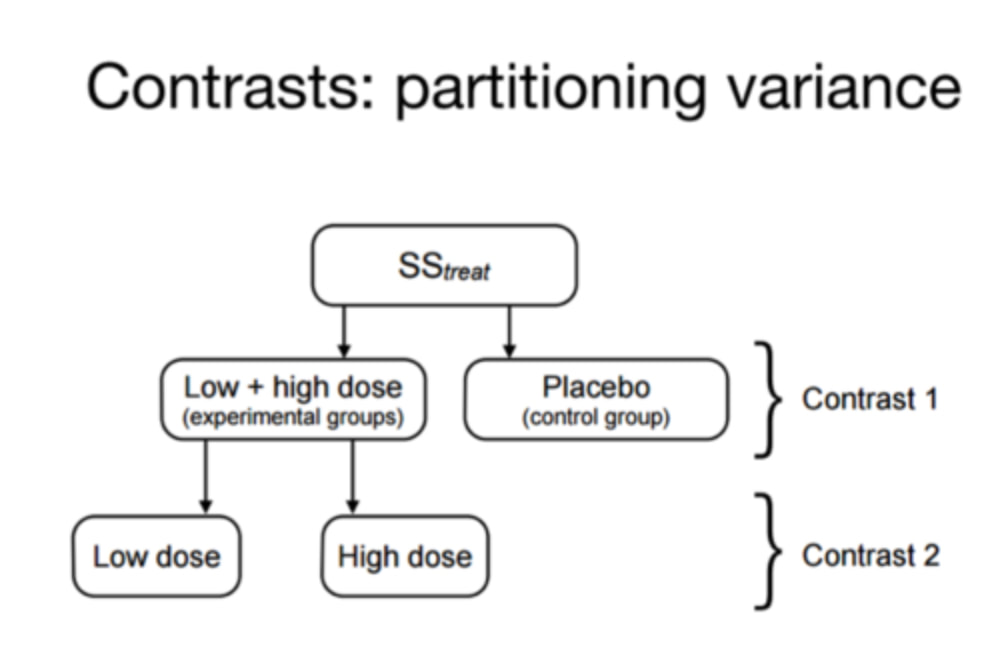
In practice, using contrasts is quite simple. I will walk you through each contrast and provide a brief summary of what it means. You essentially pick contrasts depending on the story you want to tell.
One key note, with some contrasts the order of the groups is really important and they should be ordered logically.
Load the data and run the ANOVA. If you scroll down the options, you will see "Contrasts".
Select the "simple contrast"
One key note, with some contrasts the order of the groups is really important and they should be ordered logically.
Load the data and run the ANOVA. If you scroll down the options, you will see "Contrasts".
Select the "simple contrast"
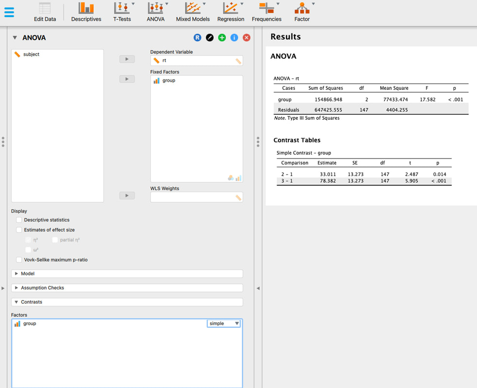
A simple contrast looks at the difference between group 1 and 2, and the difference between group 1 and 3. This is an especially useful contrast if you are comparing groups to a control group.
Now, let's look at the Helmert Contrast. In a Helmert contrast, you work your way through the groups as follows. The first group, it compared to the average of the other groups. Then, you compared the second group, to the average of the other groups. So, with three groups we compare 1 to the average of 2 and 3, then we compare 2 to 3.
Now, let's look at the Helmert Contrast. In a Helmert contrast, you work your way through the groups as follows. The first group, it compared to the average of the other groups. Then, you compared the second group, to the average of the other groups. So, with three groups we compare 1 to the average of 2 and 3, then we compare 2 to 3.
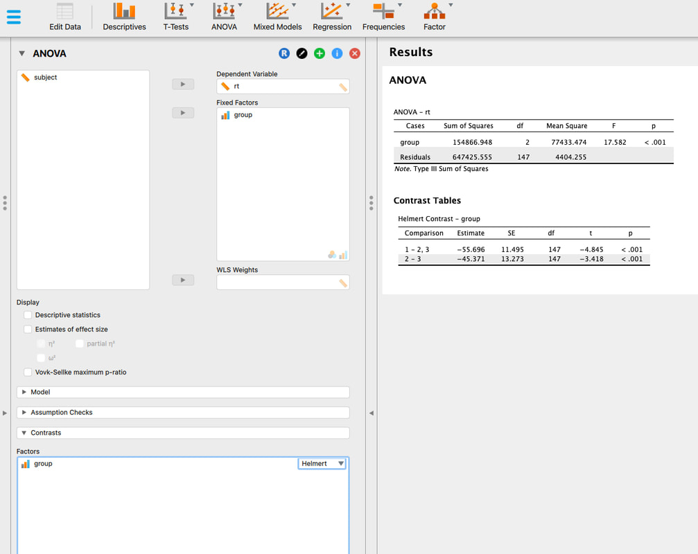
Now, lets look at the repeated contrast. The repeated contrast compares group 1 to 2, and then group 2 to 3, and so on.
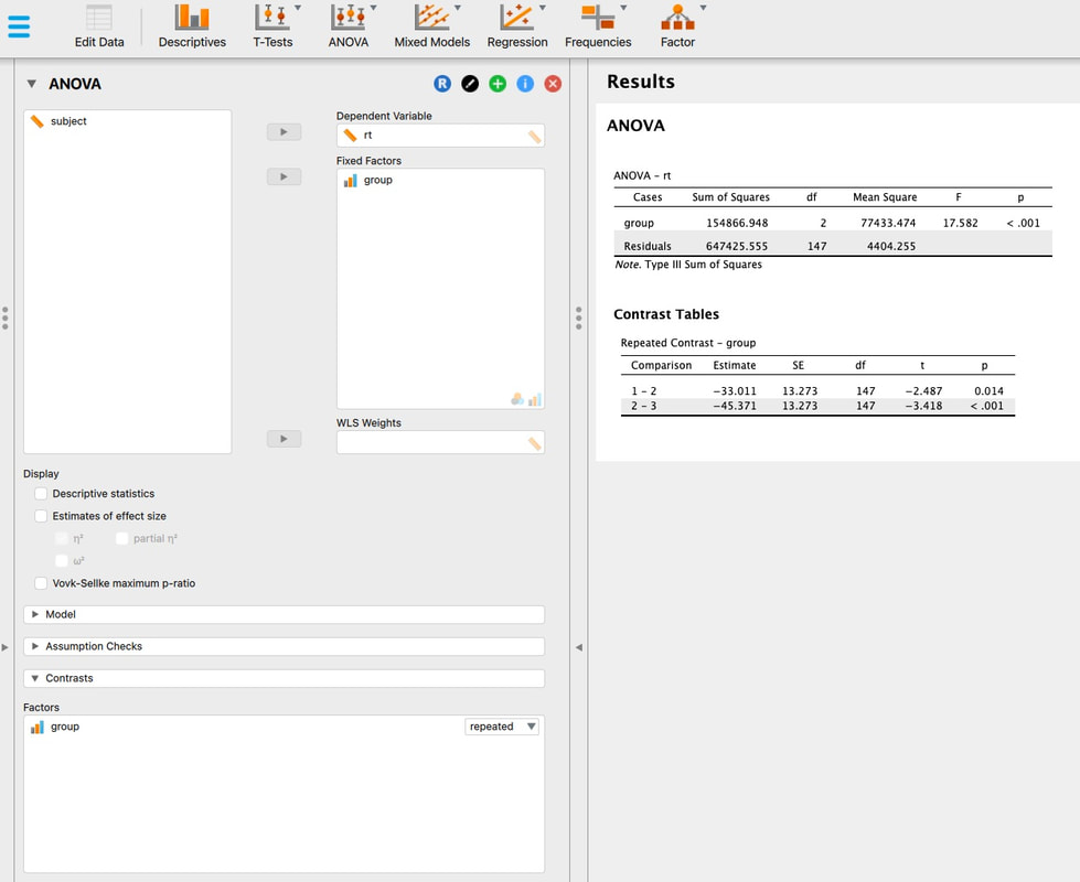
Now, let's look at the polynomial contrast. A polynomial contrast looks at trends in the data. Here, it will examine linear and polynomial trends. You might wonder why you would ever want to do that, but what if you were interested in a learning effect? A linear or polynomial trend might be way more useful to discuss than a series of posthoc tests.
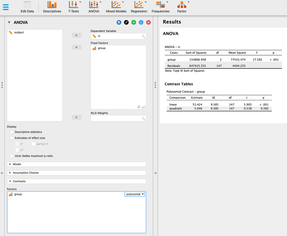
I am not going to discuss difference or deviation contrast because quite frankly, while they exist mathematically, I have never seen one used in the real world.
Some Last Thoughts on ANOVA
1. Understanding the Logic
An ANOVA is all about variance, and specifically how variance is partitioned between between groups (the effect) and within groups (the residual, or error).
Some Last Thoughts on ANOVA
1. Understanding the Logic
An ANOVA is all about variance, and specifically how variance is partitioned between between groups (the effect) and within groups (the residual, or error).
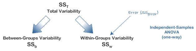
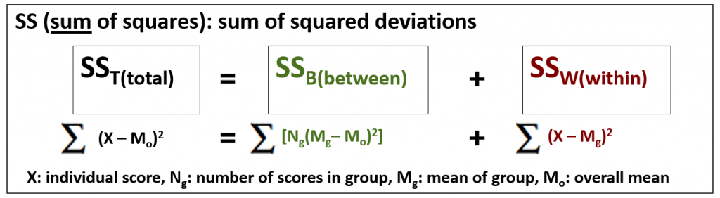
Recall we talked about the sum of squared errors quite a ways back. To understand ANOVA truly, this is a key concept.
The Total Sum of Squared Errors reflects all the variance in the data, which is the variance in each individual score from the grand mean (overall mean).
The Between Sum of Squared Errors reflects the differences between groups - which is what we are interested in. Mathematically, it is the sum of the squares deviations between the group mean and the overall mean times the number of people in the group. This is the variance between groups.
The Within Sum of Squared Errors reflects the summed deviations of individual scores from their group mean. This is error. Why? Because if the group differences were ideal, everyone in the group would have the same score.
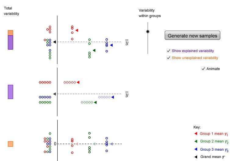
If you look at the example above, it shows the total variability at the top which is made of the between variability (purple bar) and the within variability (yellow bar). In this case, there is a lot of variability between groups and now lots within groups. Try it yourself HERE and play with the variability within groups.
2. Understanding the ANOVA Summary Table
2. Understanding the ANOVA Summary Table
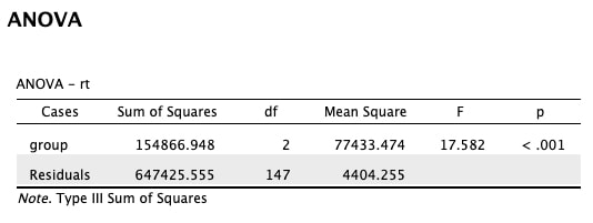
This is an ANOVA summary table. You can see the sum of squared errors we just discussed for the group differences (BETWEEN) and the residuals (WITHIN, ERROR). You could compute these by hand using the forumale above.
There are also the degrees of freedom. Degrees of freedom reflect the number of parameters that can vary. A great explanation is HERE. So for group, df = 2 because n - 1 = 3 - 2. For residuals, you have three groups of 50 so it is n - 1 + n - 1 + n - 1 = 50 - 1 + 50 - 1 + 50 - 1 = 147.
Now, what is the Mean Square error? If is simply the Sum of Squares divided by the degrees of freedom. Try it out!
Finally, you get to F, the test statistics. What is F? It is the ratio of the Mean Square errors. So, to understand how variance impacts you, think of the following:
a. If you have very small group sizes, then your df for the residuals are small and you have a larger MSE and thus F is smaller.
b. if you have too much variance within your groups, then the SSE for residuals is greater and F is smaller.
The reverse logic to increase F is equally true.
Finally, what is F? F is a test statistic just time t that we use to estimate what we cannot know - the sampling distribution of the mean. More of F HERE.
As a proof of concept, open this EXCEL sheet and you will see a worked example of an ANOVA with three groups. Try playing with the numbers and see how it affects the F statistic. For comparison, here is the data in JASP.
Contrasts in R (optional)
Load this DATA into a new table called "data" in R Studio. You will note the first column indicates subject numbers from 1 to 150, the second column groups codes for 3 groups, and the third column actual data. Rename the columns "subject", "group", and "rt".
Lets define group as a factor. Remember how to do that?
data$group = factor(data$group)
Now run the ANOVA
analysis = aov(data$rt~data$group)
Let's try this with contrasts. Essentially, contrast analysis repartitions the variance so that you can determine group effects. Try the following:
summary.lm(analysis)
This shows you the contrasts of groups 2 and 3 relative to group 1 - the default contrast.
To use a different contrast, you can define it through the contrast command them re-execute the model.
contrasts(mydata$group) = contr.treatment(3, base = 3)
modelnew = aov(mydata$rt~mydata$group)
summary.lm(modelnew)
The above code would conduct a contrast comparing the first two groups to the third.
contrasts(mydata$group) = contr.poly(3)
modelnew = aov(mydata$rt~mydata$group)
summary.lm(modelnew)
The above code would conduct a contrast examining the polynomial trends between the groups (linear, quadratic).
You can do other classic contrasts as well:
contrasts(mydata) = contr.helmert(3)
contrasts(mydata) = contr.SAS(3)
contrast(mydata) = contr.treatment(3, base = 2)
Assignment Question
The data HERE reflects data from 4 groups of people, with each group reflecting data from a different city. Run the ANOVA in JASP and use a contrast analysis (your choice) to tell the story that is present in the data. Does this differ from the story you told with your posthoc analysis?
Exam Questions
1. What is contrast analysis?
2. Explain the logic of ANOVA. - both in terms of SSE and the ANOVA summary table.
3. What is the F statistic?
Lesson 14. Factorial ANOVA
Text: Field, Chapter 12
Video: Factorial ANOVA
Video: Main Effects and Interactions
Lecture Slides: Factorial ANOVA
Lecture Slides: Posthoc Analysis of Complex Designs
The Logic of Factorial ANOVA
In factorial ANOVA you have two or more independent variables and a single dependent variable. Let's call your independent variables height (short, average, tall) and weight (below average, average, above average) and your dependent variable is calories consumed. When you run a factorial you will see if there is a MAIN EFFECT for height (is calories consumed impacted by height) and a MAIN EFFECT for weight (is calories consumed impacted by weight). Both of these MAIN EFFECTS are independent of each other. In other words, we have no idea how height and weight interact. So, in a factorial ANOVA we will get an interaction term which literally reflects the interaction between height and weight. Let's see how this impacts the way the variance is partitioned.
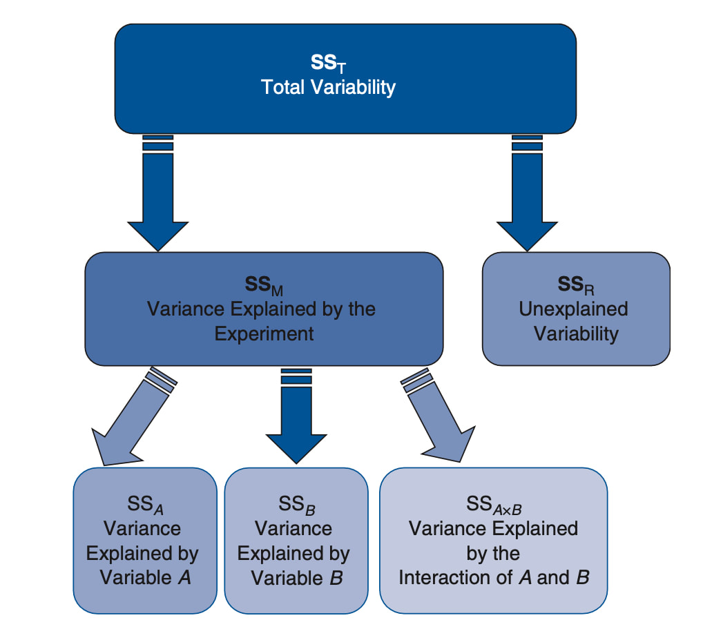
At this point I would really recommend reading the text, reviewing the videos, and reviewing the slides to ensure you understand MAIN EFFECT and INTERACTIONS.
Factorial ANOVA in JASP
A factorial ANOVA simply means you have an ANOVA with more than one level for the independent variable. Let's work with THIS data. This data has four columns. One for subject, one for age (three levels - young, middle, elderly), one for sex (two levels - male, female), and one for the dependent variable reaction time.
You cannot run a one way ANOVA because you have two fixed factors - age and sex. If you did run an ANOVA with age as the fixed factor it would ignore sex and you would just see the results for the main effect of age. If you ran a one way ANOVA on sex (Trick! It would be an independent samples t-test as there are only two levels) it would ignore age and you would see the results for the main effect of sex. But what if you were interested in the interaction between age and sex? For example, what if you hypothesized that reaction time would differ at one age level but not at the other two? This would be an interaction and you would need to run a factorial ANOVA to examine it.
STOP. If you do not understand the difference between main effects and interactions at this point, read Field, watch the videos, review the lecture slides.
Okay, running a factorial ANOVA in JASP is easy. Just enter RT as the dependent variable and age and sex as fixed factors. Note, I even tested the assumption of homogeneity of variance.
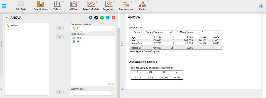
So, there is a main effect for age? But where is the difference? You would need to use Posthoc tests or Contrasts to determine where the difference is. There is a main effect for sex as well? In principle, you do not need to run a posthoc test on this as there are only two levels. IMPORTANT! The main effect for age will collapse across sex and vice versa. It would be like running the test without coding for the other variable.
But, there is an interaction. A plot of the data clearly reveals this.
But, there is an interaction. A plot of the data clearly reveals this.
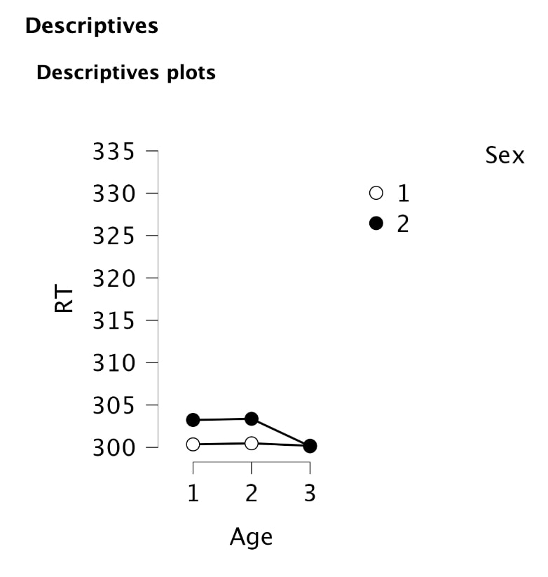
So, what do we do? Well, JASP will run all of the comparisons you need. But, what JASP does is not actually what we want to do.
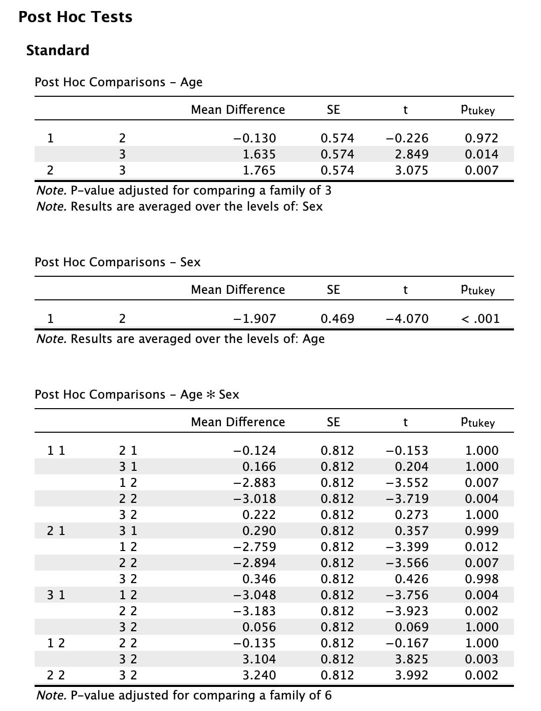
What JASP is doing is some complex comparisons using a Tukey Test. The preferred (and better) solution is to pick a direction. Either, run a series of t-tests, one for each level of age. OR, run an ANOVA for sex = 1 and another ANOVA for sex = 2. This is how you Posthoc a Factorial ANOVA correctly! The problem with this is you need to rearrange your data so you can do this easily. If you just ran an ANOVA on age with the data as is, it would not do it separately for each level of sex.
So, this is the decision point. If you run the ANOVAs on age separately for each level of sex, you tell one story. If you run three independent samples t-tests, you tell a slightly different story. The choice is yours.
The data you need to the ANOVAs if HERE for sex = 1 and HERE for sex = 2. Run the ANOVAs.
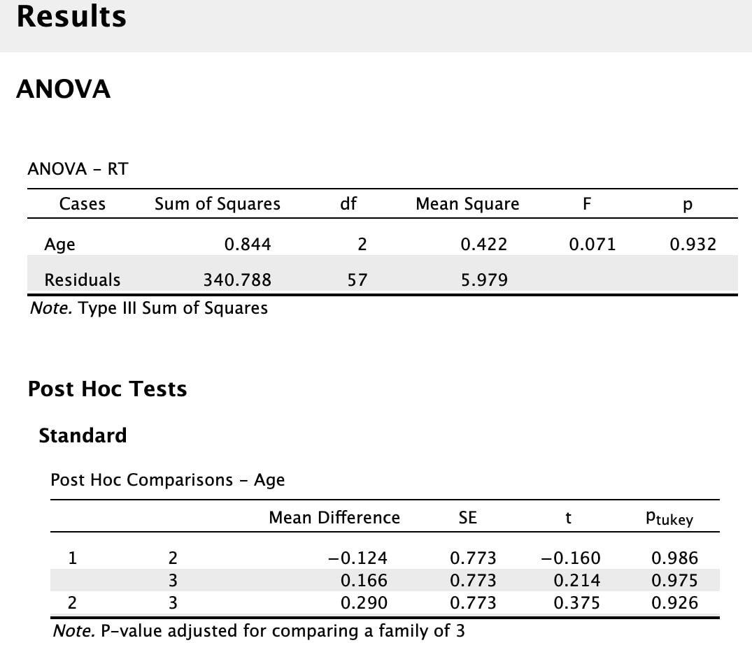
|
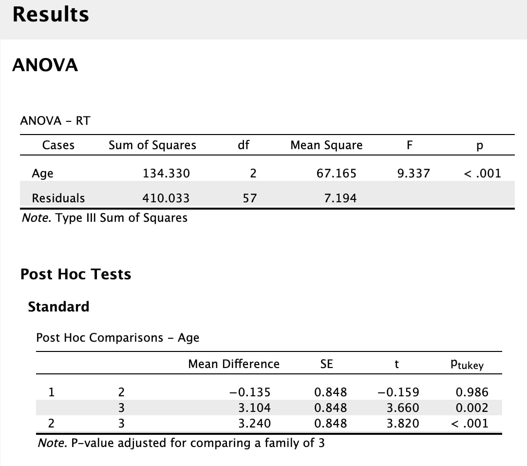
|
You would conclude RT does for differ when sex = 1, but it does when sex = 2. Then you would use the Posthoc for the ANOVA for sex = 2 to infer what the difference is. If you looks at the results for the sex = 2 ANOVA you would conclude that RT differs for sex = 2 with group 3 being different than groups 1 and 2.
Note, you could also run the three independent sample t-tests as well - that is the other choice. I will leave it to you to try this.
Factorial ANOVA in R (Optional)
In this assignment you will learn to run a Factorial ANOVA. Load the data HERE into a table called data. Rename the columns "subject, age, gender, rt".
data = read.table("sample_anova_data.txt")
names(data) = c("subjects","age","gender","rt")
This data reflects reaction time data taken from 120 participants in three age groups (old, middle, young) subdivided into two gender groups (female, male). If you look at the data, you will note that the subject numbers go from 1 to 120 with no subject numbers repeated indicating a between subjects design.
First, as ever, you would have to conduct the appropriate tests of assumptions - normality and homogeneity of variance. But, let us leave that for now till after the ANOVA.
The linear model for a factorial ANOVA has to include both main effects (age, gender) and the interaction between age and gender. It would look like this:
rt = data$rt
age = factor(data$age)
gender = factor(data$gender)
model = aov(rt ~ age + gender + age*gender)
summary(model)
Which should give you this:
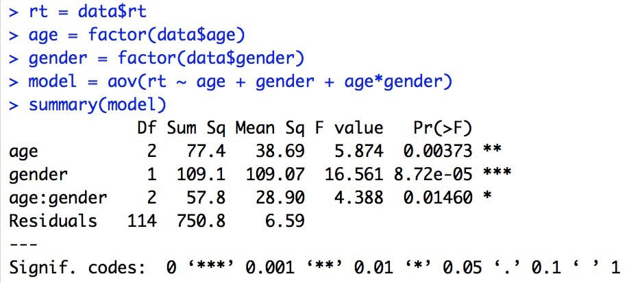
The results are straight forward - there is a main effect for age, a main effect for gender, and an interaction between age and gender.
Before we move on, lets get back to the assumptions. Try the following:
plot(model)
This will generate four plots, seen in sequence by hitting return. The interpretation of these plots if beyond this tutorial - see Field 12.5.13 for more detail. Alternatively, you could use one of the strategies that we have discussed previously.
Now, to examine the main effects of age and gender and the interaction visually:
plot(rt ~ age)
plot(rt ~ gender)
interaction.plot(age,gender,rt)
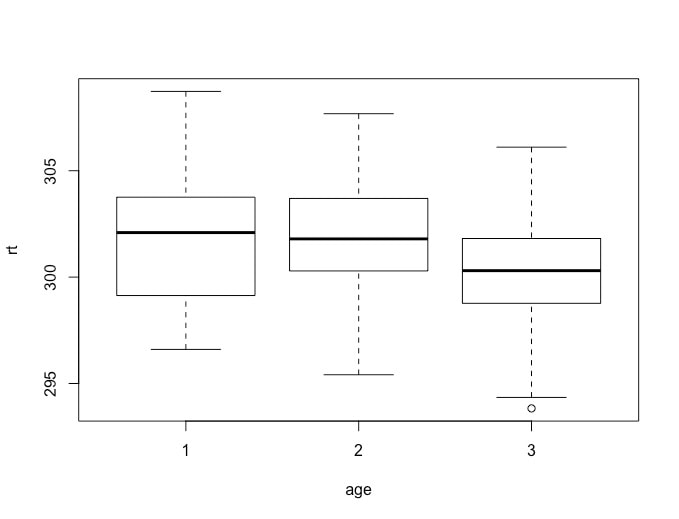
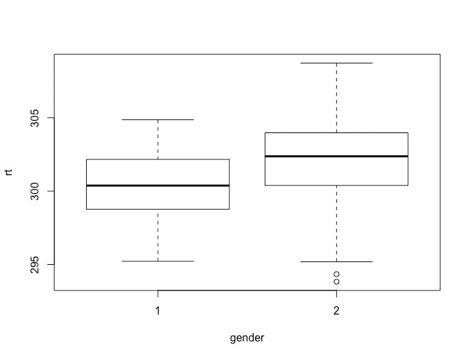
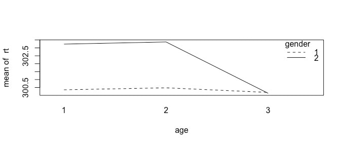
You will see that group 3 (young) appears to have faster reaction times then groups 1 (old) and 2 (middle). You will also see that females appear to have faster reaction times than males. However, these main effects are misleading when you look at the interaction plot. The interaction plot suggests rt is the same for all females (gender = 1) but is slower for older and middle aged men.
To verify this, you need to do a posthoc analysis of the main effects of age and gender and the interaction.
TukeyHSD(model)
To verify this, you need to do a posthoc analysis of the main effects of age and gender and the interaction.
TukeyHSD(model)
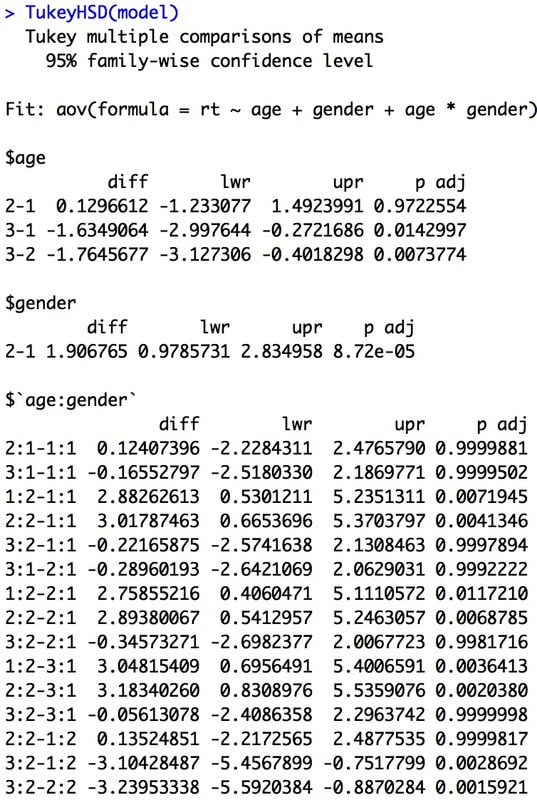
You can see easily that the TukeyHSD test compares all the main effects. But, it also compares all the cells which makes for a lot of comparisons. It also does not really tell us the story of the interaction plot. So, this is just one way to post-hoc a factorial ANOVA.
A simpler way to posthoc the ANOVA would be the following. Pick a direction: Age or Gender. If you pick Age, then you can run an independent samples t-test at each level of age to see where the difference lies.
age1 = subset(data,age==1)
t.test(age1$rt~age1$gender)
age2 = subset(data,age==2)
t.test(age2$rt~age2$gender)
age3 = subset(data,age==3)
t.test(age3$rt~age3$gender)
If you do this, you will see that the first two t tests are significant, the third is not. This tells us the nature of the interaction - rt differs between genders at ages 1 and 2 but not at 3. You will note, we have also done a lot less tests to show this effect.
Note, you could have done this the other way and run two ANOVAs, one when gender == 1 and one when gender == 2. If you do this, you will find that the ANOVA for gender = 1 is not significant and the ANOVA for gender = 2 is. You could then posthoc the second ANOVA to tell the story of the interaction plot.
gender1 = subset(data,gender==1)
model1 = aov(gender1$rt~factor(gender1$age))
summary(model1)
TukeyHSD(model1)
gender2 = subset(data,gender==2)
model2 = aov(gender2$rt~factor(gender2$age))
summary(model2)
TukeyHSD(model2)
The direction you take - to pull apart gender or age is wholly dependent on the story that you wish to tell. Both are true, but by convention you generally only pick one direction.
ASSIGNMENT 14
Okay, time to do it all. The data HERE reflects reaction time data from four countries (countries = Canada, Japan, Yemen, Peru) and three age groups (21-30, 31-40, 41,50). You do not really have a hypothesis, so you decide to use Factorial ANOVA to explore what is going on.
a. Run a Factorial ANOVA. What are the main effects? Is there an interaction?
b. Post hoc all of the significant main effects and interactions. What is the story? Write this out as a short paragraph and report your statistics. You may want to find a paper that uses Factorial ANOVA as a guide as to how to write this out.
c. Test all the appropriate statistical assumptions and include these in your report.
d. Generate an APA quality figure that shows the results.
What you are handing in:
i. A one page report of your findings (a results paragraph) that includes all relevant statistics and yur figure.
ii. The PDF of the paper you used as a model for your results paragraph.
EXAM QUESTIONS
1. What is a main effect? Give an example.
2. What is an interaction? Give an example.
3. How do you post hoc a factorial ANOVA?
Lesson 15. Repeated Measures ANOVA
Text: Field, Chapter 13
Video: Repeated Measures ANOVA
Video: Repeated Measures ANOVA
Lecture Slides: Repeated Measures ANOVA
A repeated measures ANOVA is a within design. In this type of design, everyone does everything - akin to a paired or dependent samples t-test. Just as with ANOVA, a repeated measures ANOVA is for instances when you have three or more within levels. For instance, imagine you measure reaction time in three successive weeks. You want to see if reaction time changes as a function of time. This would be a use case for a repeated measures ANOVA. Or, let's say you test the same same group of people in three different conditions - you make them run when they are cold, warm, and hot. Everyone does everything so again you use a repeated measures ANOVA. As with a between subjects ANOVA, you can run a factorial repeated measures ANOVA but that is beyond the scope of this course. Let's take a look at how the variance is partitioned up in a repeated measures ANOVA as there is a key difference.
Video: Repeated Measures ANOVA
Video: Repeated Measures ANOVA
Lecture Slides: Repeated Measures ANOVA
A repeated measures ANOVA is a within design. In this type of design, everyone does everything - akin to a paired or dependent samples t-test. Just as with ANOVA, a repeated measures ANOVA is for instances when you have three or more within levels. For instance, imagine you measure reaction time in three successive weeks. You want to see if reaction time changes as a function of time. This would be a use case for a repeated measures ANOVA. Or, let's say you test the same same group of people in three different conditions - you make them run when they are cold, warm, and hot. Everyone does everything so again you use a repeated measures ANOVA. As with a between subjects ANOVA, you can run a factorial repeated measures ANOVA but that is beyond the scope of this course. Let's take a look at how the variance is partitioned up in a repeated measures ANOVA as there is a key difference.
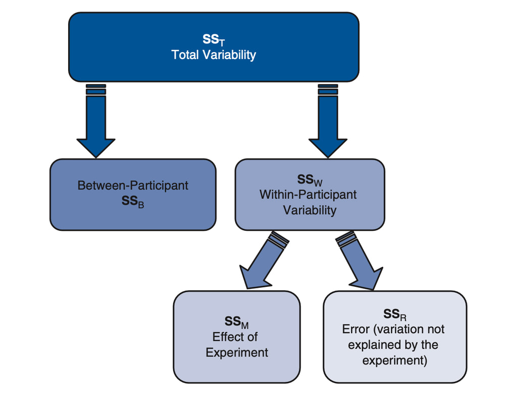
In a repeated measures ANOVA, we do not care about the between subject variability. Consider the following data:
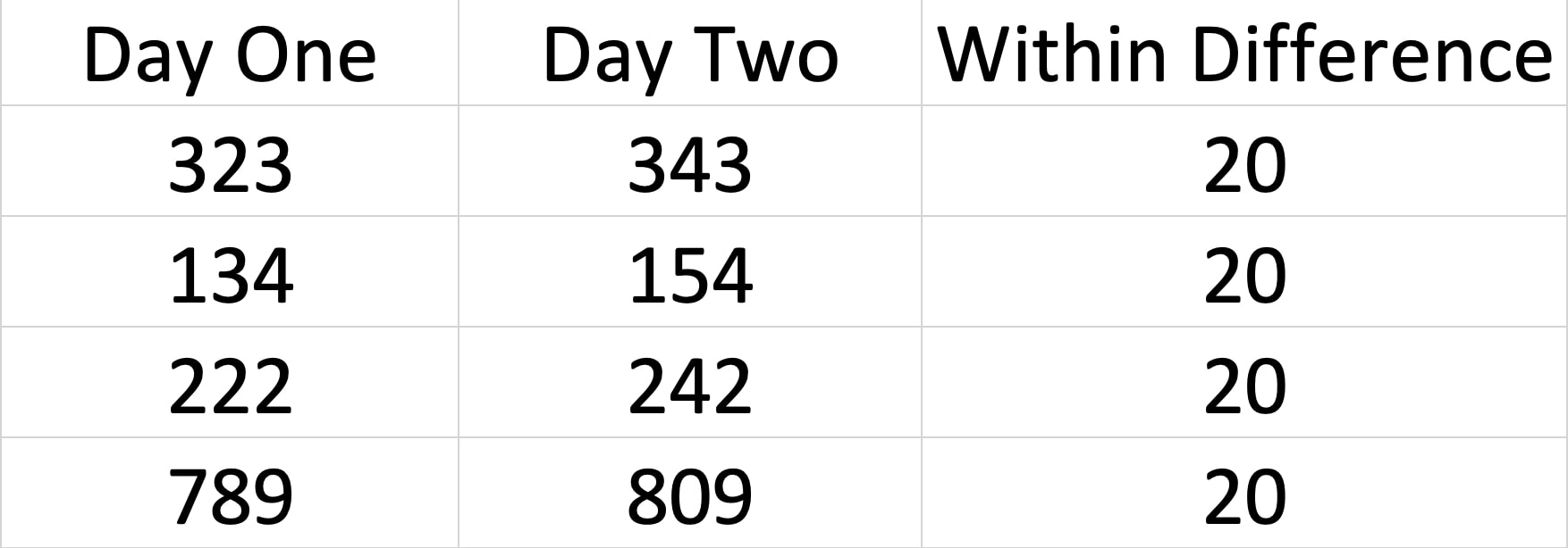
While the between subject variance is MASSIVE, the within subject variance is a constant 20 which is what we are interested in. So, if you look at the way variance is partitioned, we focus on splitting the error/residuals to isolate the within subject variance from the actual error.
Let's try it. Load the data HERE into JASP. Now, running a repeated measures ANOVA in JASP requires a bit of extra work so look at the image below and set it up to get the same ANOVA table. Note! The data for a repeated measures ANOVA in JASP has to be in WIDE as opposed to LONG format. Make sure you look at the difference. As opposed to coding week with 1's, 2's, and 3's in a single column, the three weeks of data take up three columns.
Let's try it. Load the data HERE into JASP. Now, running a repeated measures ANOVA in JASP requires a bit of extra work so look at the image below and set it up to get the same ANOVA table. Note! The data for a repeated measures ANOVA in JASP has to be in WIDE as opposed to LONG format. Make sure you look at the difference. As opposed to coding week with 1's, 2's, and 3's in a single column, the three weeks of data take up three columns.
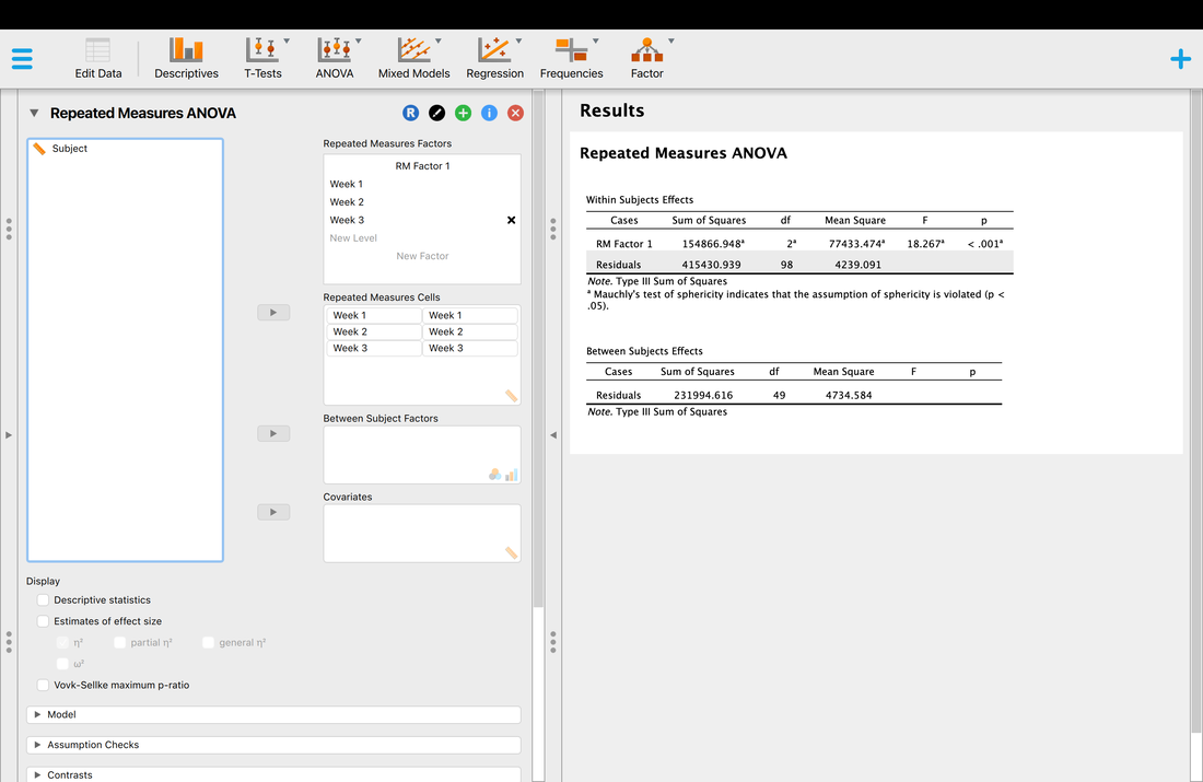
As with a between subjects ANOVA, all this tells us is that there is a difference somewhere in the three weeks of data. To understand where that difference is, we need to use posthoc tests as before. But first! You have to check assumptions.
All of the assumptions of ANOVA apply here, but in practice the only one we test is homogeneity of variance (NOTE - JASP does not actually test for this but you need to do it by hand using the rule of thumb or use R). BUT, there is another key assumption that we must test which is sphericity. Watch THIS and read Field. We will also cover this in lecture. This is a key assumption to check, because if it is violated YOU MUST CORRECT FOR IT.
So, let's check the assumption of sphericity - I will leave it for you to check homogeneity of variance.
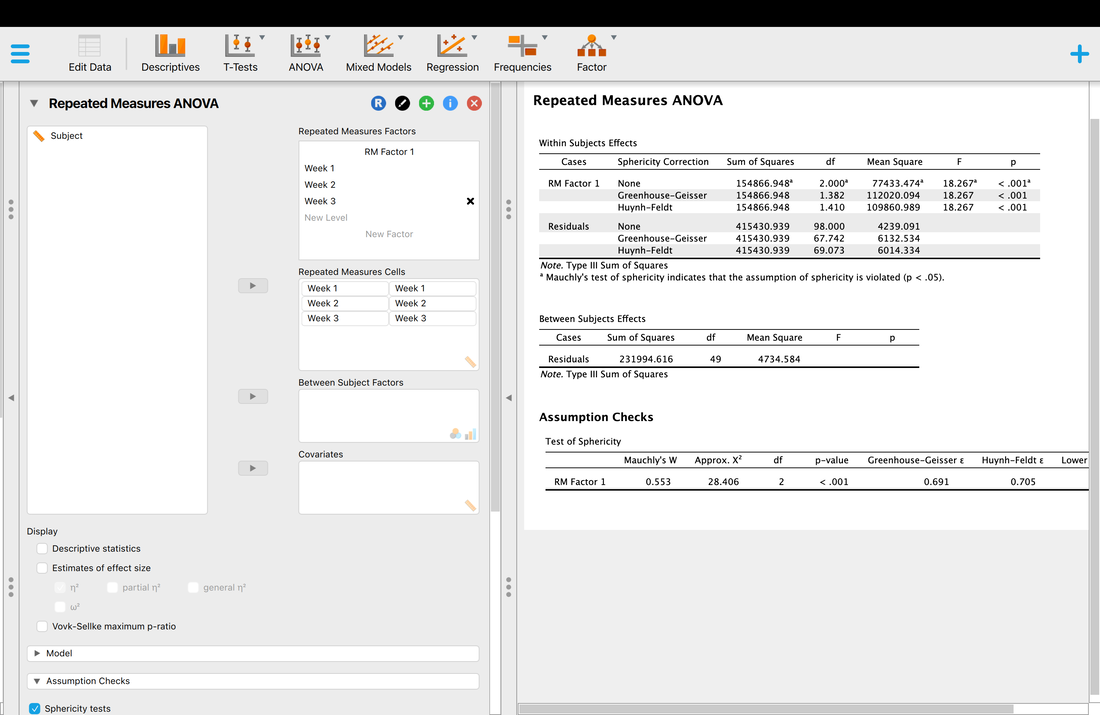
Okay, so you failed the assumption (p < 0.05) so you must correct? There are two corrections - Greenhouse-Geisser and Huynh-Feldt. Which one to use? There is a basic logic that works like this. Use the Huynh-Feldt Correction if E > 0.75 (note it is not) or n is small less than 15 (it is not). So here we would use Greenhouse-Geisser and report those statistics (which in this case are the same).
Now, on to posthoc tests. You have a choice of using traditional posthoc tests (essentially t-tests) or contrasts just as with ANOVA. As with ANOVA, the choice is yours and it really depends on the story you want to tell.
Now, on to posthoc tests. You have a choice of using traditional posthoc tests (essentially t-tests) or contrasts just as with ANOVA. As with ANOVA, the choice is yours and it really depends on the story you want to tell.
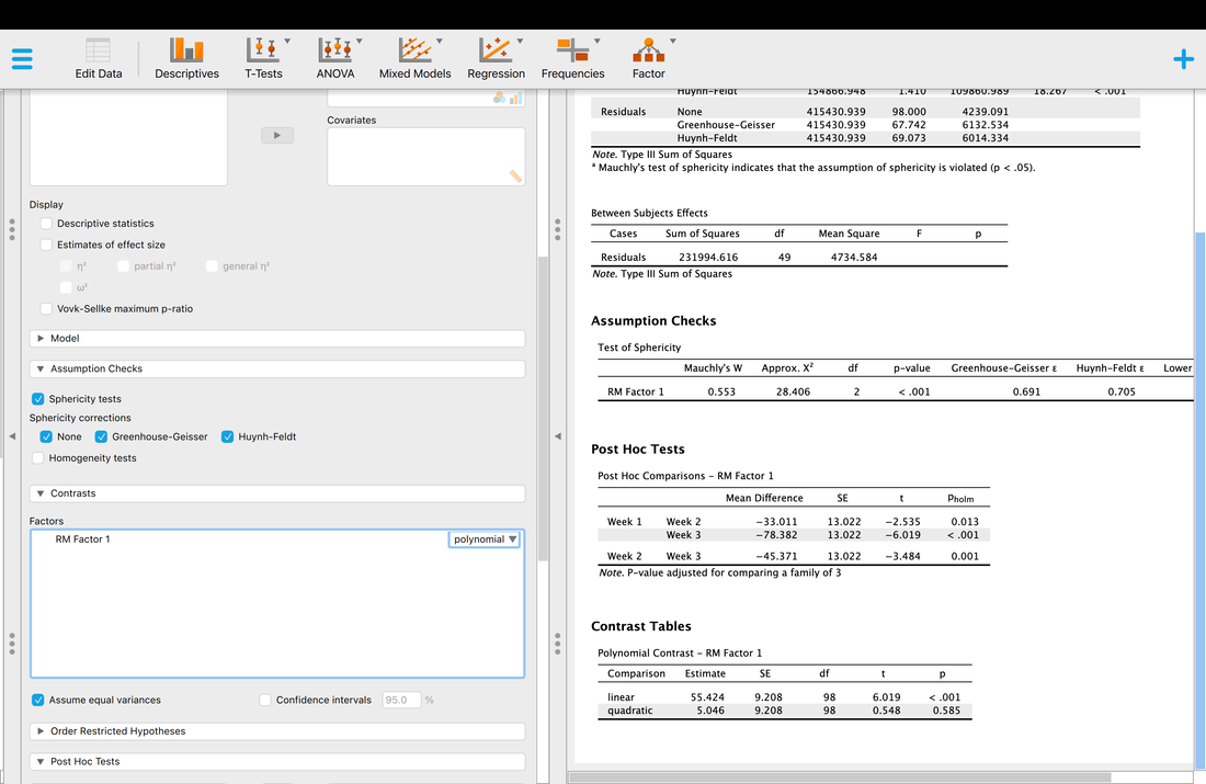
Doing a Repeated Measures ANOVA in R (optional)
First, load the data HERE into a data frame called data. You will note that the participant numbers repeat themselves from 1 to 50 three times. This makes complete sense, as in a repeated measures ANOVA you have the same participants doing the same thing on repeated measurements (i.e., measurements over time) or you have the same participants completing a series of experimental conditions. Examining the participant numbers is an easy way to tell if long format data is for a between or within design. Indeed, in order to run a repeated measures ANOVA in R it is crucial that the participant numbers be accurate. If you are used to repeated measures ANOVA in JASP/SPSS you will note that in R long format is used for both between and within designs whereas in JASP/SPSS repeated measures ANOVA data is typically in a wide or column format.
Running a RM ANOVA is easy to do in R.
data = read.table("samplermanovadata.txt")
names(data) = c("subject","condition","data")
data$subject = factor(data$subject)
data$condition = factor(data$condition)
model = aov(data$data~data$condition+Error(data$subject/data$condition))
summary(model)
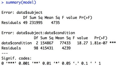
You will note one key difference in the aov command, and that is the Error term. If you recall the theory behind RM ANOVA, you are removing between participant variance from the overall error variance. This error term accomplishes just that.
Testing Assumptions
Here I will only review how to test the assumption of sphericity as you can easily refer to Assignment 7A for how you would test the assumptions of normality and homogeneity of variance.
The Assumption of Sphericity: The assumption of sphericity is that the variances of the difference scores are equal.
The reality is that in R the test of this assumption is not as easy as one might think. Indeed, it is easier to just run the RM ANOVA using the ezANOVA package.
install.packages("ez")
library("ez")
model = ezANOVA(data=data, dv = .(data), wid =.(subject), within =.(condition), detailed = TRUE, type = 3)
model
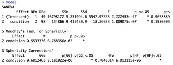
This will give you a full RM ANOVA table plus the test of sphericity. Note, if you fail the test of sphericity you should use one of the corrected p-values and correct the degrees of freedom. In general, the closer epsilon is to 1 then the more closely the assumption is met. The lower bound of epsilon is defined as 1/(number of levels - 1). So, for this design epsilon should have a range between 0.5 and 1. If epsilon is closer to the lower bound than 1 then the assumption is definitely not met. Things you can do if the assumption of sphericity is not met:
1. Use the Greenhouse-Geisser Correction
i. Use the new p value
ii. Correct the degrees of freedom by multiplying by epsilon
2. Use the Huynh-Feldt Correction (better to use this for E > 0.75 or n is small, less than 15)
i. Use the new p value
ii. Correct the degrees of freedom by multiplying by epsilon
3. Use an average of the two epislon values and p values.
Post-Hoc Analysis of RM ANOVA in R
To post-hoc this data all you need to do is run a series of pairwise comparisons:
pairwise.t.test(data$data,data$condition,paired=TRUE)
Another option would be to conduct a trend analysis.
Contrast (Trend) Analysis of RM ANOVA in R
Sometime with repeated measures data is it useful to look at the trend in the data - something that can be achieved with polynomial contrasts.
Load the data HERE into a table and plot it using the following commands:
my.data = read.table('sampleRMData.txt')
names(my.data) = c('Subject','Week','RT')
my.data$Subject = factor(my.data$Subject)
my.data$Week = factor(my.data$Week)
plot(my.data$RT~my.data$Week)
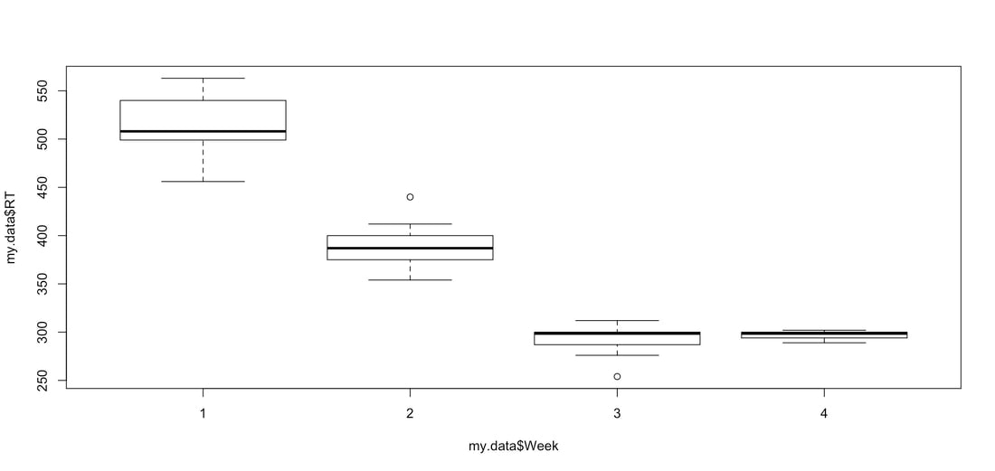
So, imagine this is performance data and you want to show a trend in the data - for example a quadratic trend to relate this to the Power Law of Practice. You can do that easily with the emmeans package and polynomial contrasts.
Try the following code:
install.packages('emmeans')
library('emmeans')
myRMANOVA = aov(RT ~ Week + Error(Subject / Week), data = my.data)
print(summary(myRMANOVA))
weekContrast = emmeans(myRMANOVA,"Week")
poly = contrast(weekContrast,'poly')
print(poly)
You should see the following output:
Try the following code:
install.packages('emmeans')
library('emmeans')
myRMANOVA = aov(RT ~ Week + Error(Subject / Week), data = my.data)
print(summary(myRMANOVA))
weekContrast = emmeans(myRMANOVA,"Week")
poly = contrast(weekContrast,'poly')
print(poly)
You should see the following output:
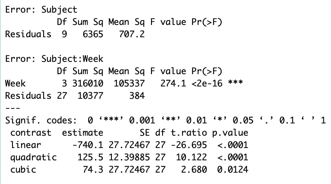
So, you have a significant repeated measures ANOVA, given the data, not surprising. However, you also have significant linear and quadratic trends! You could report these to argue practice effects as opposed to reporting the results of paired sample t-tests.
Assignment 15
For the data HERE, run a complete repeated measures analysis. The data is reaction time data measured over six weeks. Test all of the assumptions, run the ANOVA, and complete post-hoc analyses. Generate an APA quality figure. As with the last assignment, write this up as a single results paragraph. NOTE! The data is not in JASP format. You will have to fix this yourself to make this work.
For the data HERE, run a complete repeated measures analysis. The data is reaction time data measured over six weeks. Test all of the assumptions, run the ANOVA, and complete post-hoc analyses. Generate an APA quality figure. As with the last assignment, write this up as a single results paragraph. NOTE! The data is not in JASP format. You will have to fix this yourself to make this work.
EXAM QUESTIONS
1. What is Repeated Measures ANOVA?
2. How is the partitioning of variance different for a repeated measures ANOVA?
3. What is the assumption of sphericity and how can you test it?
4. How do you post-hoc a repeated measures ANOVA?
1. What is Repeated Measures ANOVA?
2. How is the partitioning of variance different for a repeated measures ANOVA?
3. What is the assumption of sphericity and how can you test it?
4. How do you post-hoc a repeated measures ANOVA?
Lesson 16. Mixed Designs
Text: Field, Chapter 14
Video: Mixed ANOVA
Sometimes you may wish to run a mixed ANOVA - an ANOVA with both between and within factors. Again, in JASP or R this is easy to do.
Imagine you have data from two groups (men and women) at two time points (week one, week ten). See the plot below.
Video: Mixed ANOVA
Sometimes you may wish to run a mixed ANOVA - an ANOVA with both between and within factors. Again, in JASP or R this is easy to do.
Imagine you have data from two groups (men and women) at two time points (week one, week ten). See the plot below.
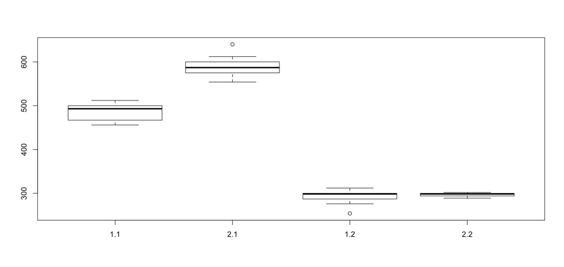
Assuming that the men are on the left and women are on the right, you might hypothesize that men have greater scores at Week Ten as opposed to on Week One, whereas there was no difference between scores for women at Week One and Week Ten. You could test this with a mixed ANOVA.
Use the data HERE.
You have to use the repeated measures tab but all you do is add a factor for the between groups IV as below.
In this case, you will have a main effect for time, week one versus week two, an interaction between time and group, and a main effect for group.
Of course, you Posthoc it as you would imagine.
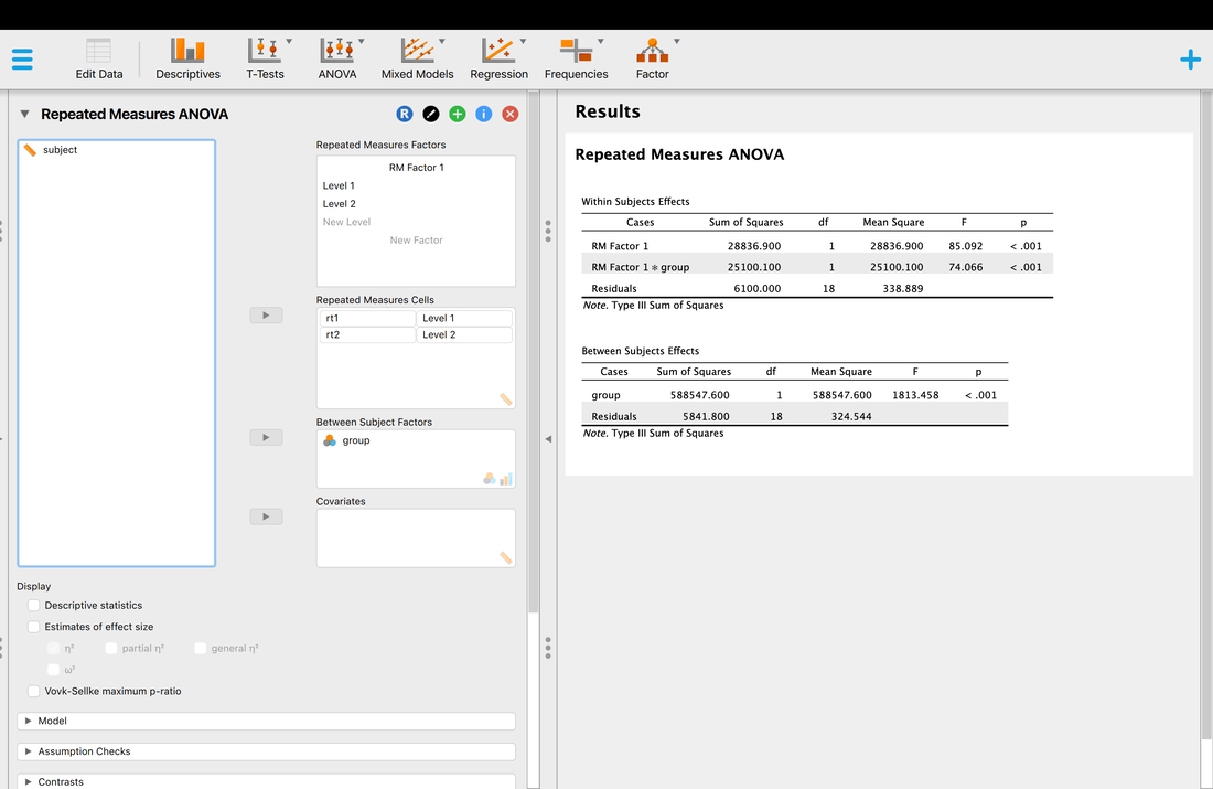
Running a Mixed ANOVA in R
Load the data HERE.
Use the following commands to run a mixed ANOVA:
my.data = read.table('mixedANOVAData.txt')
names(my.data) = c('Subject','Group','Time','RT')
my.data$Subject = factor(my.data$Subject)
my.data$Group = factor(my.data$Group)
my.data$Time = factor(my.data$Time)
myMixedANOVA = aov(RT ~ Group + Time + Group*Time + Error(Subject / Time), data = my.data)
print(summary(myMixedANOVA))
boxplot(my.data$RT ~ my.data$Time*my.data$Group)
Note that in the ANOVA model Group is not included in the error term so it is treated as a Between subjects factor whereas Time is included in the error term so it is treated as a within subjects factor. Finally, there is an interaction term that specifies the interaction between the between (Group) and within (Time) subjects factors. You should see the output below:
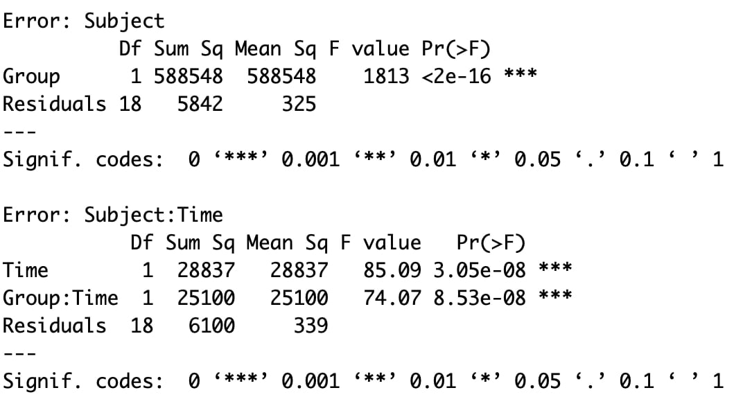
The top portion is the result for the between subjects analysis of Group. The bottom portions are the results for the within subjects analysis of Time and the Group by Time interaction.
Assignment 16
The data HERE reflects EEG score data from three groups of participants (BC, Alberta, Saskatchewan) from the summer (time = 1) and the winter (time =2). Are EEG scores impacted by province and/or time? The data is not formatted for JASP so you will have to correct for that.
Submit a brief summary of your findings with an appropriate plot.
EXAM QUESTIONS
1. What is mixed ANOVA?
2. What are the assumptions of mixed ANOVA?
3. How do you posthoc a mixed ANOVA?
Lesson 17. Non Parametric Tests
Non parametric statistical tests are used in place of parametric tests (t-tests, ANOVA, etc) when the assumptions of the parametric test are not met. Non parametric tests are robust to assumptions and most do not even have assumptions.
More on this in this VIDEO and in Chapter 15 of field.
So, for instance, if you wanted to run an independent samples t-test and you failed the assumption of homogeneity of variance then the correct test to use is a Mann Whitney U Test.
Basically, for any parametric test there is a non-parametric equivalent as seen in the table below.
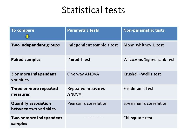
Let's try it in JASP - it is easy to do.
Load the data HERE into JASP. This data set is already formatted for JASP. The data are from two groups, one from BC (1) and one from Alberta (2) and reflect the number of calories consumed on a given day.
You do the correct thing and run an independent samples t-test, but an analysis of Levene's test reveals that you have failed the assumption of Homogeneity of Variance.
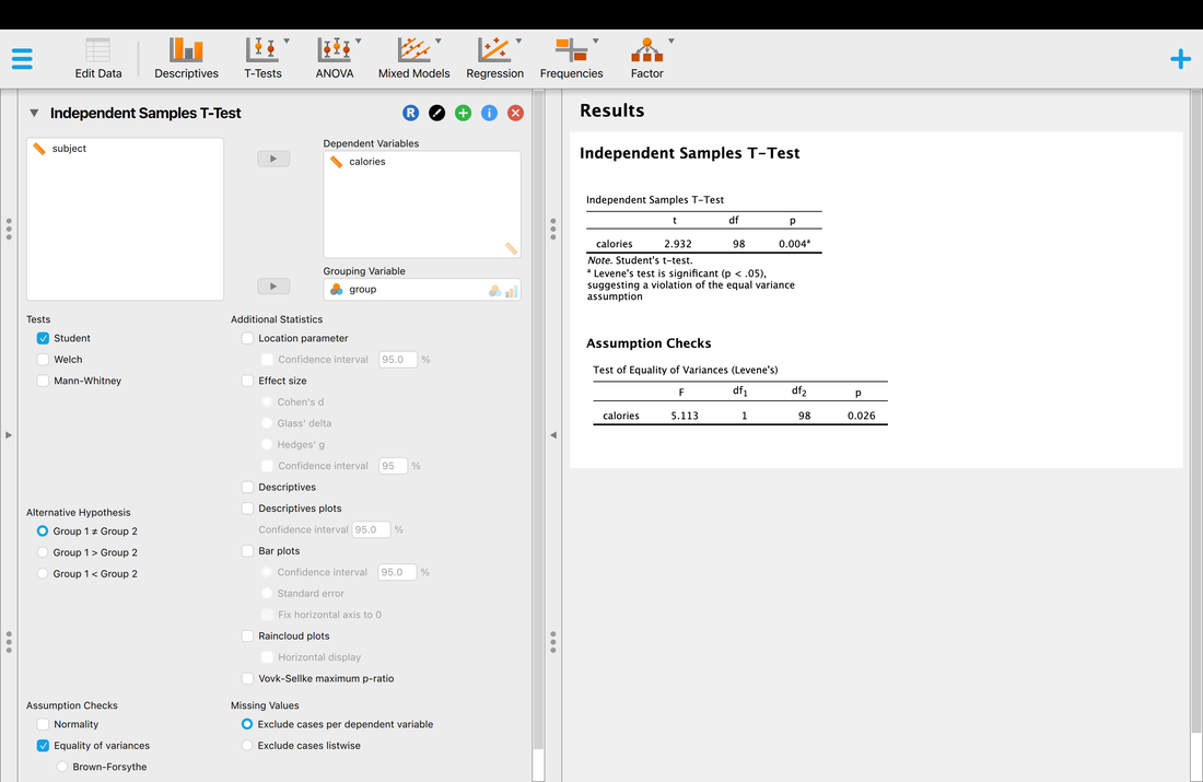
You remember your stats class and realize this is a great time to use a non-parametric test. In JASP, each parametric test has a tab where you will find the non parametric equivalent test.
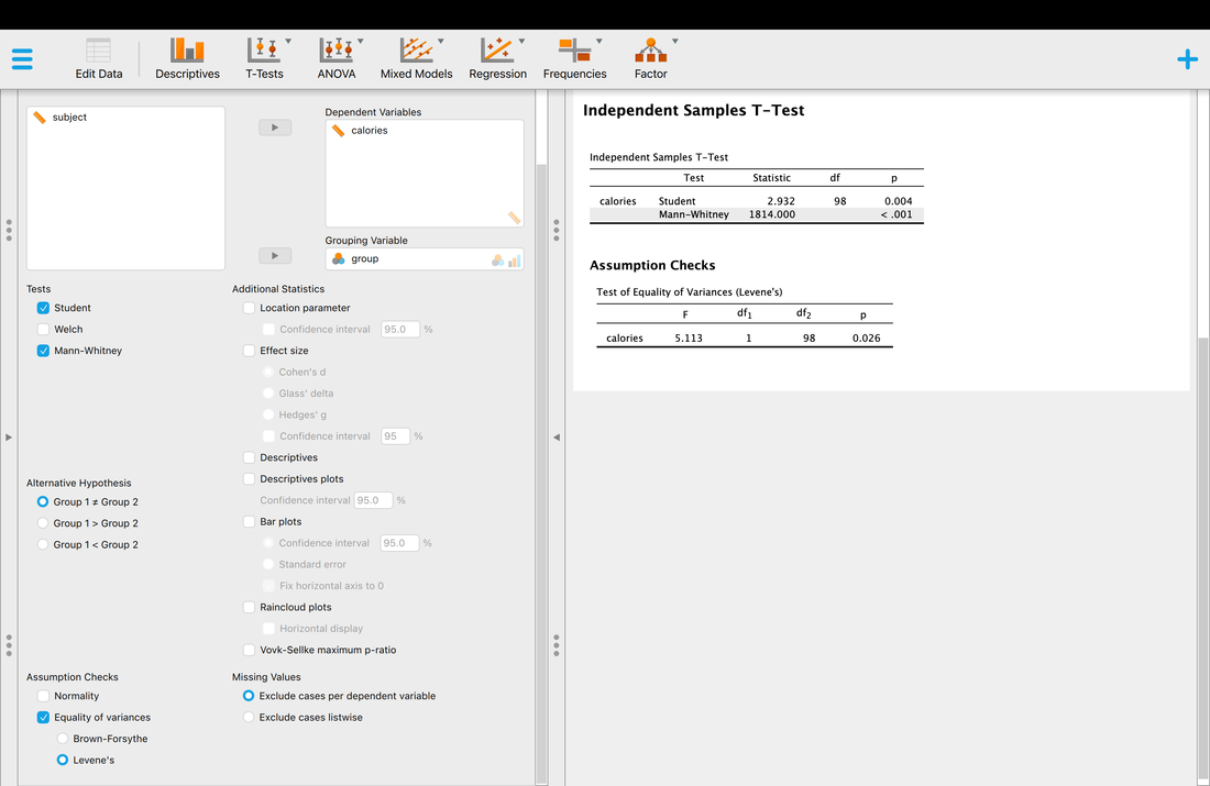
So, in your results section you would report that you failed the assumption and you would report the results on the Mann Whitney test.
I am not going to walk you through all the different non-parametric tests but if you check the analyses you have done, you will see the non-parametric tests.
I am not going to walk you through all the different non-parametric tests but if you check the analyses you have done, you will see the non-parametric tests.
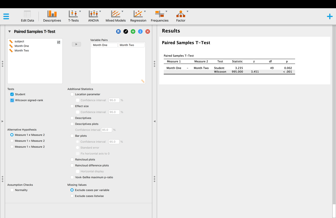
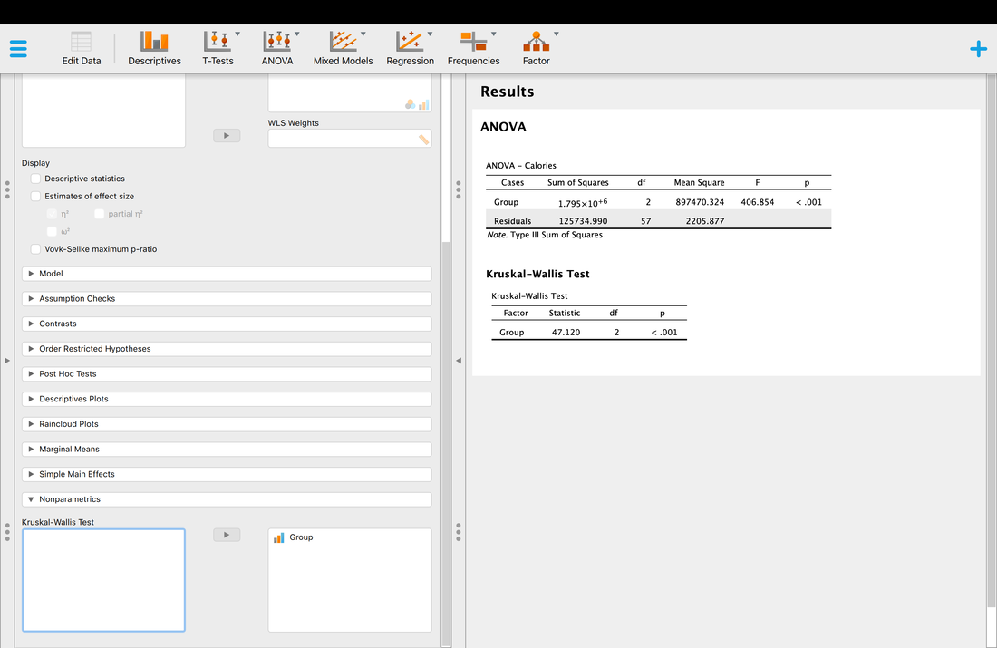
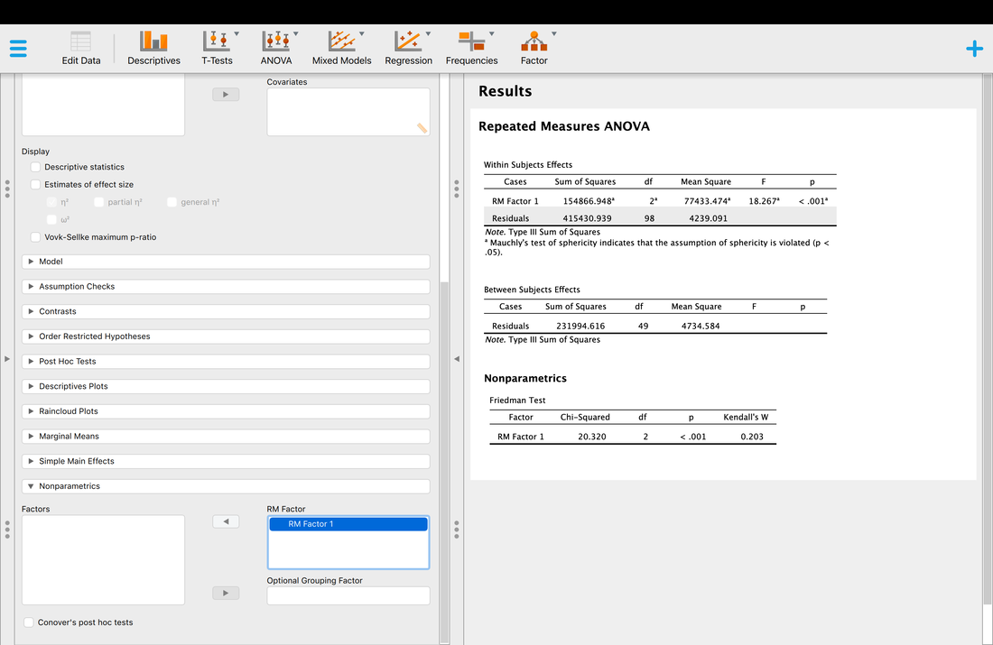
Note, in most instances the non parametric test will give you the same result as the parametric test but it is the correct thing to do.
Doing Non Parametric Tests in R (optional)
The Wilcoxon Rank Sum test is the non-parametric equivalent of an independent samples t-test. For example, if you have two independent groups (no one is in both groups) and you have concerns about normality and/or homogeneity of variance then it would be appropriate to use a Wilcoxon Rank Sum Test.
Load the data HERE into R into a table called data. Column 1 is participant numbers, column 2 is a grouping variable, and column 3 is the dependent measure.
data = read.table("ttestdata.txt")
Because the data reflects two independent groups, you find run Levene's Test to check for Homogeneity of Variance:
library(car)
leveneTest(data$V3~factor(data$V2))
You should see that test is significant, thus indicating a violation of the assumption.
You could run an independent samples t-test using the following command:
t.test(data$V3~factor(data$V2))
The test is significant, but this is actually inappropriate given the failure of the assumption. Instead, you run the appropriate non-parametric test.
To run a Wilcoxon Rank Sum test in R one would simply do the following:
wilcox.test(data$V3~factor(data$V2))
You should see that the result of this test is also significant in this instance - however, there are instances where the independent samples t test would be significant and the Wilcoxon Test would not be given the failure of the assumption. The test reports a traditional p value and W, the Wilcoxon Test statistic which reflects the sum of the ranks minus the mean rank (see Field for more detail).
The Wilcoxon Signed Rank test is the non-parametric equivalent of a dependent samples t-test. Note, the name is very close to its independent samples equivalent. For example, if you have dependent measurements (day one versus day two) and you have concerns about the normality of the difference scores it would be appropriate to use a Wilcoxon Signed Rank test.
Load the data HERE into R into a table called data. Column 1 is participant numbers, column 2 is a grouping variable, and column 3 is the dependent measure. Note that the participant numbers repeat themselves indicating a repeated or dependent measurement.
data = read.table("ttestdata2.txt")
To assess the normality of the difference scores, you could do a couple of different things. One might be:
data1 = data$V3[data$V2==1]
data2 = data$V3[data$V2==2]
differences = data2-data1
hist(differences)
The resulting histogram looks normal, so you could use a dependent samples ttest:
t.test(data$V3~factor(data$V2),paired=TRUE)
But, if you were concerned about a violation of the assumption you could use the Wilcoxon Signed Rank test:
wilcox.test(data$V3~factor(data$V2),paired=TRUE)
As with the test in the previous assignment, this test returns a p value and a test statistics, in this instance V. Sorry to be confusing, but V actually reflects T - a difference in the positive and negative ranked values (see Field).
As with the non-parametric equivalent tests for independent and dependent samples t-tests, there are non-parametric tests that are the equivalent of ANOVA and Repeated Measures ANOVA.
Load the data HERE into R into a table called data. Column 1 is participant numbers, column 2 is a grouping variable, and column 3 is the dependent measure. Note that the participant numbers repeat themselves indicating a repeated or dependent measurement. However, we will first pretend this data reflects three independent groups.
data = read.table("anovadata.txt")
For simplicities sake, let's pull the factor and dependent measure out of the table and take a look at them:
group = factor(data$V2)
dv = data$V3
boxplot(dv~group)
Note, the Boxplot alone probably suggests that this data is non-parametric, but you could verify that easily with Levene's Test:
library(car)
leveneTest(dv~group)
The non-parametric version of ANOVA is called a Kruskal-Wallis Test (see Field for full details) and is easy to run in R:
kruskal.test(dv~group)
As with the test in the previous assignment, this test returns a p value and a test statistic, in this instance a Chi Squared value. Again, you can read more about this in the Field text but at the end of the day it is a test statistic to evaluate against a distribution to obtain a p-value.
Now, given that this parallels an ANOVA it needs to undergo Post-Hoc analysis to see where the differences lie. To do this, we use the kruskalmc function which requires a new package to be installed:
install.packages("pgirmess")
library(pgirmess)
kruskalmc(dv~group)
The output will look something like this which shows that all groups are different (significance = TRUE).
Multiple comparison test after Kruskal-Wallis
p.value: 0.05
Comparisons
obs.dif critical.dif difference
1-2 15.4 13.22119 TRUE
1-3 37.7 13.22119 TRUE
2-3 22.3 13.22119 TRUE
Non Parametric Equivalent of RM ANOVA
As noted above, there is also a non-parametric equivalent of the RM ANOVA, and that is Friedman's ANOVA. I will not say much about it here - you can read the appropriate sections of field for that. Running one in R is simple, however, it requires that your data be a matrix as opposed to a data frame. As such, you could run one by going:
friedman.test(as.matrix(data))
And you could post-hoc this by using:
friedmanmc(as.matrix(data))
Assignment 17
Take the assignment data from one of the following assignments (independent samples t-test, dependent samples t-test, ANOVA or RMANOVA (pick one, no need to do them all) and run the non-parametric equivalent test. Assume the relevant assumptions were failed even if they were not. Email me a brief paragraph outlining your assumption tests and the results of the non parametric test.
EXAM QUESTIONS
1. What are non parametric statistical tests and why are they used?
Lesson 18. Regression and Multiple Regression
READ: Field, Chapter 7
Watch THIS and THIS.
Slides are HERE.
Linear regression is closely related to correlation. Recall that in correlation we sought to evaluate the relationship between two variables - let's call then X and Y for simplicity. If a relationship is present then there is a Pearson r value less than -0.1 or greater than 0.1 - if no relationship is present then the Pearson r value falls between -0.1 and 0.1.
In regression, we seek to determine whether X can predict Y. For instance, do GRE scores predict success at graduate school? Do MCAT scores predict success at medical school? Does income predict happiness?
The general form of regression is Y = B0 + B1X. Hopefully you remember that this is essentially the equation of a line - the formula you learned in high school would have been Y = MX + B, which can be rewritten as Y = B + MX. In regression models, B0 is a constant and B1 is the coefficient for X. Think of it this way - income may range from $0 to $1,000,000 in our data and our happiness score might only range from 1 to 5. Thus, the regression model needs to tweak the income scores by multiplying them by B1 and adding B0 to predict a score between 1 and 5.
Another way to think of this is: output = model + error.
Load the data HERE into JASP. The data shows a column of scores called Calories and Attitude. We want to see if the Calories consumed on average PREDICTS Attitude.
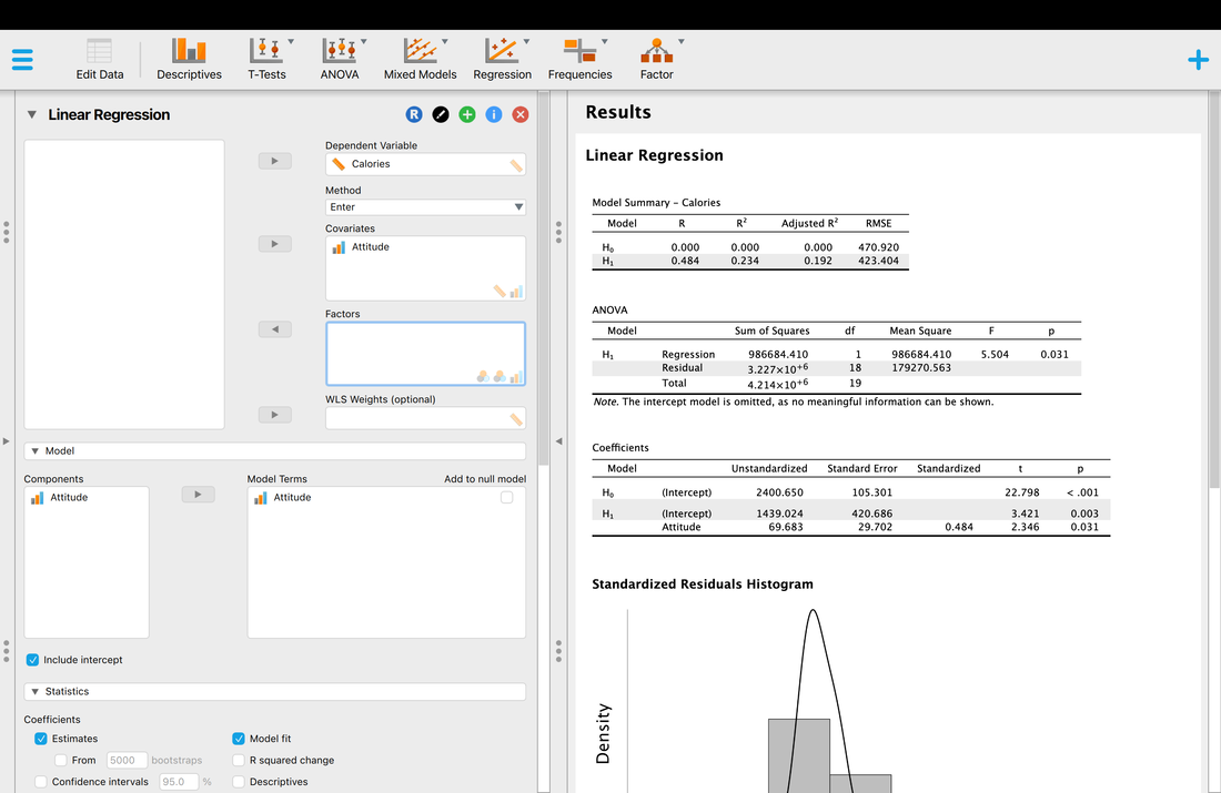
So what does all this mean? What JASP is doing is comparing a Null Model (Ho) which is simply the intercept on its own against a regression model where Calories is used to predict Attitude (H1). If you look at the ANOVA table it shows that there is a model that fits (p = 0.031). So, Calories do predict Attitude to some extent. It also shows that the model explains 0.234 % of the variance which is not that great. It also does a test on the coefficient but this test does not mean as we only have one predictor variable, Calories. And, this is the same test statistic as F = T^2 (you can check this out). The technical name for this variable is that it is a regression coefficient.
Now, what about assumptions?
Regression does have assumptions. Quite a few actually.
1. Variable types: All predictor variables must be quantitative or categorical (with two categories), and the outcome variable must be quantitative, continuous and unbounded.
2. Non-zero variance: The predictors should have some variation in value (i.e., they do not have variances of 0).
3. No perfect multicollinearity: There should be no perfect linear relationship between two or more of the predictors. So, the predictor variables should not correlate too highly.
4. Predictors are uncorrelated with ‘external variables’: External variables are variables that haven’t been included in the regression model which influence the outcome variable.
5. Homoscedasticity: At each level of the predictor variable(s), the variance of the residual terms should be constant.
6. Independent errors: For any two observations the residual terms should be uncorrelated (or independent). This eventuality is sometimes described as a lack of autocorrelation. This assumption can be tested with the Durbin–Watson test.
7. Normally distributed errors: It is assumed that the residuals in the model are random, normally distributed variables with a mean of 0.
8. Independence: It is assumed that all of the values of the outcome variable are independent.
9. Linearity: The mean values of the outcome variable for each increment of the predictor(s) lie along a straight line.
So, what do people actually do? Usually, one examines a histogram of the residuals or errors in prediction.
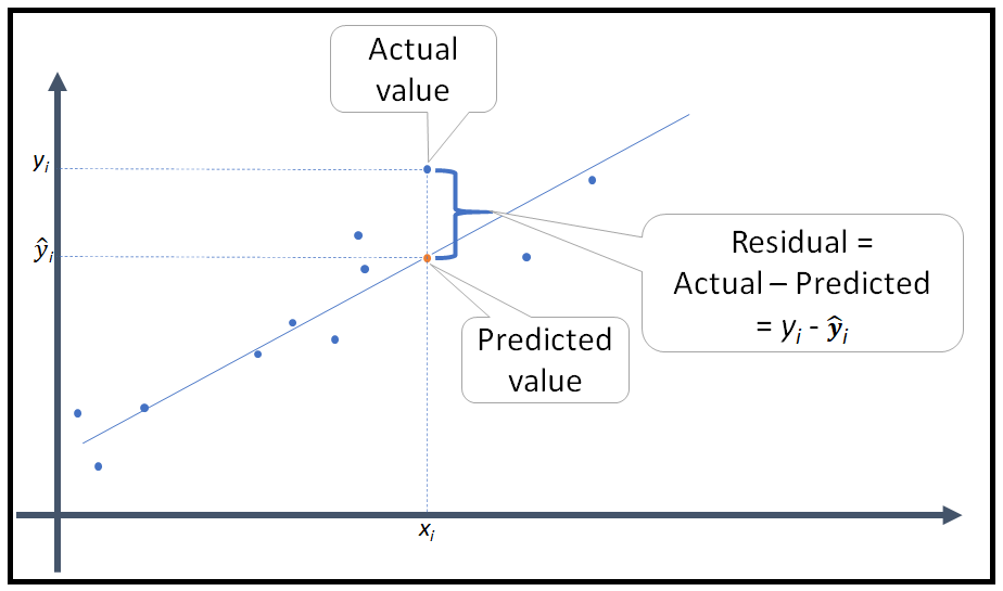
You can examine the histogram of the residuals in JASP easily.
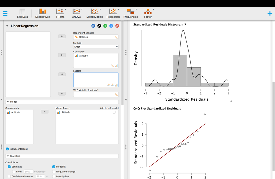
So here, the histogram of the residuals is normally distributed so most people would use this as justification that all of the assumptions are met. One can also look at the Q-Q plot and use that as an assessment as well. If you were going to use regression or multiple regression in your thesis or dissertation, I would strong recommend this BOOK and a thorough read of that chapters on regression and multiple regression.
Multiple Regression
I am only going to briefly describe multiple regression here as it is a bit beyond the scope of this course. You can always read more with Field and I would strongly recommend the Tabachnik and Fidell book.
Load the data set HERE into JASP. You are running a study where you are trying to predict GRE scores from a variety of other measures. Can you do it? Running a multiple regression in JASP is also easy. Take a look at the image below.
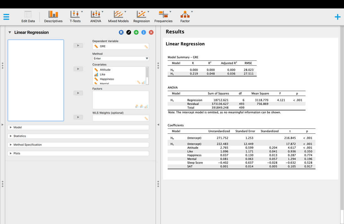
As with the first regression we did, there is a significant model, p < 0.001, but you will note it that it did not explain a lot of the variance, only 0.048 so less than 5%. Ideally, you would like R to be at least 0.5 and thus R^2 to be 0.25 as a minimum. With a multiple regression, the tests for the coefficients are more interesting as well. Here, you will see that only attitude is significant which could be interpreted as this is the only variable contributing to the model.
There is another way to test this. With multiple regression you can choose different Methods to add or remove variables from the model. The Enter Method just puts them all in. However, change the Method to Backward. With a Backward Method all the variables are put into the model. Then they are removed one by one and the reduced models are run until there is a significant change in the variable that is explained - then the process stops at that is the "final" model. You will see everything is removed until only Attitude is left in the model. This you would definitely interpret as saying that Attitude is the only predictor of GRE scores. You will notice that the R and R^2 values drop as variables are removed. If Attitude was not a predictor, then there would be no significant modell.
There is another way to test this. With multiple regression you can choose different Methods to add or remove variables from the model. The Enter Method just puts them all in. However, change the Method to Backward. With a Backward Method all the variables are put into the model. Then they are removed one by one and the reduced models are run until there is a significant change in the variable that is explained - then the process stops at that is the "final" model. You will see everything is removed until only Attitude is left in the model. This you would definitely interpret as saying that Attitude is the only predictor of GRE scores. You will notice that the R and R^2 values drop as variables are removed. If Attitude was not a predictor, then there would be no significant modell.
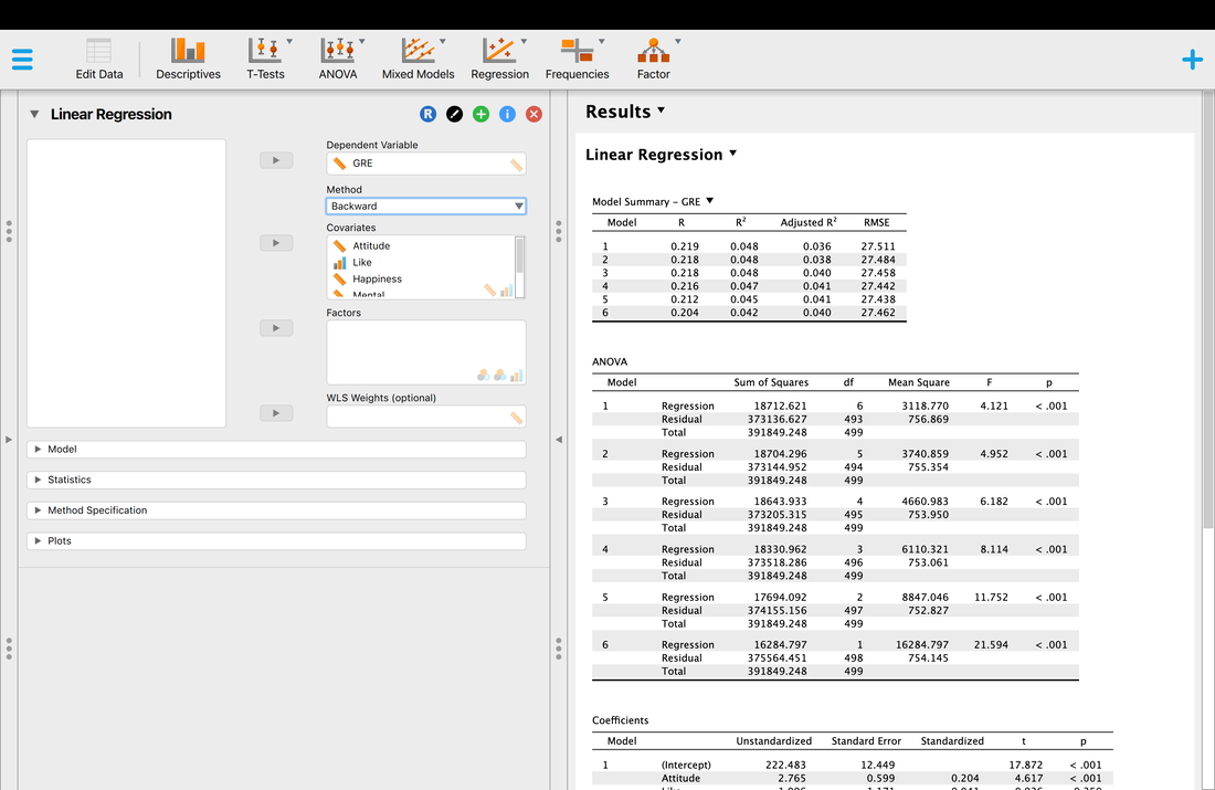
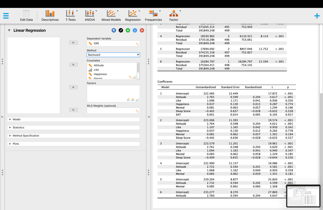
The Forward Method does the reverse of the Backward Method and adds variables one by one. If you switch to this, you will see that Attitude is the only variable that gets add as no other variable increases the predictive power of the model. Stepwise is similar to the Forward Method but it tries different combinations of variables. The Method you choose is largely a matter of opinion.
You can add colinearity statistics and the Durbin Watson test to examine some of the assumptions, but most people simply examine the histogram of the residuals as noted before.
You can add colinearity statistics and the Durbin Watson test to examine some of the assumptions, but most people simply examine the histogram of the residuals as noted before.
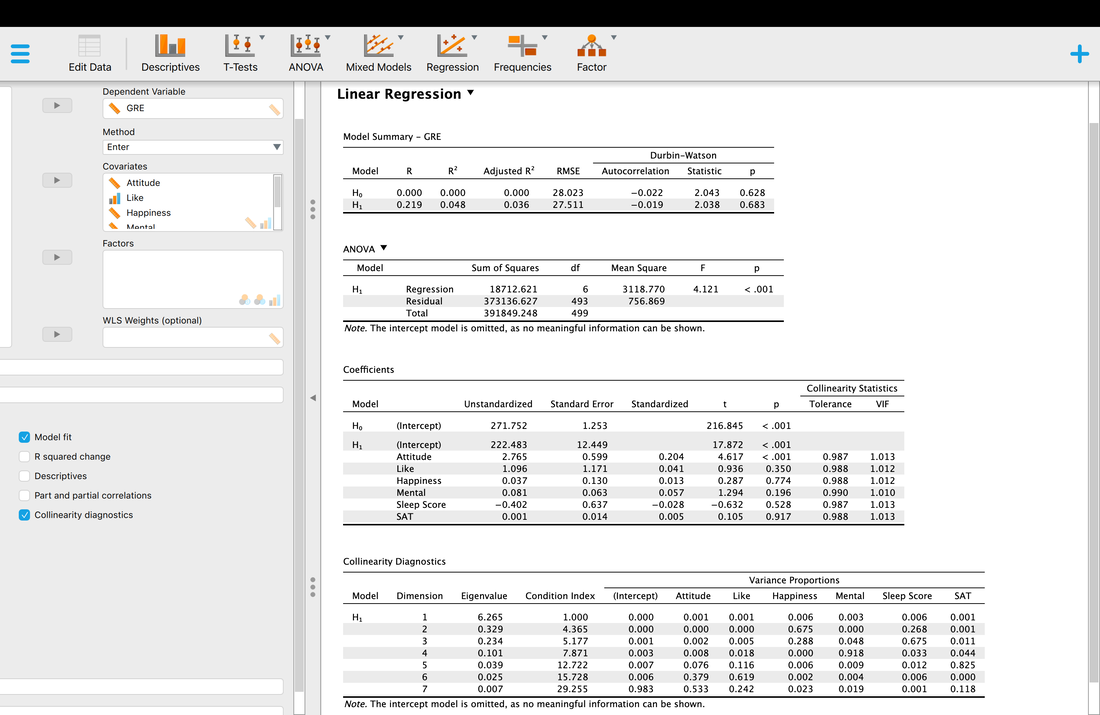
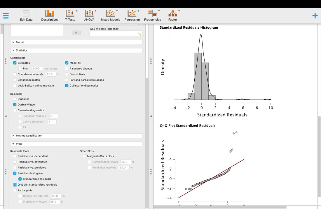
Regression and Multiple Regression in R (optional)
MR in R is trickier than in JASP, but it is significantly better at testing the assumptions of multiple regression.
Load the data HERE into a table in R called data.
Running a regression is simple. All you need to do is use the following command:
model = lm(data$V1~data$V2)
summary(model)
You should see output that looks like this:
Call:
lm(formula = data$V1 ~ data$V2)
Residuals:
Min 1Q Median 3Q Max
-36783 -9544 -1284 7467 74017
Coefficients:
Estimate Std. Error t value Pr(>|t|)
(Intercept) 38504.2 11889.9 3.238 0.00141 **
data$V2 1260.2 234.9 5.364 2.29e-07 ***
---
Signif. codes: 0 ‘***’ 0.001 ‘**’ 0.01 ‘*’ 0.05 ‘.’ 0.1 ‘ ’ 1
Residual standard error: 16040 on 195 degrees of freedom
Multiple R-squared: 0.1286, Adjusted R-squared: 0.1241
F-statistic: 28.77 on 1 and 195 DF, p-value: 2.294e-07
Essentially, what R is telling us is that there is a model that fits - p < 0.05. You will notice that it returns a multiple R-squared value which is the square of correlation coefficient r. It also return B0 and B1 which in this case are 38504.2 and 1260.2, respectively. Thus, the regression equation would be Y = 38504.2 + 1260.2X for this data.
Note, a model might not always fit the data. You can see the linear model by using the following commands:
plot(data$V2~data$V1)
abline(lm(data$V2~data$V1))
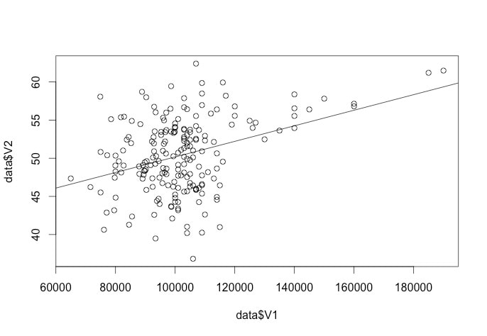
In this assignment you will learn how to do a multiple regression. Note, MR is a very complicated topic - the point of this tutorial is simply to show you how to do multiple regression in R. For understanding of the material, I strongly recommend you read Chapter 6 and 7 the Field textbook.
1. Load the data file HERE into a variable called data.
2. For simplicities sake, let's make the following variable assignments:
y = data$V1
x1 = data$V2
x2 = data$V3
x3 = data$V4
x4 = data$V5
x5 = data$V6
x6 = data$V7
This is simply just assigning the variables in the data frame columns to separate variables.
3. Running a multiple regression in R is easy. If you wanted to see how the variables x1, x2, x3, x4, x5, and x6 predicted y you would simply write:
results = lm(y~x1+x2+x3+x4+x5+x6)
summary(results)
You should see something that looks like this:
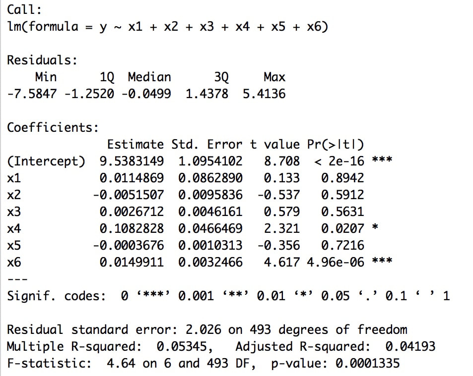
At the top you see the call - you are telling R to create a linear model where y is a function of x1, x2, x3, x4, x5, and x6.
You then get the residuals of the model. What are residuals? The residuals are the differences between the predicted and actual y values. What R is showing you here is information about the residuals as a whole - the minimum and maximum values, the values of the 1st and 3rd quartiles, and the median.
R next provides you with the regression coefficients, the standard error for each coefficient, and the significance test of each coefficient. In this case, you will note that variables x4 and x6 significantly contribute to the model. We will do more on model evaluation and comparison later, but the short version is only x4 and x6 are needed to accurately predict y (sort of).
Finally, R provides you with an overall test of the model (is there a linear model that fits the data?) and the R-squared value (actual and adjusted) - in other words, the proportion of variance in the data explained by the model.
Testing the Assumptions of Multiple Regression
Statistical assumptions are the criteria that must be met for a statistical test to be valid. In other words, if you do not meet these criteria then the results of the test may be invalid.
1. The Assumption of Independence of Errors
When you use multiple regression it is important to test whether or not there is an independance of the errors (residuals) in the model - another term for this is to check the autocorrelation of the errors. In R, this is easy to do using a Durbin Watson Test. However, this test is in the car package so:
install.packages("car")
library(car)
durbinWatsonTest(results)
You should see that D-W statistic is 1.996064 which is good (you want this value to be between 1 and 3 and as close to 2 as possible). You will also see that the result of this test is non-significant which is also good.
2. The Assumption of Multicollinearity
In general, you do not want variables in a multiple regression to be highly correlated - when they are this is collinearity. To test this, we typically examine VIF or variance inflation factors. In R, it is easy to generate a few statistics to check the multicollinearity of the data. The three criteria are:
i. No VIF above 10 - check with vif(results).
ii. The average VIF should be close to 1- check with mean(vif(results))
iii. Ideally, the tolerance (1/vif) should be not be less than 0.1, and less than 0.2 may be a problem - check with 1/vif(results)
3. The Assumption of Normality, Linearity, and Homoscedasticity of Residuals
While this is not one of the actual assumptions of multiple regression, one simple test of the assumptions in R is to examine the residuals. If the residuals are normally distributed then one can generally assume that all of the assumptions have been met.
res = resid(results)
This command puts all of the residuals (the difference between the actual and predicted y values) into a variable called res.
hist(res)
If the histogram is normally distributed, then one can assume the assumptions were met. One could also formally test the distribution with a statistical test if desired to gauge normality. It is also worth noting that if the histogram looks normal it suggests there are no outliers in the data (but this may be wrong, see below).
Using Q-Q Plots to Examine Normality
Another thing to check is the Q-Q plot of the data. The Q-Q plot in a multiple regression shows deviations from normality thus you want it to be straight. You can see the multiple regression plots by using:
plot(results)
Hit RETURN until you see the Q-Q plot, which in this case, looks just fine.
|
|
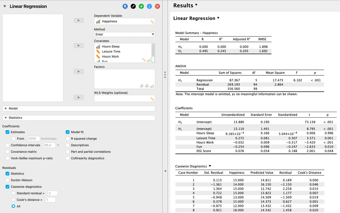
|
4. The Absence of Outliers and Influential Cases
As with any analysis, outliers and certain data points can push the analysis around quite a bit. A simple way to examine for multivariate outliers is to compute either a Cook's Distance or Malhabanonis Distance from the multivariate centroid of the data. In R, this is easy to do:
cooks = cooks.distance(results)
plot(cooks)
You will note quite clearly on the plot that there is an outlying value that should be removed from the data and the WHOLE analysis should be rerun with this data point removed.
Assignment 18
You are interested in predicting self reported happiness from a bunch of other predictor variables. This is your DATA.
Run a multiple regression to predict Happy. What variables predicted Happy? Justify your answer. Test the assumptions by examining the histogram of the residuals.
Exam Question
1. Explain the logic of regression and multiple regression.
2. What are residuals?
3. What are the assumptions of multiple regression?
4. How do you tell that variables are important predictors in multiple regression?
Lesson 19. Categorical Data
Read: Field, Chapter 18
Watch THIS and THIS.
Categorical data differs significantly from continuous data in terms of how it is analyzed - the statistical tests that we have used in the past are not valid and thus you have to do something different.
Watch THIS and THIS.
Categorical data differs significantly from continuous data in terms of how it is analyzed - the statistical tests that we have used in the past are not valid and thus you have to do something different.
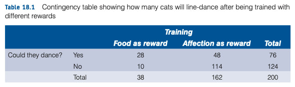
The data is categorical because it is simply a count and not a continuous measurement. But, as a researcher you will want to know if there is a difference in whether or cats could be trained to line dance depending on the type of reward given, food or affection. This data set is HERE. Open it in JASP.
The simplest test to do to analyze this data is Pearson's Chi Square Test. Basically, think of the test like an ANOVA - it computes a statistic (Chi Square) to determine if there is a difference between the call. This is an Omnibus Test and does not tell you where the difference is. To run the test in JASP, go to Frequencies --> Contingency Tables and set it up as below.
The test relies on the computation of expected counts based on the data and is essentially testing whether the actual counts differ from the expected counts. You can see the expected counts below.
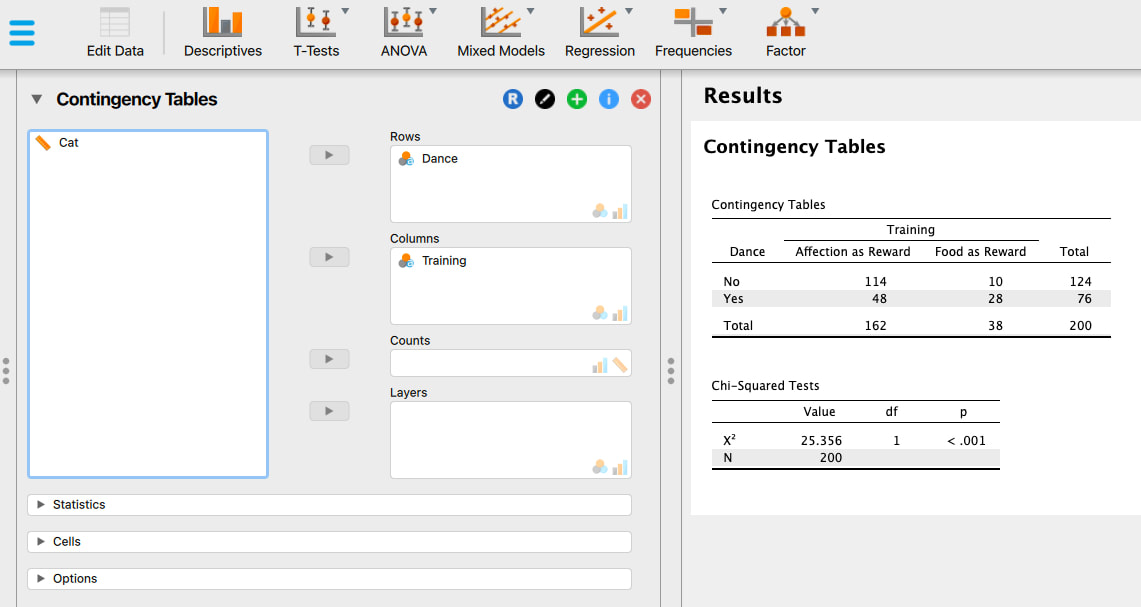
The Chi Squared test is significant, so there is a difference in the counts. Sadly, the test does not tell you where the difference is - you infer that from the counts. In this case, training with food seems to be better than training with affection as a reward. You can get at this somewhat using odds ratios as it may not seem intuitive. Odds of dancing after food = 28/10 or 2.8 I am getting these values from the counts themselves. Odds of dancing after affection = 48/114 or 0.421. Thus, if you compare these you get 2.8/0.421 = 6.65. What does this mean, cats were 6.65 times more likely to dance after food as opposed to after affection. This is the only decent want to Post Hoc a Chi Squared test.
The Chi Squared test, like any other test, has its faults. As such, various "corrections" have been proposed - the continuity correction, using Likelihood ratios, the Vovk-Selke maximum p-ratio, and Fishers exact test. Running these in JASP is relatively easy, you simply click the appropriate buttons as shown below. I will leave it to you to read Field, Chapter 18 to understand what these different corrections are and why they are used. In practice, most people just report the Chi Squared value. If a reviewer or supervisor asks for a correction, you know where they are.
The Chi Squared test, like any other test, has its faults. As such, various "corrections" have been proposed - the continuity correction, using Likelihood ratios, the Vovk-Selke maximum p-ratio, and Fishers exact test. Running these in JASP is relatively easy, you simply click the appropriate buttons as shown below. I will leave it to you to read Field, Chapter 18 to understand what these different corrections are and why they are used. In practice, most people just report the Chi Squared value. If a reviewer or supervisor asks for a correction, you know where they are.
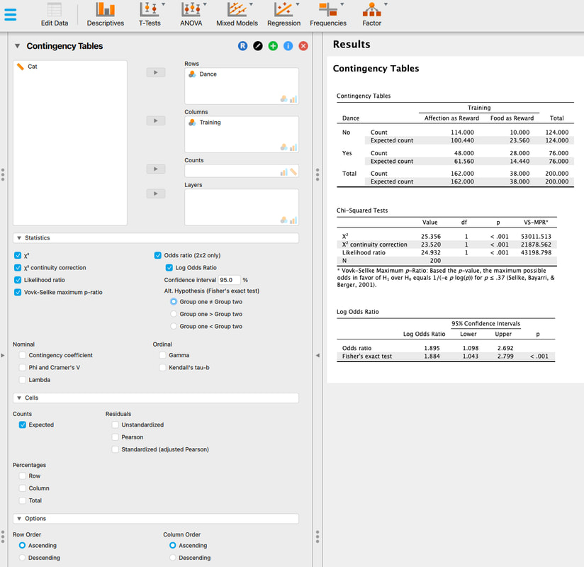
Statistical Assumptions
1. Independence. Each entry has to be unique - you cannot run repeated measures designs with a Chi Squared test.
2. All expected frequencies need to be above 5. If they are not, you do not have sufficient power to run the test and the results are mot likely inaccurate.
Doing This in R
Coming soon!
Assignment 19
The data HERE reflects provides physical activity and consumption of fruits of 1184 students. There are two variables - Physical activity of the participant (Low, Moderate, Vigorous). and the participant's consumption of fruits (Low, Medium, High). What do the results of the test tell you about potential relationships between physical activity and fruit consumption? Check the expected frequencies for assumption violations and use odds ratios to determine what the specific differences are.
Exam Questions1. Explain the basic logic of a Chi Squared Test and the assumptions of the test.
Lesson 20. The Problems with Null Hypothesis Testing and the New Statistics
The short version of this lesson is, p-values are not all they are cracked up to be. We will cover this in class as a formal lecture. The slides for that are HERE.
Also some videos:
Video: The New Statistics I
Video: The New Statistics II
Video: The New Statistics III
The key paper to read on this issue is my Cumming and it is HERE. You might also find THIS statement and THIS statement interesting and THIS statement interesting.
Other people have written about these issues:
Haller Kraus 2002
Iaonnidis 2005
Moonesinghe 2008
Nuzzo 2014
Vankov 2014
Okay, now to understand the problem and see it in action. Load the following SCRIPT into RStudio and run it. What the script is doing is creating a population with a mean and standard deviation. Then, it draws two samples, each from the same population and runs a t-test. Run it a few times. Note the p-value changes every single time. Once in awhile, you will see a significant result even though there is only one population. This, by definition is a Type I error and you can see how easy it is to commit one. What if you only ran the one study that had the two samples that were statistically different but were not in principle. You would be telling a story of differences. THIS is a slightly different version that runs 10000 samples for you. Take a look at the histogram of p-values!
So, what do you do about it? You embrace the "New Statistics". It is now time to read the Cumming (2013) paper if you have not already. Some of the key points (he has 25) in his paper.
1. Move away from dichotomous thinking - do not think of significant or not significant.
This is kind of the point, if p-values are flawed you have to throw out NHST logic completely. Be wary of any p-value. Replicate whenever possible.
2. Use 95% confidence intervals wherever possible.
We are talking full on graphical interpretation, or at least, use the confidence intervals to guide interpretation but do not forget point number one! To compute a between subjects CI is easy - just use the standard formula for each group CI = tcritical(df, and at 0.25) * standard deviation / sqrt(n). We will compute these below. Note, for within designs it is more appropriate to use within subject confidence intervals. More on this HERE.
3. Report effect sizes at all times.
We have not really talked about effect sizes, but basically you want a statistic that describes the magnitude of the effect as opposed to whether there is an effect or not. Again, we will compute these in a bit. HERE is a quick video.
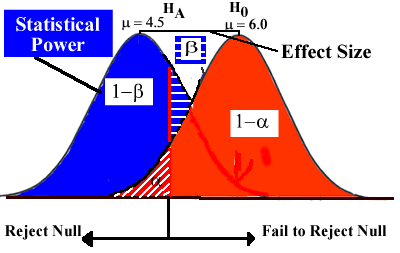
4. Use Meta Analysis whenever possible.
Meta analysis is a bit beyond the scope of this course but essentially you want to combine data from across multiple studies to try and better understand what is going on, if anything. HERE is a short video about meta analysis.
5. Avoid p hacking.
Basically, some tips to avoid making the mistakes outlined above. i) Declare you sample size in advance. Do not test more people to get an effect or stop when you have one. ii) Declare your analysis procedures in advance. iii) Stop the study when the criteria from i) are met. iv. Be very careful with meta analysis.
Okay, lets try this out. Load the data HERE into JASP. We have worked with it in the past. Basically, it is RT data for three groups. Run the ANOVA.
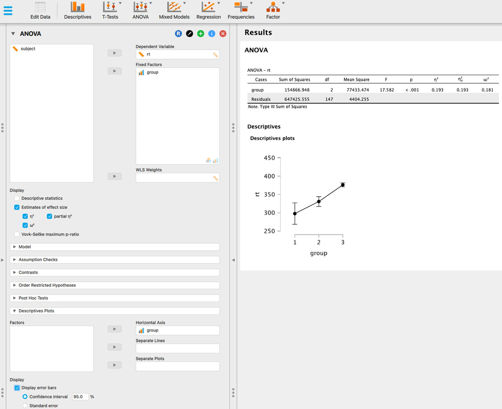
So, if we embrace the "New Statistics", we would look at the 95% confidence intervals first and decide that group 3 is most likely different from the other groups. We would then look at the effect sizes - eta squared and partial eta squared are the most common and talk about the size of the effect. Remember, this is similar to the proportion of explained variance we discussed with regression. And this would be the story. You could also break this down a bit further and compute Cohen's D values to look at the effect size between groups - Cohen's D is just (Mean1 - Mean2)/PooledStandardDeviation. You might even be able to do a meta analysis but that is beyond the scope of this lesson.
Assignment 20
Redo the assignment for ANOVA (Assignment 11) but use the New Statistics to interpret your findings in a short paragraph. In other words, discuss confidence intervals and effect sizes, not p-values. Do not worry about statistical assumptions.
Exam Questions
1. Discuss some of the problems with using p-values.
2. What is the "New Statistics"?
Lesson 21. The "New" Statistics and Meta Analysis
Lesson 22. The Logic of Bayesian Statistics and Bayes Factors
Bayesian logic is quite complicated - I strongly recommend THIS excellent introduction by Mike Masson. It is a perfect primer for getting into Bayesian statistics.
For doing Bayesian statistics in JASP read THIS paper.
For interpreting Bayes Factors read THIS paper.
Lecture Slides
Doing Bayesian Statistics in JASP, Bayes Factors
Reviewing the logic behind Bayesian statistics is beyond the scope of this online tutorial. I strongly recommend Mike Masson's video above as a start and then probably a textbook or two if you are serious about using them.
The basic idea is we start with a prior belief about the world. We then collect dome evidence (data) and we use that to update our prior belief about the world (our posterior belief). In principle we would repeat this process over and over to make our posterior belief as accurate as possible.
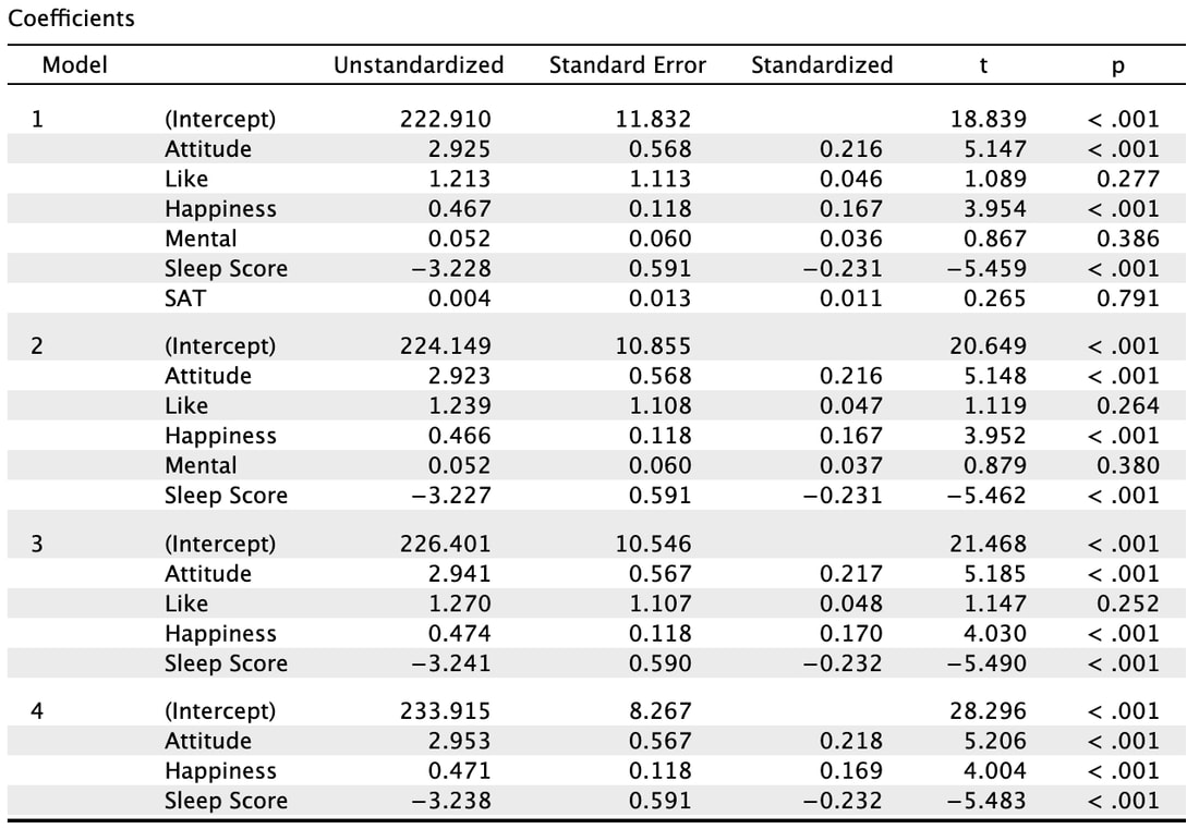
From an experimental perspective, we think in terms of the null and alternative hypothesis. We have a prior belief about the null hypothesis and a prior belief about the alternative hypothesis. Practically, we should assume that the probability of both hypotheses is equal (0.5/0.5) thus this term cancels out. What we then do is compute a Bayes Factor from our data to see which hypothesis (if either) is more likely.
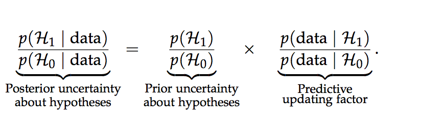
Luckily, JASP does all the heavy lifting for us so all we have to do is interpret the Bayes Factor.
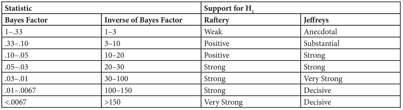
Load the data HERE into JASP.
The data here reflects reaction time data for three groups so go ANOVA --> Bayesian ANOVA and set it up as below.
The data here reflects reaction time data for three groups so go ANOVA --> Bayesian ANOVA and set it up as below.
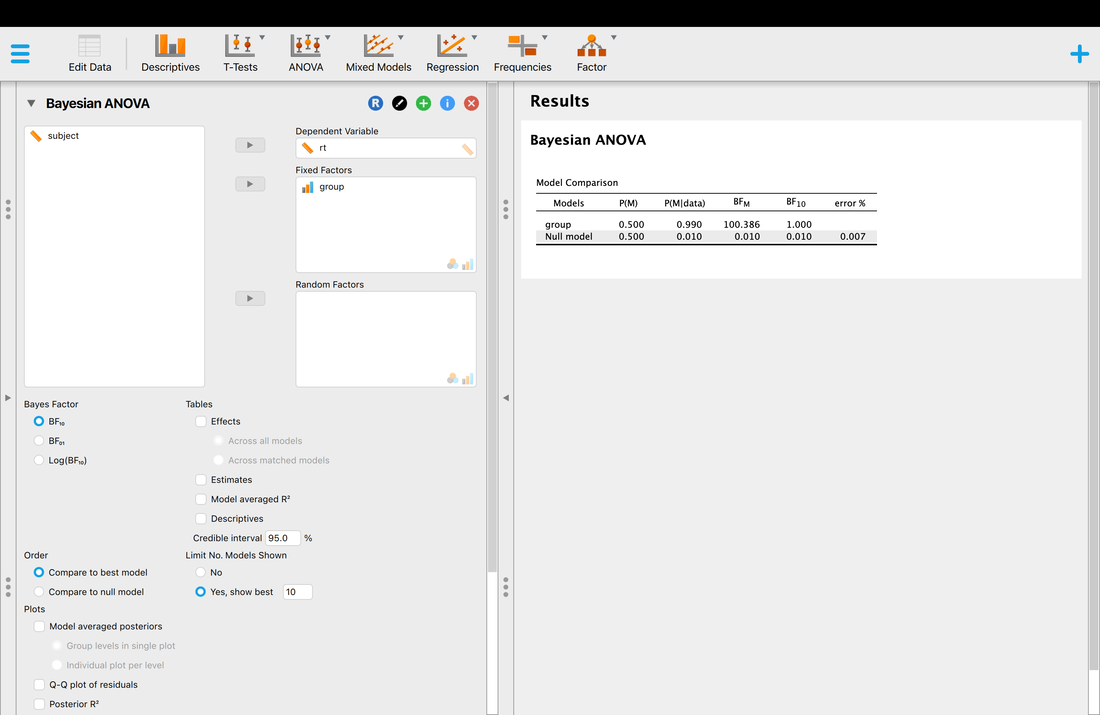
You will note that JASP is reporting a BFm (which is actually BF10 as that is what is selected) of 100.386. So, based on the table above this is either strong or decisive evidence that H1 is 100.386 times more likely than H0. In classical terms, there is a difference between groups.
Now, with JASP you can Posthoc the Bayesian result. I have also made a plot of descriptives using credible intervals (the Bayesian version of 95% CIs) which we will discuss next lesson. You will note the Bayes Factors suggest the difference between groups 1 and 3 is really what is driving this whereas the evidence for differences between groups 1 and 2 and 2 and 3 is considerably weaker.
Now, with JASP you can Posthoc the Bayesian result. I have also made a plot of descriptives using credible intervals (the Bayesian version of 95% CIs) which we will discuss next lesson. You will note the Bayes Factors suggest the difference between groups 1 and 3 is really what is driving this whereas the evidence for differences between groups 1 and 2 and 2 and 3 is considerably weaker.
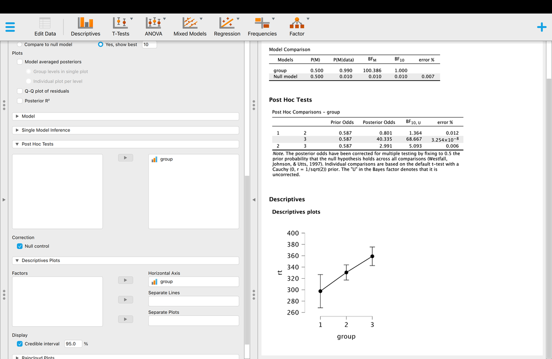
In JASP, you can also specify priors for the model. Note, JASP assists you as while you specify the type of prior, the statistical test you select (t-test, ANOVA, etc) tailors the prior to the test and H0 and H1. A full discussion of priors is beyond this lesson, but uniform and beta are the most common.
Assignment
Take the data from any of your previous assignments (I recommend t-tests or ANOVA) and reinterpret your findings using Bayesian statistics. Posthoc the results if necessary. Write a brief paragraph summarizing your findings.
Exam Questions
1. Explain the basic logic behind Bayesian statistics.
2. What is a Bayes Factor and how is it interpreted.
Lesson 23. Bayesian Statistics: Credible Intervals
The short version is, Bayesian credible intervals are the Bayesian equivalent of 95% confidence intervals.
To understand, watch THIS. And then watch THIS. And then finally watch THIS.
You can use THIS as a reference. And THIS.
Assignment
For one of your previous assignments, use JASP to compute the credible interval for a data set. Generate a figure (in JASP) and submit this.
Exam
1. What is a Bayesian Credible Interval
Lesson 24.