Now that we have done some simple descriptive statistics, let's look at a few ways that MATLAB can visualize the data. But first, a reminder copying and pasting code may not work due to hidden carry over to MATLAB. You will need to type this in.
If you still have your data frame active, great! If not, you can quickly load it using the following commands:
my_data = readtable('my_data.txt');
my_data.Properties.VariableNames = {'Subject' 'Condition' 'RT'};
We can also quickly generate some means to plot:
meanCon(1) = mean(my_data.RT(my_data.Condition == 1));
meanCon(2) = mean(my_data.RT(my_data.Condition == 2));
You will notice we have done something a bit different here. As opposed to putting the means into two separate variables we have placed them into one variable. Take a look for yourself in the Workspace. meanCon(1) indexes the first position in a variable. When you create meanCon(2) MATLAB instantly knows to add this to the variable meanCon in the second position.
EXPERT TIP: If you have created a variable already and try to force something into sometimes MATLAB will not like this and give you an error message. Just adding an entry like this is easy, but sometimes MATLAB will not like what you are trying to add.
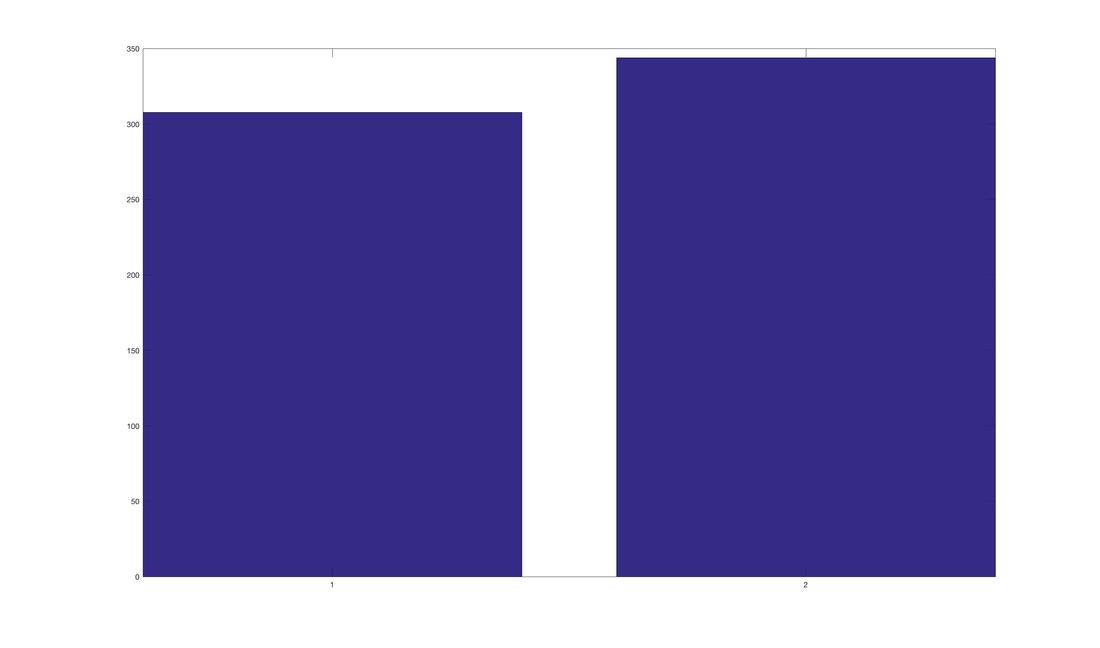
Back to plotting. Try this:
bar(meanCon);
You should get a horribly formatted and coloured bar graph that looks like this:
If you still have your data frame active, great! If not, you can quickly load it using the following commands:
my_data = readtable('my_data.txt');
my_data.Properties.VariableNames = {'Subject' 'Condition' 'RT'};
We can also quickly generate some means to plot:
meanCon(1) = mean(my_data.RT(my_data.Condition == 1));
meanCon(2) = mean(my_data.RT(my_data.Condition == 2));
You will notice we have done something a bit different here. As opposed to putting the means into two separate variables we have placed them into one variable. Take a look for yourself in the Workspace. meanCon(1) indexes the first position in a variable. When you create meanCon(2) MATLAB instantly knows to add this to the variable meanCon in the second position.
EXPERT TIP: If you have created a variable already and try to force something into sometimes MATLAB will not like this and give you an error message. Just adding an entry like this is easy, but sometimes MATLAB will not like what you are trying to add.
Back to plotting. Try this:
bar(meanCon);
You should get a horribly formatted and coloured bar graph that looks like this:
Manuscript quality plots can be generated in MATLAB, but it takes a bit of programming know how. However, for now, we can clean this up fairly easily using a few commands. Try the following:
title('Mean Reaction Time for Stroop Task');
set(gca,'xticklabel',{'Congruent' 'Incongruent'});
ylabel('Reaction Time (ms)');
axis([0.5 2.5 0 400]);
I think most of these are pretty straight forward. title puts a title on the plot. The next line is a reference to set an axis property, thats the set(gca...) bit. ylabel is a pretty straight forward command that labels the y-axis. axis allows you to set the axis range of the plot with 4 entries, xmin, xmax, ymin, ymax.
All of these plotting commands have literally thousands of options and there are a ton more plotting commands. It is possible to make manuscript quality plots with MATLAB - I have published quite a few. However, it takes time to make a script that you really like. The good news is, once done. You can easily reuse the script!
Error Bars
It is very easy to put error bars on a MATLAB plot. Let's start with something easy like the standard deviation. First, we need values:
stdCon(1) = std(my_data.RT(my_data.Condition == 1));
stdCon(2) = std(my_data.RT(my_data.Condition == 2));
Next, we need to plot them!
hold on
e = errorbar(1:2,meanCon,stdCon,'.');
set(e,'linewidth',3,'CapSize',20);
hold on tells MATLAB not to overdraw the previous plot (for reference, hold off turns this off!). Next, we need to plot the error bars. The 1:2 refers to the two bars. We need to give errorbar meanCon so it knows the starting point of the error bars. Of course, we also need to give it two values that are the length of the error bars, thus stdCon. Finally, we tell MATLAB to plot the means as a point '.'. Try removing this and see what happens! You will notice we also got a value e out of errorbar. This is the handle or a value you can use to identify the plot. Thus, in the next line we can quickly refer to e and set some properties - the linewidth of the error bars and the size of the caps.
Things To Do
1. Use Google to learn how to customize bar plots in MATLAB some more. Try changing the colour of the bars, removing some of the axes, removing axis ticks, etc.
2. Try and make a manuscript quality plot using a MATLAB script.
3. Replace the error bars above with the confidence intervals we generated in the previous tutorial.
Then, move on to the next tutorial.